Quantcast
Channel: Journal
Viewing all 17412 articles
Browse latest View live

The Brilliant Brick Architecture of Vietnam

$
0
0

Architects: Showcase your next project through Architizer and sign up for our inspirational newsletter.

The architects of Vietnam know a good building material when they see one. In this case, it’s brick. Sustainable, cheap and locally produced, baked brick is not only derived from the local setting in its physical composition and cultural significance, but is used in ways that harness the environment, and ultimately benefit the environment, too. The earthy color of brick remains becoming under the often-harsh glint of the sun, while its very presence in modern homes implicitly tethers them to the ancient brick temples that dot nearby regions. With absorptive properties that allow it to regulate humidity, it is no surprise why brick has become increasingly popular in architectural projects across the country.

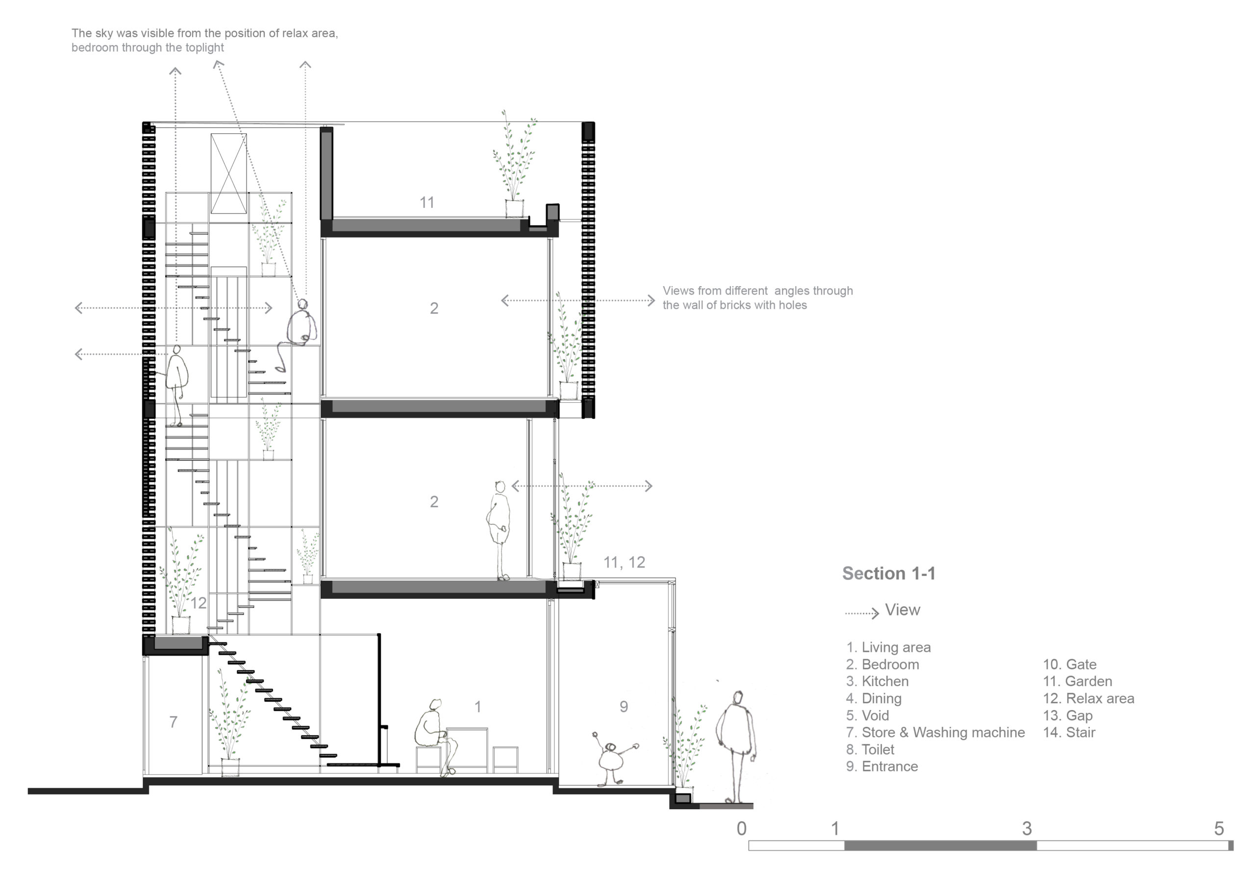
Scattered around Vietnam, many of the houses in this collection use lattices constructed out of bricks, simple in design and execution but stunning in outcome. But these screens were not designed purely for aesthetic reasons; the punctured brick façades also allow for natural ventilation and daylighting, making the best of the balmy climate. As it is deployed in the following projects, the humble material makes a convincing suggestion overall: that design can be affordable, relatively uncomplicated and undeniably good.

MM House – Tropical Suburb House by MM++ Architects / MIMYA, Hồ Chí Minh, Vietnam

Located in a Saigon suburb, the MM House differentiates itself from the surrounding neo-Victorian structures with a reinvention of the vernacular South East Asian stilt house typology. Its brick skin forms a lattice that promotes natural ventilation, a requisite for the tropical climate.

Maison T by Nghia-Architect, Hanoi, Vietnam

Seen from the narrow alley in which it sits, this house for one hides an impressive double-height interior behind an unassuming brick screen. The shape of the screen toys with the convention of a Western gabled roof house and opens onto an intimate, green courtyard.

TERMITARY HOUSE by TROPICAL SPACE, Da Nang, Vietnam

Named after the dwellings of termites and their characteristic structural intricacy, the Termitary House not only uses its simple building material to arresting effect, but addresses the particularities of the South East Asian climate. To protect against tropical storms, the brick building was designed with a double skin to mitigate the pressure of the wind and rain, while the allocation of circulation and service spaces create a buffer to steady the house against typhoons.

ZEN House by H.a, Ho Chi Minh City, Vietnam

A multiplicity of textures defines the tranquility of the ZEN House, built for inhabitants who sought respite from the chaos of Vietnam’s largest city. A continuous succession of spaces, tied together by a simple wooden staircase, is encased by tall walls of exposed brick. Unpolished and unpainted, the disparate materials come together beautifully in the sunlight, turning the dwelling into a residential monastery of sorts.

Terra Cotta Studio by TROPICAL SPACE, Quang Nam Province, Vietnam

Ever more brick screens bring ever more stippled light into the architectural projects of Vietnam, and in this case into the workspace of artist Le Duc Ha. Meant to recall a traditional Vietnamese furnace, the cubic structure is irrevocably tied to the surrounding landscape and its attendant histories. While the interweaved bricks take care of daylighting and cooling, the bamboo scaffolding allows the artist to dry his terra cotta works and to rest after a day of work.

BINH HOUSE by LANDMAK ARCHITECTURE, Thạch Thất, Hà Nội, Vietnam

Tasked with building on a cramped plot of land, the architect of this suburban home designed a minimalist structure that fits snugly with the tapered edge of the site. A white brick skin allows for privacy and is backed by a second screen of foliage that spills out of the building’s front.

WASP HOUSE by TROPICAL SPACE, Hồ Chí Minh City, Vietnam

A house for two siblings, sandwiched into a dense row of buildings in the Binh Tan district, takes full advantage of the light-yet-private brick hole technique. With a tight budget in mind, the architects kept the details and materials simple, using metal and wood finishes to design the external gate and fence as well as the interior staircase, which doubles as a reading perch.

LT HOUSE by TROPICAL SPACE, Long Thành District, Dong Nai, Vietnam

Continuing their ongoing research into affordable housing design in Vietnam, Tropical Space designed this residence for a newlywed couple, adding visual texture to the brick surfaces with patterned grids of holes. At night, the lattices turn the house into a living lantern, all the while keeping the inhabitant attuned to the natural world by permitting the entrance of directional breeze.

FA House by atelier.tho.A, tp. Đà Lạt, Vietnam

Seeking to restore the weathered structure her father once built, the client of the FA House navigated the delicate balance of old and new by installing a translucent screen around the existing abode. While an ethereal blur frames silhouettes on the façade of the house, the retention and extension of warm brick surfaces tether the project to its intimate origins.

Architects: Showcase your next project through Architizer and sign up for our inspirational newsletter.

The post The Brilliant Brick Architecture of Vietnam appeared first on Journal.


In the Round: 8 Curvaceous Examples of Brutalist Architecture

$
0
0

Architects: Showcase your next project through Architizer and sign up for our inspirational newsletter.

When architecture critic Reyner Banham set out to identify what would come to be known as Brutalism, he distilled his concerns into a single, simple question. “The New Brutalism,” he asked. “Ethic or aesthetic?”

In Banham’s binary, the post-war building style was not about what makes it, in popular opinion, seem so obviously “brutal.” While often defined by its concrete construction and imposing formal expression, Brutalism had just as much to do with a more implicit set of characteristics: a newfound moral seriousness among architects and a socialist-tinged desire for honesty in public architecture.

Its pioneers, British architects Peter and Alison Smithson saw its rhetorical potential. “Brutalism tries to face up to a mass-production society, and drag a rough poetry out of the confused and powerful forces which are at work,” they said. “Up to now brutalism has been discussed stylistically, whereas its essence is ethical.”

Nevertheless, the style can’t be thought of without mention of its signature visual qualities — cast concrete surfaces, exposed functional elements, stark and unapologetic forms. Banham himself singled them out: “In order to be Brutalist,” he wrote, “a building has to meet three criteria. The clear exhibition of structure, the valuation of materials ‘as found’ and memorability as image.”

In This Brutal World, a new book from Phaidon by graphic designer Peter Chadwick, pages abound with architecture that meets Banham’s test. Monochrome shots of Brutalist buildings around the world, from the 1950s to the present day, make a solid case for memorability as image. The eye follows the contours of cultural centers, hospital extensions, airports and apartment blocks, enraptured by a now-lost architectural honesty. This collection extracts a few projects that share a tendency towards the curve, combining organic outlines with manmade materials in ways that might seem incompatible but never fail to inspire awe.

St. Joseph’s Hospital by Bertrand Goldberg, Tacoma, Wash., United States, 1974

An extension of the Tacoma hospital complex, the undulating surface of Bertrand Goldberg’s design is an articulation of his theory of “nuclear design” in which each quadrant housed “villages” of patient beds clustered around nursing stations. The arrangement was conceived with the intention to optimize access to care, and the outward appearance of the earthquake-resistant structure honestly reflects its internal design.

‘The Egg’ Center for the Performing Arts by Wallace Harrison, Albany, N.Y., United States, 1978

Part of the Rockefeller Empire State Plaza in the state capital, the cultural center was designed to reflect Nelson Rockefeller’s penchant for sculptural architectural design. Fittingly, the inclined “Egg” appears to rest on a pedestal, which connects the structure to six underground floors.

Bio-Towers, renovated in 2008 by Jähne & Göpfert and Zimmermann & Partner, Lauchhammer, Germany, 1957

Built in brick, this cluster of industrial structures were part of a lignite coking plant in the former GDR. Although seemingly monumental, their curved forms reflect a surprising simple filtering technology and the internal circulation is snuggly fitted amidst each group of four towers. Although the plant closed in 1991, the towers have been renovated and opened for tours, symbolic as they are of a once industry-heavy segment of the country.

Grand Central Water Tower by GAPP Architects & Urban Designers, Midrand, South Africa, 1996

This striking architectural feature would have made Bernd and Hiller Becher, who began documenting industrial structures in the 1960s, swoon. Its cantilevered structure made of prestressed concrete supports a massive conical tower designed to hold 6,500 cubic meters of water on the outskirts of Midrand.

Trudelturm by Hermann Brenner and Werner Deutschmann, Aerodynamic Park, Berlin, Germany, 1936

Part of a collection of alienesque structures in an aerodynamic research facility, the Trudelturm is an architectural structure so unusual that it had a brief cameo in the 2005 sci-fi film “Aeon Flux.” But its strange design is entirely reflective of its purpose: the concrete blob was built to investigate the phenomenon of aircraft spin, serving as an upended wind tunnel used for research testing.

Meditation Space by Tadao Ando, UNESCO, Paris, France, 1995

Known for his contemporary renditions of traditional Brutalist aesthetics, Tadao Ando designed a minimal meditation space for the UNESCO headquarters in Paris, in celebration of the organization’s 50th year. Built with the notion of inclusivity in mind, the concrete cylinder is lit to stunning effect through a small slit between the round walls and the floating roof.

Trans World Airlines (TWA) Terminalby Eero Saarinen and Associates, JFK Airport, New York, N.Y., United States, 1962

One iteration of the architect’s continuing investigation of curved forms, the TWA Terminal in Queens celebrated the onset of a future defined by air travel. Called “the Grand Central of the jet age,” the flight center is housed underneath a thin shell roof that creates a womb-like interior hall.

Les Choux de Créteil by Gérard Grandval, Créteil, France, 1974

Dubbed “the cabbages,” this residential development in the southeastern suburbs of Paris was built to address the metropolitan region’s growing need for affordable public housing. Its curvaceous design involves large round structures covered in smaller petal-shaped balconies that were designed to allow each inhabitant a private viewing spot. While built primarily in concrete, the vegetal reference point of the project makes it seem to sprout almost naturally out of the ground.

Want to explore the Brutalist tradition? Get yourself a copy of Phaidon’s stunning title “This Brutal World”:

The post In the Round: 8 Curvaceous Examples of Brutalist Architecture appeared first on Journal.

Call For Entries: Tell a Story With an Architectural Drawing for a Shot at $2,500!

$
0
0

It’s time to get those pencils sharpened and those computer mice warmed up — the Second Annual One Drawing Challenge is officially open for entries! Submit your drawings before the Early Entry Deadline at midnight EST on Friday, July 17th.

Enter the 2020 One Drawing Challenge

Competition Brief

Thanks to social media, more people than ever now consume architecture every day through their feeds. However, their attention is fleeting — with millions of architectural ideas flowing across the web, each designer has just a brief moment to make an impact. This means one image or drawing needs to possess the power to tell a whole story on its own, in seconds. For any designer, producing a viral drawing might just kickstart their career.

So, the #OneDrawingChallenge is laid down: Can you create a single drawing that tells the story behind a complex piece of architecture?

Your task is as follows: Create one drawing that communicates a new architectural proposal or existing piece of architecture, and the experience of those that would inhabit it. It can be located anywhere in the world and be at any scale. It can take the form of a plan, section, elevation, perspective or sketch. As long as it portrays part or all of a building or group of buildings, it is eligible.

This should be accompanied by a short description of your proposal, no more than 150 words.

2019 entrants, clockwise from top left: “Between Possibilities and Limitations” by Ozair Mansoor (2019 Student Winner); “Plastic Britain” by Christian Coackley (Commended Entry); “The Machine: A Mechanical Mudlark” by Mandalika Justine Roberts (2019 Non-Student Winner); “All at Sea” by Amélie Savoie-Saumure, Pascale Julien and Matt Breton-Honeyman (Commended Entry)

Prizes and Recognition

In partnership with Escape Motions and Paintstorm, we are thrilled to announce that 2 Grand Prize winners (one student and one non-student) will receive the following prizes:

  • $2,500 cash prize
  • Leuchtturm1917 Notebook
  • Pro Digital Drawing Package, including:
  • Total Value: $2,810

Further to this, 10 Commended Entrants will receive:

  • Leuchtturm1917 Notebook
  • Pro Digital Drawing Package, including:
    • Rebelle by Escape Motions
    • Creative License for Paintstorm

100 Shortlisted entries will also be published on Architizer Journal. Winners and Finalists will be celebrated by millions via Architizer’s newsletter and social media channels.

A selection of 2020 One Drawing Challenge jurors. Check out every juror and their bios here.

The Jury

The One Drawing Challenge Jury comprises practitioners and thought leaders from the worlds of architecture, design and technology, each with a special connection to drawing. They include:

The jury represents those leaders who are actively bringing architecture to the public today, both online and in the built environment. For entrants and winners, this is an opportunity to get their work in front of the people shaping how the world engages with architecture now and in the future.

2019 Commended Entrants: “The Unending Square” by Caleb Ong Yan Weng; “Seed Lottery” by Nathan Gradoville; “Knucklebead” by Andrew Evans; “Baker Street” by Isabelle Turco

Without further ado, make sure to submit your drawing before midnight EST on July 17th, 2020 to secure your Early Entry Discount. We can’t wait to see the stories you tell about architecture this year — good luck from the whole team at Architizer!

Enter the Competition

The post Call For Entries: Tell a Story With an Architectural Drawing for a Shot at $2,500! appeared first on Journal.

5 Tips for Improving Your Architecture Portfolio

$
0
0

Whether you are an architecture student looking for your first internship or an architect presenting work to prospective clients, a portfolio is undoubtedly one of the most important parts of the profession. It is common to think that a portfolio is a mere compilation of one’s past work, but here’s a lesser known fact: Your portfolio also determines your future work potential.

Documenting great work experiences in your portfolio will lead you to more opportunities in the future. These opportunities may come in the form of jobs at offices with interesting projects, more leads for clients and projects, and with a combination of the two, greater design freedom and an even better collection of work. This is why a great portfolio not only takes you to your next milestone, but also puts you on a trajectory to achieve your long-term goals.


1. Design your portfolio

This was probably the biggest game changer between an entry level student to professional architecture job. Portfolio is much more than a compilation of your work. It is a representation of yourself.

Consider how the reader might traverse through your pages, and ensure that correct information is visible and clear. Ask yourself “What are my strengths and weaknesses?” “How do I want to be remembered?”


2. Strive for consistency

Establish your layout design language early on, and stick to it. This includes choosing a common font and font size, clear project transitions, and establishing a grid for any visual elements. This allows readers to easily understand your project narratives, and recognize important elements and where to find them. It might be difficult at first to come up with a layout and style that works across all your projects. Once you establish a strong design language, you can start to break the rules slightly to add a creative spin to it.

Utilize InDesign’s master pages and paragraph styles. If you want to learn these, check out “Life Changing InDesign Tips & Tricks” on our YouTube channel.


3. Experiment with delivery methods

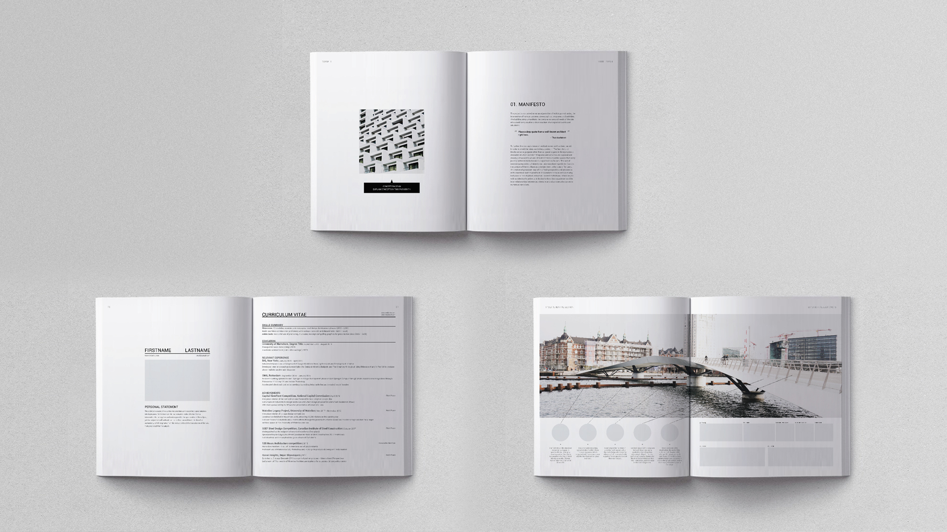
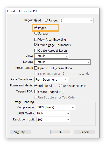
Traditional portfolios were only delivered in physical books. In this day and age, however, they can be delivered in several formats, including print, slideshow or issuu. Make sure to export your file appropriately to ensure that your work is showcased in the best light possible.

  • Print: portrait spread complete with back cover:

  • Slideshow: fit to computer screen 16:9 aspect ratio:

  • Issuu: export by pages:


4. Include personal work

Personal work at the end of your portfolio is a great opportunity to distinguish yourself from the crowd. Have some fun and make yourself likable to your future coworkers and faculties. Because everyone one includes sketches and paintings doesn’t mean you have to. Find something unique, and don’t be afraid to be provocative too!

Some of the most unique personal work sections included fashion, publication, UXUI design, and cinematography to give you some ideas.


5. Create a narrative

Narrative is the ultimate destination for your portfolio. Excellent design experience, beautiful illustrations, and proof of software skills are in service of this intention. The reason is because it dictates the overall impression of YOU as a personal brand.

All the previous points are done in service of creating the narrative. In addition to excellent work, strong design language, consistency, and unique works emanates a sense of trust and amiability.


Archi Hacks is founded by an ex-BIG, OMA employee dedicated to helping young professionals find success in their fields. We provide free lessons via YouTube, and Architizer articles amongst other services. One of which includes private portfolio coaching, which has provided us with the privilege to review almost 50 portfolios from our clients.

Archi Hacks is also on YouTube and Instagram in case you’re looking for more interesting tips & tricks to upgrade your career. Stay tuned for the next series of tutorials!

The post 5 Tips for Improving Your Architecture Portfolio appeared first on Journal.

The Architects of Systemic Racism

$
0
0

Wandile Mthiyane is an Obama Leader, TedxFellow, architectural designer, social entrepreneur and the founder and CEO of Ubuntu Design Group (UDG), an architectural organization that focuses on social impact design projects ranging from individual housing to urban design scale.

In my second year of architectural studies at a university in Michigan, I was introduced to the “history of architecture.” As a South African, I was particularly excited about this course because the syllabus revealed that it covered African architecture. When the class began, we were briefly taught about ancient Egyptian architecture stretching from the first known architect who designed the pyramid of Saqqara to how great Egyptian ingenuity laid the foundation for the classical architectural language of the ancient Greeks and Romans. Learning that early inventions in African architecture shaped western architecture was revolutionary, but my excitement was short-lived as after only 14 pages into Egyptian architecture, we went on to study 576 pages of western architecture with slivers of Islamic architecture.

As the great architect I.M. Pei best put it, “Life is architecture and architecture is the mirror of life.” Due to my frustrations about the erasure of contributions of other African nations, I spent the next three years of architecture school feeling like architecture wasn’t for people who looked like me because I was learning about and designing buildings that people from my community might never have the privilege to see, let alone inhabit.

Andrews University students in an aparthied-shaped township in Durban, South Africa (2016). Photo Credit: Troy Homenchuk, Andrew Von Maur, Andrews University School of Architecture & Interior Design

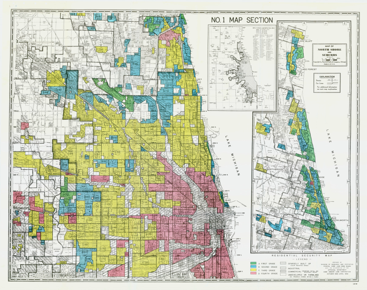
In light of the recent protest against police brutality and the continued work of the Black Lives Matter movement, it’s important for us as architects to take responsibility for the fact that design has historically been one of the most powerful tools to perpetuate systemic racism. Architecture is at the root of racial bias against people of color in America and around the world. Although informal discrimination and segregation has always existed in the United States, in 1934, the Federal Housing Administration (FHA) instituted the National Housing Act that began the discriminatory practice called redlining. 

Redlining is an unethical practice that places services (financial and otherwise) out of reach for residents of certain areas based on race or ethnicity. It can be seen in the systematic denial of mortgages, insurance, loans, and other financial services based on location (and that area’s default history) rather than an individual’s qualifications and creditworthiness.

This resulted in the dividing of neighborhoods along racial lines, leading banks to start lending to certain neighborhoods and not other neighborhoods based on race. The zoning laws and lending legislation at the time institutionally crippled predominantly African American neighborhoods, all the while lending to white neighborhoods, therefore enabling wealth accumulation.

A 1930s-era redlined map of Chicago; image via Chicago Magazine

The effects of redlining is evident in neighborhoods such as the one that former First Lady of the United States, Michelle Obama, South Side of Chicago, which was stripped from economic opportunities. Property values went down the drain, which led to higher unemployment rates, which is associated with a desperation for survival and higher crime rates. Not every student was as privileged to afford the opportunity to take two buses 12 blocks away to attend Whitney M. Young Magnet school located on the westside of Chicago like the former First Lady was.

Most of the other schools nearer to the neighborhood were under-resourced which led to high dropout rates. This led to high unemployment levels and higher crime rates which the government used to justify higher police presence in the neighborhoods. Unfortunately, in America this directly relates to the higher numbers of deaths of innocent young Black men and women by the hands of the police. Thirty-eight years after Michelle Obama’s high school days, not a lot has changed. According to data from the Chicago Police Department, police are 14 times more likely to use force against young Black men than their white counterparts. 

In a similar pattern, halfway across the world, apartheid architecture in South Africa segregated communities along racial lines. Apartheid was a system of institutionalized racial segregation that existed in South Africa between 1948 and 1994. It was a system the minority white folks used to effectively oppress, control, and rule over the majority native Black South Africans.

Officials examine Johannesburg ‘Native Townships’ plan. Apartheid Museum Photograph: Apartheid Museum; image via The Guardian

Like redlining and other government-sanctioned efforts to disenfranchise Black communities, the apartheid regime designed working camps known as “townships.” They used a system called the 40-40-40 rule where they built 40 square meter homes, located 40km away from economic centers. This forced Black people living in these communities to spend 40 percent of their income commuting to work, which rendered them incapable of developing their own homes. The communities were designed to be devoid of social and economic opportunities that crippled the Black communities’ economy. 

Although Apartheid ended over two decades ago, township residents still commute 40km to work in town, limiting these residents to the same impoverished conditions into which they were forced during Apartheid. The laws may have changed, but the systems remain. Until we change the way we design and build, we’ll not be able to extinguish the evils of systemic racism.

Wandile explores the science behind apartheid architecture whilst breaking down how it continues to disenfranchise Black townships and shantytown communities 26 years after apartheid was abolished.

Architecture is never neutral; it either heals or hurts. According to a study by the National Community Reinvestment Coalition, three out of four neighborhoods that were redlined on government maps 80 years ago continue to struggle economically. We as architects are not just the designers of glass skyscrapers and infinity pools, but are direct contributors to these injustices. As Winston Churchill best put it, “We shape our buildings; thereafter they shape us.” 

Ubuntu Architecture Summer Abroad Program has created a cross-cultural design-build experience for architecture students from around the world. This program is an intercollegiate educational experience in which students learn a community-centered approach to architecture. Students will design and build dignified and culturally-influenced homes for marginalized families in Durban, South Africa, who were affected by apartheid architecture.

The experience will aim to expose students to design problems stemming from systemic racism in a place beyond their own contexts. As apartheid architecture was used to segregate and oppress, community-centered design will focus on bringing people together and enabling equitable opportunities for all. At the end of the program, participants will be equipped with the tools necessary to implement change in their own communities.

Andrews University students working together to finalize the design of the Mtshali family home (2016). Photo Credit: Troy Homenchuk, Andrew Von Maur, Andrews University School of Architecture & Interior Design

As architects, it is important, and in fact we are trained, to take into consideration the entire environment into which we are designing. Examining existing architecture in the area, accessibility, the path of the sun, the approach to the space, and of course, climate and area become second nature to us very quickly. What we need to also make second nature in our designing and planning is examining the history of a place, the people of a place, and the culture of a place–for everyone. 

Ubuntu Architecture Summer Abroad Program does exactly that: It trains the next generation of architects to take a broader view of the impact of their work and consider it more than just creating beautiful functional spaces; it trains us to see, hear, think, and feel beyond the aesthetics and into the community in which it resides.

Join us as we use architecture to begin the process of healing communities. Apply here: https://ubuntuasa.org/

Program Location: Durban, South Africa

Program Duration: May 15 – 29, 2021 (not including travel dates)

Eligibility: Third year to graduate-level architecture (and related) students

The post The Architects of Systemic Racism appeared first on Journal.

Try Before You Buy: Walkable Plans Offer a New Way to Visualize Architecture

$
0
0

Architects: Showcase your next project through Architizer and sign up for our inspirational newsletter

Even with detailed floor plans and renderings, it’s difficult for architects and clients to clearly visualize and estimate the proportions of a space. This discrepancy can lead to delays in design finalization, mid-construction changes and costs or an inadequate final product. 

Ron Lyndon seeks to mitigate this issue and provide greater transparency during the design process with his new Walkable Plans venture. Located in Pittsburgh, Pennsylvania, Walkable Plans is a floor plan projection center that provides an immersive 1:1 scale layout of a residential or commercial space. 

Walkable Plans

According to NEXTpittsburgh, Lyndon based the company on an idea he saw on “Shark Tank Australia” called Lifesize Plans. He took the concept of projecting true-sized floor plans and applied it to Walkable Plans, which is the first of its kind in the United States. 

Using the latest technology, the floor plan projection facility displays life-sized architectural layouts onto the floor, allowing an architect or client to better experience and visualize a space. It gives builders, designers, architects and families the ability to confirm that a design is perfect before investing in construction. 

The Walkable Plans facility uses four projectors that are connected to create one massive image measuring 48 by 70 feet. All the company needs is a PDF of the drawings a few days in advance. To make the experience even more immersive, the facility uses real furniture and portable walls in order to provide better clarity. 

Walkable Plans

The Walkable Plans technology also has applications beyond residential and commercial building. It can cover landscapes, retail, manufacturing, office, medical and entertainment spaces. Additionally, it can be applied to more civic projects, such as public transportation and city planning spaces. 

As stated on NEXTpittsburgh, Lyndon views Walkable Plans to be the “missing step in the design process.” The benefits are clear. Its ability to display all types of spaces allows individuals to cautiously plan, which ultimately saves money and time on a project.

Architects: Showcase your next project through Architizer and sign up for our inspirational newsletter.

All images via Walkable Plans

The post Try Before You Buy: Walkable Plans Offer a New Way to Visualize Architecture appeared first on Journal.

The Architecture of Inequality: On Bong Joon-ho’s ‘Parasite’

$
0
0

Architects: Showcase your next project through Architizer and sign up for our inspirational newsletter

In Bong Joon-ho’s Academy Award winning film ‘Parasite,’ architecture isn’t silent, it speaks. Again and again, the built environment indicates where people fit into the social hierarchy — or if there is a place for them at all.

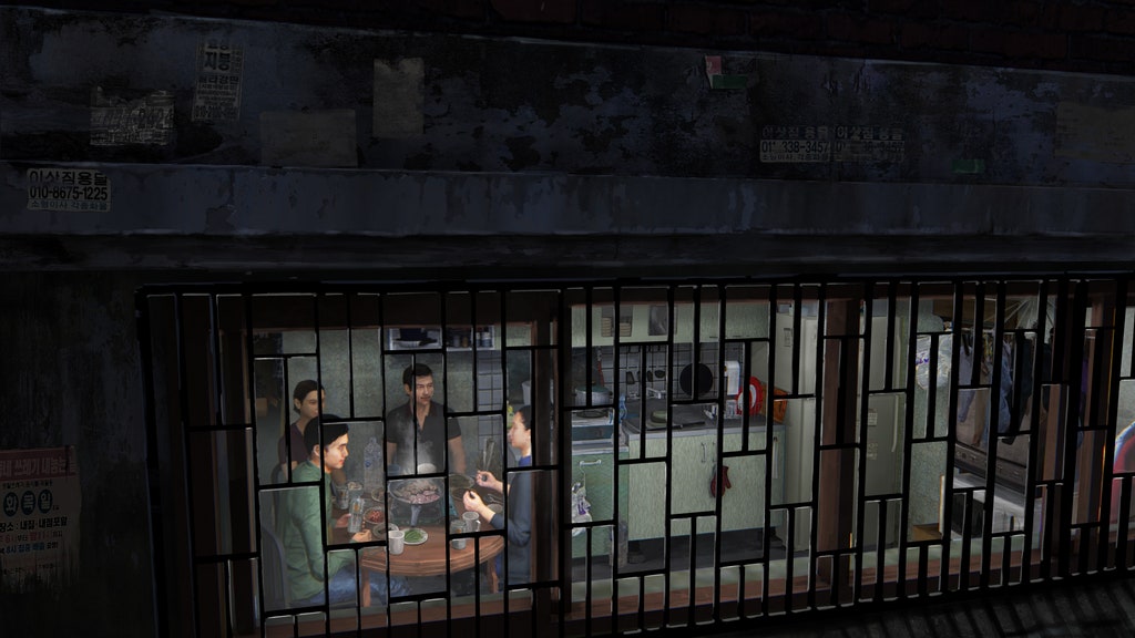
The film opens in the apartment of the Kim family, the movie’s protagonists. This is a semi-basement apartment, or banjiha, a common type of working-class residence in South Korea. “It really reflects the psyche of the Kim family,” explained Joon-ho in an interview with Architectural Digest. “You’re still half overground, so there’s this hope and this sense that you still have access to sunlight and you haven’t completely fallen to the basement yet. It’s this weird mixture of hope and this fear that you can fall even lower. I think that really corresponds to how the protagonists feel.”

An early rendering of the Kim family’s semi-basement apartment. Photo: ⓒ 2019 CJ ENM CORPORATION, BARUNSON E&A

From the first shot of the film, the viewer can see that this is an improvised living situation, a space where nothing ever feels settled. As the opening credits flash across the screen, the camera lingers over socks hanging from a light fixture that is being used as a makeshift drying rack.

In the next shot, we see the two youngest members of the Kim family, siblings Ki-jung and Ki-Woo, frantically scanning the apartment with their phones, searching for an unsecured wi-fi signal they can connect to. They eventually find service in the strange bathroom, in which the toilet is elevated on a tiled platform. Now, it seems, the bathroom will become a new communal space where the family will hang out and browse the Internet.

Park So-dam, left, and Choi Woo-shik play the two children of the Kim family. Photograph: Allstar/ Curzon/ Artificial Eye

The way the Kim family lives in their space, improvising as necessary, reflects the way they exist economically. Without stable jobs, the Kim family is forced to constantly hustle, make adjustments, and find new ways to make money. If they slow down, even for a second, it might prevent them from making ends meet.

The Kims’ stressful lifestyle is emblematic of the so-called “gig economy” that has emerged in recent years. In his now-classic 2009 book Capitalist Realism, the late theorist and blogger Mark Fisher argued that the proliferation of “gig” work in the 21st century has taken a serious psychological toll on workers worldwide.

The Kim family’s most recent “gig” is folding pizza boxes. Photograph: Allstar/ Curzon/ Artificial Eye

“To function effectively as a component of just–in-time production you must develop a capacity to respond to unforeseen events, you must learn to live in conditions of total instability, or ‘precarity’, as the ugly neologism has it,” Fisher explains. “Periods of work alternate with periods of unemployment. Typically, you find yourself employed in a series of short-term jobs, unable to plan for the future.”

This passage, like many others in the book, could have been written about the Kims.

In ‘Parasite,’ the crucial difference between the experience of the working-class and the upper-class is not opulence but stability. The only other living space that features prominently in the film is a gleaming modern estate enclosed by concrete walls. It belongs to the Park family, for whom the Kims’ college-aged son, Ki-Woo, goes to work as an English tutor. (With fabricated credentials, of course; like his other family members, Ki-Woo is adept at hustling, or doing what he needs to survive).

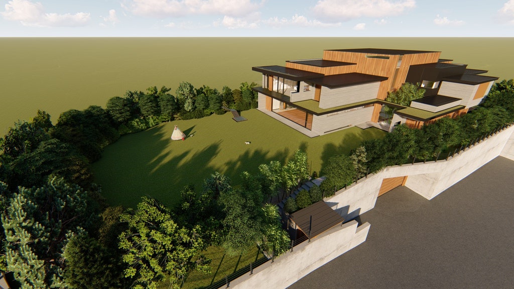
The residence of the wealthy Park family is said to have been built by a famous architect. This is an early rendering developed by production designer Lee Ha Jun. Photo: ⓒ 2019 CJ ENM CORPORATION, BARUNSON E&A

Much has been written about the Parks’ gorgeous house, which is said in the film to have been designed by a famous architect named Namgoong Heonja. The space is so convincing that many viewers of the film assumed it was a real house, an architectural marvel. However, it is actually a series of sets designed by Lee Ha Jun, the film’s production designer.

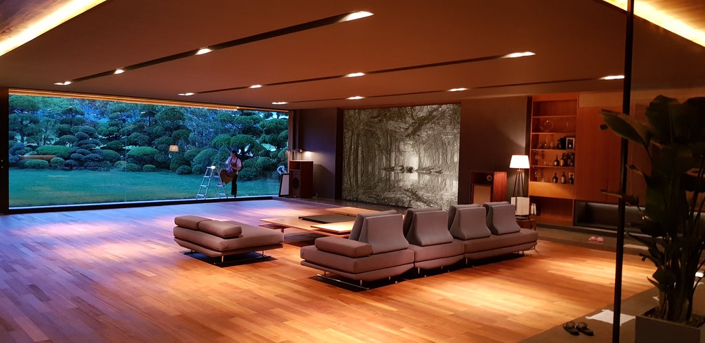
“Bong left it all to me in terms of its architectural style,” Lee explained in an interview with Dezeen. “He showed me a simple floor plan which he sketched whilst writing the script.” Instead of sticking to one architectural style, Lee took inspiration from multiple homes that had a minimalist design. The key element he wanted to capture was “great space arrangement.”

The sets were designed to convey “great space arrangement” according to proudction designer Lee Ha Jun. Photo: ⓒ 2019 CJ ENM CORPORATION, BARUNSON E&A

The fact that the Parks’ house was supposedly designed by a famous architect is a significant detail. As soon as Ki-Woo steps into the house, he is leaving the chaotic and improvisatory space of working-class Seoul and entering planned, architectural space. Here, light fixtures do not double as drying racks and bathrooms aren’t used for surfing the web. In contrast, every detail of the Park’s house speaks to the logic of its overall design.

This is a living space that has carved out its niche in the social order. It asserts its right to exist.

In ‘Parasite,’ secrets lurk even in spaces that appear meticulously logical in their design. Photo: ⓒ 2019 CJ ENM CORPORATION, BARUNSON E&A

However, the seeming stability of the Park household ultimately proves to be an illusion. The shocking ending of the film illustrates that dark secrets lurk in every house, even ones with open floor plans. It also shows that class tensions can only be tamped down for so long. If inequality persists, and workers continue to be unable to take control of their lives, something is eventually going to crack.

Architects: Showcase your next project through Architizer and sign up for our inspirational newsletter

The post The Architecture of Inequality: On Bong Joon-ho’s ‘Parasite’ appeared first on Journal.

These Haunting Photographs Explore the Ruins of Communist Architecture

$
0
0

When the walls that divided Communist Eastern Europe from the rest of the world came crashing down, something was lost forever — not just a political formation, but a worldview, a way of seeing.

In the USSR, art and architecture were made to express the empire’s perception of itself as the harbinger of global communist revolution. The nation’s sense of destiny was reflected in the grandiose style of Stalinist Architecture and in various art movements that sought to celebrate the nobility of the working class. Artists who tried to represent different values, like the poet Joseph Brodsky, could find themselves imprisoned. Similar norms prevailed in other communist countries within the Soviet sphere of influence.

Art in the Soviet Union was meant to glorify the state; photos by Eric Lusito.

The perspective that art and design should glorify the state is rightly recognized today as an affront to individualism. However, the architecture, art and design of this era carried an undeniable utopian energy, reflecting an empire that viewed itself as historically unique.

This came through in a 2016 photography exhibition in London called “Dead Space and Ruins.” This show combined the work of three photographers and one filmmaker who document grand Soviet buildings that have fallen into ruin.

Eric Lusito’s photographs focus on abandoned military sites.

Italian photographer Eric Lusito, whose work focused on the rubble of abandoned Army bases, describes his work as documenting the remains of an empire that once saw itself as “all powerful.”

“From East Germany to Mongolia, from Poland to Kazakhstan, these now decaying military buildings and structures — sites hidden for so long which formed the very heart of the Soviet system, with their symbols of the all-powerful Soviet Empire once seemingly inviolable — illuminate and inform our understanding of the power and influence the military held over the people of the Soviet bloc countries, and in turn they reflect the decay of the empire itself,” Lusito said of his photographs.

Danila Tkachenko’s makes use of negative space in his photographs of “restricted areas.”

The Russian photographer Danila Tkachenko focused on “restricted areas” that cannot be found on a map. Here he found brutalist ruins, concrete buildings and sculptures that once served as symbols of technological progress. Tkachenko makes ample use of negative space to underscore the placelessness of these structures, which have been cut off from history.

Vahram Agasian’s “Ghost City” depicts an abandoned housing project

The third series of photographs, by Vahram Agasian, focused on an abandoned construction site that is now engulfed by water. This massive housing project was meant to rehouse victims of an earthquake in 1988 but was never completed. Agasian calls his series “Ghost City.”

Agasian urges viewers to see his photographs as a “silent reminder of economic meltdown, natural disaster and industrial catastrophe.”

The exhibition also included a film by the Russian filmmaker Anton Ginzburg about Constructivist architecture. This was a modernist movement that flourished in the early revolutionary period of the 20s and 30s. It was supplanted in later decades by more formally conservative styles like Stalinist architecture and Socialist Realist art.

“Dead Space and Ruins” ran at the Calvert 22 Foundation until August 7, 2016.

EDIT: An earlier version of this piece implied that all of the buildings featured were located in former Soviet nations. However, some buildings, including the Buzludzha Monument in Bulgaria, which is featured in the cover image, were located in communist countries in the Eastern bloc.

All images via dezeen

The post These Haunting Photographs Explore the Ruins of Communist Architecture appeared first on Journal.


5 Steps to Create Captivating Ink Wash Architectural Paintings

$
0
0

Have you got awesome architectural drawings to share? If so, we want to hear from you: Register for the One Drawing Challenge for a chance to win $2,500!

Great design is represented through diverse mediums. From drawing and sketching to more uncommon methods like digital quilling, choosing the right medium helps define a building’s character. Whether visualizing ideas and concepts in the early stages or creating accurate technical details for construction, architects should always consider how different mediums tell unique stories. This is especially true for ink wash paintings, a process that typically utilizes black India ink to create grey scale works of art.

Ink wash painting is a process that’s similar to using watercolors. With roots dating back to China’s Tang dynasty, the brush-based technique uses tonality and shading created through varied ink density. The idea is to capture the “spirit” or idea of a space or building over its direct representation. Part of the beauty in ink wash paintings is that once a stroke is made, it cannot be changed or erased. Taking inspiration from the ink washes of Pritzker Prize winning RCR Arquitectes, the following guide breaks down the steps and ideas behind this elegant medium.

Les Cols Pavilions, Eugeni Pons, Courtesy RCR Arquitectes

1. Start with the basics

For those trying ink washing for the first time, it’s important to have an understanding of their basic components. Ink washes work with color gradation, and you should practice mixing different amounts of water to find the right shade, varying the ink load and pressure with each brushstroke. The heart of ink wash painting lies in an understanding of your own brush movement and a controlled ink flow.

Remember that different brushes have different qualities, and depending on what stage of a project you’re on, the correct tool can help you capture the right atmosphere or spirit in your work. In RCR’s work, ink washes are used to explore conceptual ideas and set the larger idea for a project’s direction. They are often part of a series, a record of how they think through a particular problem.

La Lira Theatre, Courtesy RCR Arquitectes

2. Try a one color wash

One of the most common methods of Ink Wash is using a single color. By spreading a light coating of water on the paper, you can start with the first layer that will give your work a strong base. Trying experimenting with different line techniques, and as you gain confidence and control, a range of shades can be created with single strokes.

Water on the paper will mix with the ink from your brush, and you can spread it around on the page or tip it from the side. One color washes are a great place to start as you learn control and how to work with the brush, paper, water and ink together. As you learn, you can progress to multiple colors and gradients.

Soulages Museum, Courtesy RCR Arquitectes

3. Develop lines and techniques

Line work is directly tied to levels of pressure and the brush. Working with India ink will allow you to create thicker or thinner lines, as well as darker or lighter variants. As you press down, this variable pressure is known as “weight.” Experiment with rectilinear lines and shapes, as well as more complex curves or sweeping strokes.

You can work with various cross-hatching techniques, or allow the ink to mix and move around. This is called bleeds, and it creates a range of effects based on the amount of water and paper type. There are many techniques that you can learn to create visual hierarchy and bring the work to life.

RCR Arquitectes

Crematorium Hofheide, Courtesy RCR Arquitectes

4. Sketch a base

Don’t be afraid to start with a sketch, especially as you first start out. Using a light pencil outline can help guide your brushwork and give structure to your work. It can also create its own kind of visual affect when combined with the ink wash lines and gradients. As you color the image, you can use slightly darker tones to add depth and dimension.

Water can help you smooth over your transitions, and allowing time for drying between your steps will help keep the structure of a base sketch before repeating the wash process. Beyond its possibilities as an underlay or structure for the wash, you can utilize sketching with different tools, even combining mediums to express the idea or concept you wish to convey.

RCR Arquitectes

Bell Iloc Winery, Courtesy Eugeni Pons

5. Study precedents

Once you begin to understand color gradation, ink load, pressure and brushstrokes, consider looking to other examples of designers who work with ink washes. While you can study existing precedents at any stage of the process, it helps to have some practice and familiarity with how washes work. For some designers, ink washes are not about conceptual ideation, but rather, portraying an existing building or space to try and understand it through the wash.

Though the ink wash paintings of RCR Arquitectes may seem simple or obscure at first glance, by understanding how the firm’s art influences built designs, you discover how our process informs the finished product. Most importantly, try different mediums to find what you enjoy most and what speaks to your ideas and designs.

Have you got awesome architectural drawings to share? If so, we want to hear from you: Register for the One Drawing Challenge for a chance to win $2,500!

The post 5 Steps to Create Captivating Ink Wash Architectural Paintings appeared first on Journal.

8 Stunning Lobbies Featuring Perforated Metal Imagery

$
0
0

For commercial organizations, first impressions mean everything. That’s why companies hire the world’s best designers to help craft their lobbies, tasking them with creating an impactful entrance space to present their brand in the best possible light. These architects are faced with a challenge — their clients often desire striking materials and finishes, but balk at the cost associated with bespoke systems. Is it possible to achieve a high impact design without spending a fortune?

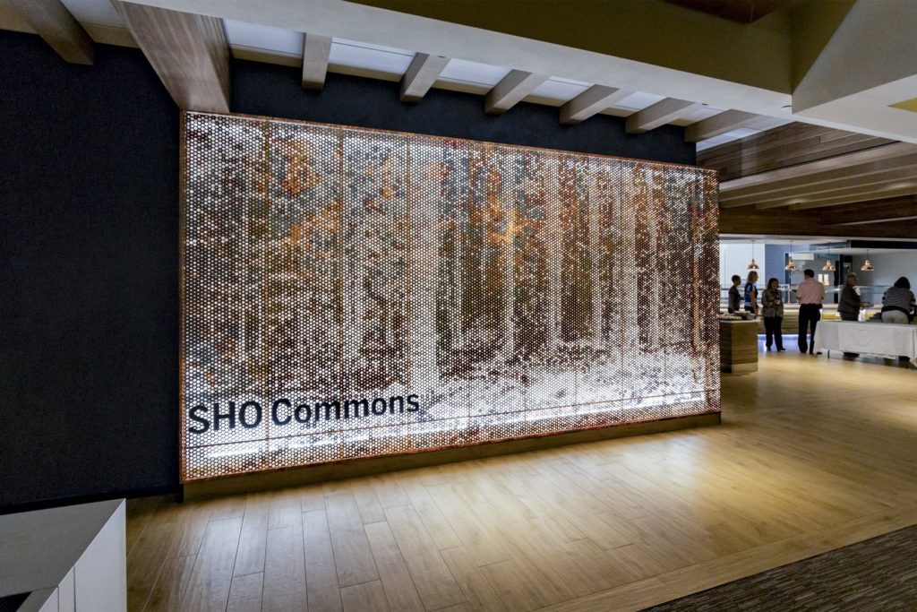
Answering the call, renowned architectural metal company Zahner has masterminded the innovative ImageWall system, which enables architects to specify custom perforated metal panels at a fraction of the typical cost. After architects specify their desired image, material and finish using ImageWall’s unique interactive design tool, Zahner’s patented process recreates the image as a series of perforations across the surface of the metal. Panels are then shipped with all the hardware and substructure, ready for easy installation.

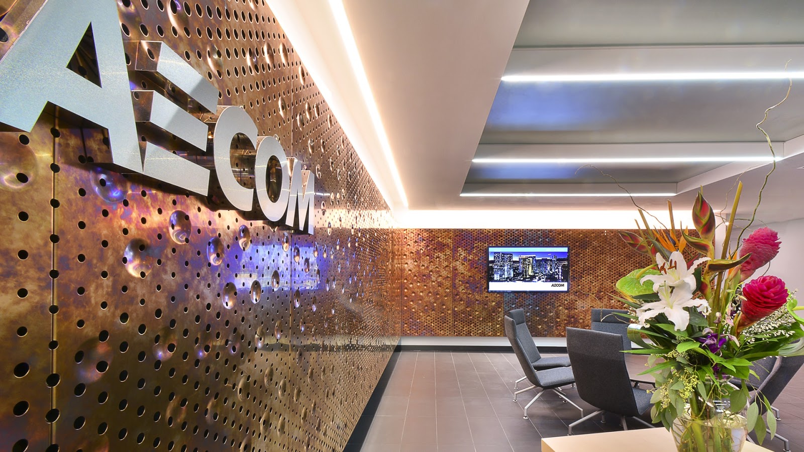
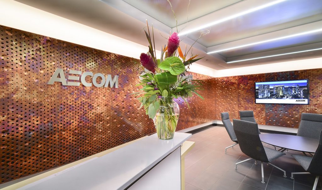
AECOM’s Cleveland Office Interior features Zahner ImageWall with a distinctive Zahner Dirty Penny™ patinated copper.

ImageWall marks a new milestone in an exciting new era of metal construction — perforated metal has only been utilized in this way for around 10 years, and is quickly emerging as a go-to material for architects in search of innovative systems for both façades and interior walls. With a 125-year history of delivering world-class materials, finishes and engineering solutions, Zahner has established itself as the industry leader in this new material category.

ImageWall can be used for projects of all scales, from 8 foot partitions to 100 foot façades, and with a variety of materials, including exclusive Zahner Surfaces such as Roano patinated zinc, Angel Hair® stainless steel, Solanum preweathered steel, Dirty Penny patinated copper and anodized or painted aluminum.

The system is perfect for commercial lobbies, allowing designers to add incredible visual elements that can provide a company with a striking first impression of their office. In order to truly understand the incredible impact ImageWall can have, we’ve put together a collection of recent projects that utilize this innovative product.

ImageWall

Photo © A. Zahner Company

Lineage Logistics by Gensler, Irvine, CA, United States

Using ImageWall, Gensler designed a feature wall for Lineage Logistics. This gleaming lobby wall is made of painted aluminum, with depth allowance for back lighting. A clean illustration of the world is carved out on the surface of the wall, signifying the international reach of the company.

ImageWall

Photo via ImageWall

Sentry Insurance by Potter Lawson, Stevens Point, WI, United States

This feature wall was designed by Potter Lawson for Sentry Insurance, and features an abstract design that lends the space a stylish, contemporary feel. The wall and partition screens are made of dirty penny copper, a finish with a sophisticated patina and iridescent hues ranging from purple to deep brown.

ImageWall

Photo via ImageWall

6060 NCX Lobby by Merriman Anderson Architects, Dallas, TX, United States

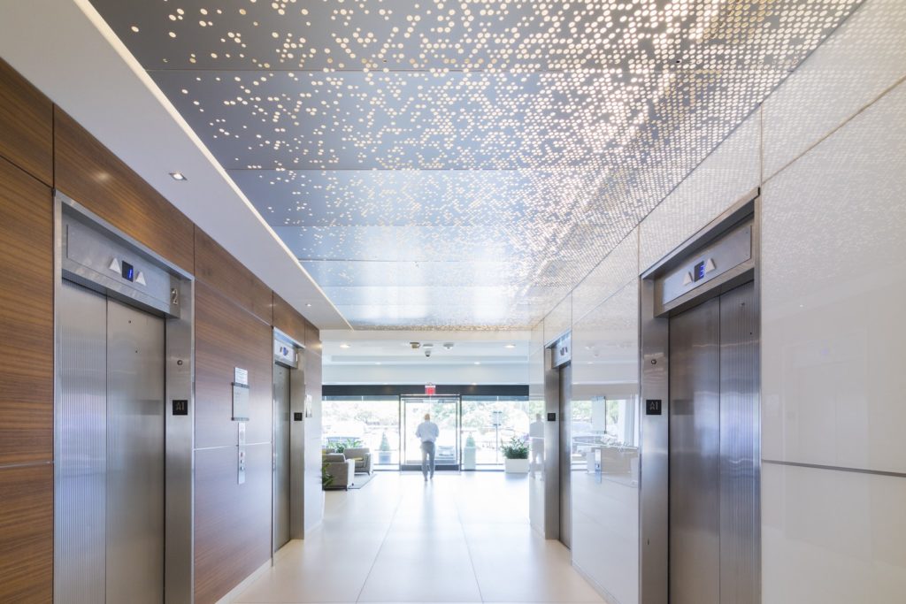
For the lobby of this mixed-use development in Dallas, Texas, Merriman Anderson Architects created an abstract elevator lobby ceiling in clear anodized aluminum. The variation of density in the perforations allows for different levels of light to be permitted across the surface, giving architects a high level of control over the atmosphere of each space.

ImageWall

Photo via ImageWall

Twitter Headquarters by Bohlin Cywinski Jackson, San Francisco, CA, United States

For Twitter’s huge headquarters in San Francisco, Bohlin Cywinksi Jackson utilized Zahner’s ImageWall to install vivid, perforated screens and wall panels. The architects combined a painted aluminum finish with a range of colored back lights, striking a bold contrast in keeping with the tech giant’s modern identity.

ImageWall

Photo © Of AECOM Buildings and Places

AECOM Cleveland Office Interior by AECOM, Cleveland, OH, United States

AECOM Buildings and Places division used ImageWall to develop striking interior walls for the foyer of their new office in Cleveland, Ohio. For the surface, AECOM opted for the custom patina of the “Dirty Penny” copper alloy finish. Perforations and indentations across each panel adds an additional layer of complexity to the surface.

Southern Methodist University Collins Executive Center by Gensler, Dallas, TX, United States

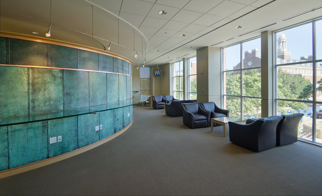
For these interior panels, Zahner provided its exclusive Star Blue copper, a custom patina on copper. Zahner developed the pre-weathered copper panels in its fabrication and patination facility in Kansas City, and delivered the panels to the installers in Dallas.

ImageWall

Photo © A. Zahner Company

New World Symphony by Frank Gehry Partners, Miami, FL, United States

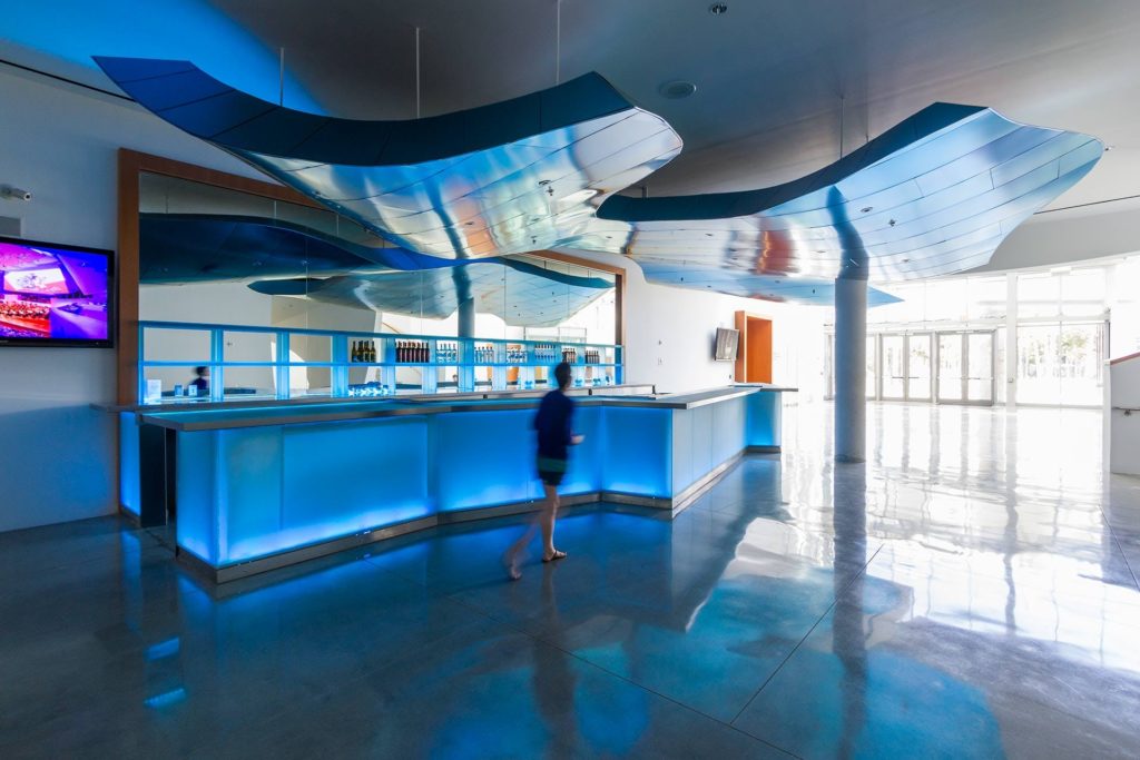
This iridescent canopy was designed by Frank Gehry Partners for a bar within the New World Symphony Orchestra in Miami, Florida. The canopy is made of titanium, with a striking blue-green tonality. ZEPPS, Zahner’s patented prefab building system, was used to construct the piece.

Photo © A. Zahner Company

Holmes Murphy Office by BRR Architecture, Kansas City, MO

ImageWall provided a sleek, semi-transparent backdrop for the lobby for Holmes Murphy, striking a neat contrast with the office’s bright, post-industrial aesthetic. A series of varying perforation sizes were utilized to form the company’s distinctive logo behind the reception desk. The screen was crafted using the stylish Angel Hair Stainless Steel finish, with a painted aluminum backing.

To view more innovative uses of Zahner’s ImageWall technology and see how to apply the system to your next project, head this way. 

The post 8 Stunning Lobbies Featuring Perforated Metal Imagery appeared first on Journal.

The Power of Tradition: Russia Unveils a Massive Cathedral Dedicated to the Military

$
0
0

Architects: Showcase your next project through Architizer and sign up for our inspirational newsletter.

“They don’t make them like they used to,” people are known to say when visiting historic cathedrals. They should hasten to add “except in Russia.”

The Russian Revival style of architecture, which combines historical details with modern building materials and techniques, remains popular in Russia. In fact, one of the largest and most ambitious buildings ever created in this style was just opened last month.

The Main Cathedral of the Russian Armed Forces is dedicated to the 75th anniversary of the Red Army’s Victory in the Great Patriotic War, which is what Russians call World War II. In addition to being a place of worship for practitioners of the Russian Orthodox faith, the cathedral is a monument to Russian military might, both in World War II and in all other historical conflicts where Russian armies prevailed.

It is located in a complex called Patriot Park in the Odintsovsky District, about 34 miles west of Moscow. According to the cathedral’s official website, “the church was designed in a monumental Russian style, organically incorporating modern architectural approaches and innovations unique to the Orthodox Church creations.”

Aerial view of the cathedral under construction, April 2020. The six golden domes represent different branches of the armed forces. Photo: Denis Voronin/Moscow News Agency/Handout via Reuters

At 95 meters in height and 79 meters in length, the Military Cathedral is one of the largest Orthodox churches in Russia. The Saviour-Not-Made-by-Hands icon that looks down from the central dome is the largest image of Christ’s face ever created in mosaic.

Clearly, the church was built with the intention that it would stand alongside St. Basil’s and other important Orthodox cathedrals as a significant Russian landmark. When the project was announced, in 2018, Russian President Vladimir Putin said it would be “one more symbol of the indestructibility of our national traditions, of our loyalty to the memory of our forefathers and their achievements,” according to a report in the Times of London.

The image of the Saviour-Not-Made-by-Hands that looks down from the central dome is the largest image of Christ’s face ever created in mosaic. Photo courtesy of the Moscow Times

The modern elements of the cathedral include a façade that is totally clad in metal and enormous glazed arches that allow natural light to pour in from above. But these items are integrated into an overall aesthetic that is uncompromisingly traditional.

One thing that separates this cathedral from those of past centuries was the length of its construction. Despite the intricacy of its detailing, the cathedral was built in just 18 months. Funding for the project came from both private donations and public funds from the city of Moscow and the surrounding region of the Moscow Oblast. Overall, it is said to have cost 82 million USD.

The exterior of the building is clad in metal, and glazed arches allow sunlight to pour in from above. Image via Wikipedia.

The dimensions of the church are symbolic. The diameter of the drum of the main dome is 19.45 meters, symbolizing the final year of World War II, 1945. The belfry is 75 meters heigh, representing the 75 years that have passed between 1945 and 2020, the year of the church’s consecration. And finally, the height of the small dome is 14.18 meters, reflecting the 1,418 days and nights that the conflict lasted. The steps to the cathedral are rumored to be clad in metal sourced from melted-down Nazi tanks.

The cathedral’s combination of religious and patriotic sentiment is itself a throwback, as the great Catholic and Orthodox cathedrals of past centuries were also built to glorify the wealth and power of the state. The walls of the church are decorated with stained glass mosaics that illustrate scenes from both scripture and Russian history, including those of the Red Army’s victory over the Nazis.

Interior mosaics feature both scenes from scripture and Russian military history. Photo courtesy of patriarchia.ru/

One wing of the cathedral is dedicated to a museum-style exhibition that traces the history of the Russian state and its armed forces. In April 2020, two months before its consecration, the cathedral made international headlines when photos leaked of mosaics that appeared to celebrate Russia’s 2014 annexation of Crimea. These murals featured an image of Putin, bringing the cathedral’s celebration of Russian history right up to the present.

The Russian government at first defended these murals, which sparked outrage around the world, but later decided to remove them. According to a spokesperson from the Kremlin, it was Putin himself who recommended the removal. “Someday our thankful descendants will appreciate our merits, but it’s too early to do so now,” the Russian president is said to have remarked.

A mosaic featuring Putin that celebrated the Russian annexation of Crimea was removed before the cathedral opened. Photo courtesy of the Moscow Times

Whether or not Putin’s likeness is displayed inside the cathedral, the church embodies his vision of the Russian nation. Some may find it ironic to celebrate the Red Army in a church, given that religion was repressed during the Soviet era.

But for Putin and other leaders who position themselves as the guardians of national traditions, the accuracy of a given historical account is less important than its political utility. From the standpoint of bolstering Russian national pride, synthesizing the grand legacy of Orthodox church architecture with the military accomplishments of the Soviet Union makes perfect sense.

Architects: Showcase your next project through Architizer and sign up for our inspirational newsletter.

The post The Power of Tradition: Russia Unveils a Massive Cathedral Dedicated to the Military appeared first on Journal.

Architectural Details: How 1.8m-Width House Makes the Most of Its Minuscule Site

$
0
0

Architects: Showcase your next project through Architizer and sign up for our inspirational newsletter.

The combination of two competing ideas — purity and hybridity — found in traditional Japanese houses is still present in Japan’s contemporary architecture where the idea of “software” underlies physical structures. In the case of the A+Award-winning 1.8m-Width House in Tokyo, the interior layout is largely a hybrid space of shifting floor plates and multi-use areas.

Despite its extremely limited lot size, YUUA Architects and Associates‘ project epitomizes the vitality of the inherently Japanese concern with staging and social aspects of architecture.

Commissioned by a “couple with two cats,” the 1.8-Width House is an example of an ultra-compact house, kyo-sho-jutaku in Japanese, built on tiny pockets of land and suited to young people looking to build their homes in over-populated areas like Tokyo, where skyrocketing property prices have forced a generation of designers to rethink the concept of urban living.

Principal and cofounder Madoka Aihara relates that she “learned how to make houses as expansive and open as possible while preserving privacy by designing small houses.”

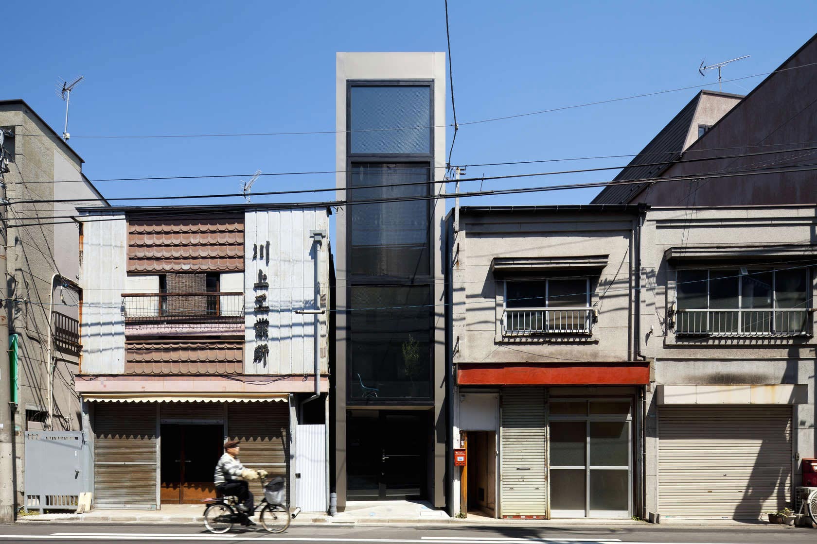
The building’s entire street-facing façade overlooking a quiet residential neighborhood is fully glazed: the windows allows natural light to enter during the day while concealing the occupants from outside views, preserving the core idea of intimacy.

At night, the house reveals its contents, but only exposes areas that are used periodically; the living and dining spaces are cleverly situated deeper in the volume of the building. “The layer of the floors shuts out the views looking up from the street.”

Its tranquil glazed exterior evokes a kind of large-scale vitrine that houses the floors within, like slices in a vertical exploded view through the building’s height. Every inch of the house is focused on the two narrow façades, ultimately overriding the verticality of the space through the visual and organizational strength of its lateral axis.

In the interest of “expressing the client’s personality into spaces” — YUUA’s primary objective — Aihara acknowledged their request for maximizing the space. “They required that the floors were separated into several levels and it worked as stages of multifold life activities, so that the house became a fun place.”

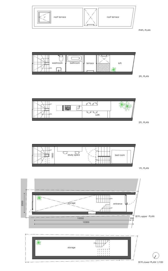
A recessed entrance leads to a partly submerged storage area and an elevated ground. The smaller height difference between this space and the first floor reminds of the traditional Japanese entryway areas known as genkan, small areas at street level where people remove their shoes and step up onto a raised floor. This slight height difference dominates the rest of the building and offers glimpses of the windows from different levels of the house.

The first floor serves as a study space connected to a small platform with a bed. The living room merges with the kitchen and dining space on the second floor as well as a contemplative area near the window.

Starting with the first floor, the role of vertical communication is taken over by a rear spiral staircase, which connects the study, living area, and the loft space, including a bathroom, washroom, and a small terrace nestled in the middle of the building’s length. Two skylights serve to illuminate parts of the house furthest from the windows, while the orientation of the fenestrated façades and the utilization of an air circulator facilitate natural ventilation.

There are almost no closed spaces within the house. Instead, open shelves around the stairs and in the kitchen accentuate the fluidity of volumes and impart a distinctive warmth to the minimalist interior.

The choice of dark walls may seem counterintuitive — especially considering the predominant whitewashed surfaces and airy spaces of the contemporary Japanese architectural milieu — but Aihara notes that “the edges of space are blurred by the dark color, like the space beyond the earth’s atmosphere … I think the dark color obscures the feeling of narrowness.” Meanwhile, the spatial organization, delicate volumetric nuances, and geometrical purity echoes the design principles behind iconic Japanese housing projects such as Sou Fujimoto Architects’ House NA.

Using a steel-frame construction method to minimize columns and beams and maximize the interior space, the architects were able to form small volumes that feel both interconnected and functionally distinct. Through the thoughtful aggregation of spaces, the house continues the paradigm of flexibility found in both traditional and contemporary Japanese houses where architecture concerns itself more with relationships and less with form.

Asked about YUUA’s mission statement, Aihara responded, “We would like to make spaces suitable for an environment and make the people feel comfortable in it and cherish it” — an admirable goal that they have clearly achieved with the 1.8m-Width House.

Architects: Showcase your next project through Architizer and sign up for our inspirational newsletter.

The post Architectural Details: How 1.8m-Width House Makes the Most of Its Minuscule Site appeared first on Journal.

Pascale Sablan on Architecture’s Role in Fueling Social Change

$
0
0

Architects: Showcase your next project through Architizer and sign up for our inspirational newsletter.

If there’s any silver lining to the chaotic, tragic mess of 2020, it’s that deeply entrenched issues that are routinely ignored and downplayed have been brought to the fore. The two most clear examples of this are the COVID-19 pandemic, which has exposed the frailties of the American healthcare system, and the senseless murder to George Floyd, highlighting the fact that racial injustice has and continues to brutalize black people. The gravity of both of these occurrences has been exacerbated by poor leadership, complacency and most of all systemic racism, which is ingrained in every facet of American society. 

The events following George Floyd’s death have embroiled America in a state of social unrest, with countless ongoing protests calling for greater accountability and major systemic changes. Everyone, from individuals to entire industries, have been placed under a microscope to see how they’ve perpetuated and benefited from the oppression of others. 

While it’s easy to identify the police as a major agent of systemic racism, it’s much harder to do so for entities that act on a much more subtle level. This is dangerous. When it comes to the architectural profession, it’s difficult to immediately recognize its place within today’s social climate. However, it is not exempt and, in fact, its role in fueling racial injustice is quite large. To better understand the role architecture plays in framing American society, and the ways in which the industry can fuel the advancement of people of color, we spoke with architect and mentor Pascale Sablan.

Pascale Sablan

Pascale Sablan, image via AIA

Pascale Sablan is only the 315th living black, female architect to receive licensure in the United States. She is a senior associate at New York-based firm, S9Architecture. With a career spanning more than a decade, Sablan’s work includes a number of commercial, cultural and residential projects across the U.S., Asia and the Middle East. Pascale Sablan’s accolades include the AIA New York/Center for Architecture Emerging Professional Award in 2014, National Organization of Minority Architects (NOMA) member of the year in 2015, and the 2018 AIA Young Architects Award. 

On top of this, Pascale Sablan is also the founder and executive director of an organization called Beyond the Built Environment, which aims to address inequality by creating platforms and greater visibility for women and diverse designers. Pascale Sablan’s work and achievements go on, and they’re incredibly pertinent to the current state of the world. Read below, in her words, the way we can design a better future.

Nathaniel Bahadursingh: How do you think architecture is situated within issues of social injustice?

Pascale Sablan: Our role as architects is to listen, to hear, and to feel the cries and what is being demanded by the communities for these injustices, and serve as a resource for not just wealthy clients, but for the greater public. Our charge is making sure the world is more equitable and just. So really, our approach is not to assume that we are leaders here, because for us to be leaders would mean that we’d be highly educated and understand the process and the dynamics of a suppressive infrastructure well. These are expertise we do not have.

Therefore, this is a moment for us as architects and designers to pause our thoughts and listen to what is being said, do research in terms of the injustice, work collaboratively with the community to get those answers, and find a solution together.

Pascale Sablan

SAY IT LOUD – New York, View of Exhibition, Curator Pascale Sablan, Designer Manuel Miranda; image © Cameron Blaylock

In your opinion, what are some immediate actions that firms and educational institutions can take to initiate change in this critical moment?

First, I think putting out statements is important. It’s critical that all designers and architects participate in this conversation and make actionable items in these statements. Remove the pressure that the statement must solve everything in one statement. It should be two, three, four, five statements. It’s an ongoing conversation on a very complex issue that we are all trying to solve, and that’s going to take time; it’s going to take dialogue. So, I think putting out actionable statements is important, and I think putting actual dates and metrics of success for measurement and accountability is equally important.

As the founder and executive director of Beyond the Built Environment, I’ve put out my statement for dismantling injustice that basically launches three major initiatives. The first is called SAY IT WITH – MEdia. The idea and root of this initiative is to have publications take a commitment to tracking and increasing the content of diverse designers in their publication by 5% annually until 15% at a minimum is reached, whether that be print, digital, or broadcast. This is about removing the entire burden and onus of us to elevate our identities and distribute this commitment with media outlets. This pledge by publications works in tandem with elevating the stories of under-represented groups, researching the history of women and diverse designers, and tracking, maintaining and publishing our progress of increasing women and BIPOC representation of those featured in their publication.

The second initiative is the SAY IT LOUD – Now Exhibition. SAY IT LOUD is part of a traveling activation exhibition series that elevates local diverse designers, where we’ve produced and curated 15 exhibitions that have successfully elevated the contributions of 250 great diverse designers. The goal of this initiative is to double our library to the number of 500 profiles of diverse designers, not just in the US, but all over the world. We have a call for submissions and September 1st is the deadline. We are seeking diverse (Black, Indigenous, People of Color and women of any ethnicity) designers (architects, interiors, landscape, planners, environmental, engineers, students, and artists) that have an impact on our built environment to submit their work. The biggest challenge is convincing diverse designers that they are worthy of praise and elevation.

The third initiative is Data to Define Policy. As a designer and an architect, I’m a huge advocate that throughout the design process, we need to engage the community and ask them the questions that cultivate an understanding of what they need. The same is true with the advocacy process. As leaders, board members and people of power work to create policy that will help solve some of these issues, the first thing we must do is ground the work. To make our efforts relevant and effective, we must communicate and have conversations with the oppressed communities that we are fighting for in order to understand their unique stories and needs.

Therefore, after we’ve reached our goal of 500 new profiles and having a database and network of 500 diverse designers, we’ll pair up with Remesh, a live communications software that will allow us to have discussions about injustice, where they’re receiving it, and how they’re dealing with it. That will allow us to identify institutions and key characters that are pushing those oppressive agendas and find ways of dismantling them.

In a time that feels clouded with performative gestures, how can the architecture industry ensure sustained, meaningful change?

I want to echo the previous point that we must not just put a statement in camaraderie and solidarity, but to actually put action items. It’s not enough to show up to a funeral and your condolences; it’s to bring the lasagna too. How are you contributing to dismantling the system that brings pain, injustice and oppression? How are you going to leverage your position, work and power to fight to eradicate racism from our profession, our built environment and in society as a whole? Then it’s not a gesture; it’s a plan of action.

When it comes to the advancement of Black people in architecture, what does individual advocacy look like? What responsibility lies on the individual architect?

Well, many architects tend to look towards their employer or their firm leaders or even organization leaders to give us direction. We are frozen while we wait for those in charge to define how to change our industry, to make meaningful changes, how to be proactive, and how to be effective in the work. Unfortunately, the reality is that not all firms will take any positions on the matter that is gripping the heart of our society. It’s incredibly important for us as individuals to feel empowered to make a difference, to make a change, and to work towards justice with or without our firms.

Through volunteering with organizations such as NOMA, the National Organization of Minority Architects, or other similar organizations that have always been advocating for justice in both the built environment and in the profession, we can find the leadership we are seeking from our firm and industry leaders, and push for immediate action. 

However, I would also like to offer that advocacy work can and should start on your block, in your neighborhood, in your community. See what injustices are impacting your town, and take that as a beginning standpoint. Once you’ve identified the community’s specific oppressions, whether that be architectural or other, you should reach out to the community leaders and get more information, understand the politics of the issue, understand the institutions, and the characters that perpetuate the injustice. Together with that deeper level of understanding, ask how you can get involved. Let’s make the fight for justice personal; bring it home to your family, your neighbor, your block and your community, and make them better and more just.

Pascale Sablan

SAY IT LOUD – United Nations Worldwide, United Nations Information Centre New Delhi, Curator Pascale Sablan; image © United Nations Information Center

What do you think the barriers are to finding greater representation in architecture and design?

The answer to this question led me to my first dismantling injustice initiative, SAY IT WITH – MEdia, which is really to stop trying to put the onus on us to elevate ourselves, but also having publications and awards juries to seek out our information as well and to elevate us. To cease the practice of only elevating one designer of color or one woman design and make them the end-all-be-all to showing diversity in the profession. The publications must dismantle that barrier and really work to elevate the plethora of us that exist. I think about the young students that we mentor who go home and Google “great architects”, a search that yields 50 faces and names. One is a woman, nine are people of color, and zero are African-American.

The list of 50 ranges from contemporary all the way down to when architects were Ninja turtles, like Michelangelo and Rafael. I visited Google’s headquarters and spoke with their team, and asked them why was this the outcome of the search. Their statement was “Pascale, there’s not enough content on the web that actually specifically calls you all as great.” Understanding that, I launched the Great Diverse Designers Library, where we are identifying and profiling these designers as great.

We showcase their work, their bio and headshots, their journeys and their proudest achievements. It’s a way to avoid these superficial articles / lists that just gives us 2 or 10 or 15 or random numbers of people to be aware of without showing their impact to the built environment. This library, which is composed of all the information we gather from our various SAY IT LOUD Exhibition, is now serving as a business development directory for people to be able to find and identify local talents in their region. Being able to hire them to do work serves as a way of creating more content that call us great!

Pascale Sablan

SAY IT LOUD – United Nations Worldwide, United Nations Information Center Bujumbura, Curator Pascale Sablan; image © United Nations Information Center

How would the built environment look different if more black voices were in power in architecture and design industries?

I don’t want to make the assumption that just because one is Black or Latino or Asian that they’re only going to work in their own communities, because historically that hasn’t been the case. But, the idea is by creating a more just and equitable profession in the built environment, you will then be creating diversity and inclusion. J.E. = D.I. The way that the built environment would look different when we eradicate racism and oppression from the world begins with the removal of poorly appointed architecture, together with the creation of reformative spaces that serve as a scaffolding of support for the community’s hopes and aspirations for the future. There isn’t a prescribed aesthetic or form of this Just world; it will be formalized once the profession accepts the task of envisioning and constructing it. 

For instance, when USGBC was creating their LEED certification process, they studied the issues and developed criteria that would solve an enormous environmental crisis. The idea was that, by developing these metrics of accountability, it would make architecture more sustainable. During that process they were careful to not script or force a “green” design, instead allowing the industry to be inspired by these challenges, and to respond through their designs. 

Therefore, this effort is to change architecture’s role of perpetuating racism and injustice to one that strives to eradicate it. The resulting design of that new world is left to the imaginations and talents of the architects and designers who rise to that challenge. The work starts with understanding of how racism manifests into the built environment — how it shows up in the brick and mortar — so that we can disassemble it and make sure that is not part of our design, technique and process moving forward.

Currently, Black people are fighting on a lot of fronts, from combatting structural racism to navigating a day-to-day life in white spaces. How can this burden be divided? And if so, what would that look like?

The reality is that many people of color, from Black to Indigenous architects and designers in the industry, have been carrying multiple identities and being careful about which part of their culture or identity they allow to be present in the workplace. One of the biggest challenges is ensuring that the people who are being oppressed do not take on the burden of solving it alone. Making suggestions to provide information and clarity will really allow everyone to participate in the disassembling of racism and oppression. Therefore, as employers, firm and organization leaders we must be vigilant to avoid tasking your diverse designers with the lion’s share of the work. 

It is powerful and important to understand that we’re all behind this mission to ensure that racism is not part of our future as a country and as a people. Regardless of your gender and/or race, we are working towards that mission together. Although I am guilty of this as well, it is important that we do not overburden ourselves with taking on the responsibilities of solving these issues. It’s not our part, it’s not our role to take; it’s an effort that’s going to require the entire community to participate in. 

However, I will say as architects, if we do not show up for this call to action — if we decide to maintain our irrelevance in the fight for civil rights — we will be left behind. This is not a fad. This is not a trend. This is not going to go away. Justice will be found in the built environment and I really hope that, as architects, we are part of the conversation and a positive force in that movement.

If not, we will be taught the same kind of lessons that ADA, the American Disability Act, taught us. People pleaded with us, the profession, with regards to making our structures and our projects more accessible, but we ignored them. We chased glossy high rise buildings that were higher than the one previous. The oppressed community responded by going to city hall and literally climbing the stairs on their forearms and elbows to show visually and figuratively how the built environment has failed them. Now it is law, rightfully so, and all new construction projects must be accessible. 

The American Disability Act is one of the most powerful and most inspiring moments of protest and advocacy. It shows us as architects that in order to maintain relevance, we must be a positive force towards justice. We need to hear, listen to the cries of those who are oppressed, and if we do not show up in a meaningful way, the community will find another way to reach the justice that they deserve.


If you are a diverse designer, submit your profile for the SAY IT LOUD – NOW initiative. Prizes include:

  • Feature in the SAY IT LOUD – NOW Virtual Exhibition
  • Inclusion in the Great Diverse Designers Library
  • Name, business or work promoted in publications, on websites and social media
  • Per your election, application will be considered for future SIL Exhibitions
  • Potential to be featured in the Great Diverse Designers Textbook

The deadline for submissions is September 1st 2020. Head this way to submit.

Architects: Showcase your next project through Architizer and sign up for our inspirational newsletter.

The post Pascale Sablan on Architecture’s Role in Fueling Social Change appeared first on Journal.

An Architect’s Guide to Building Codes: 7 Steps to a Safer Design

$
0
0

Mike LaValley is the architect, speaker, and writer behind Evolving Architect. For more creative and nerdy insights, follow him on Instagram or check out his upcoming book.

Building Codes. Why did it have to be Building Codes?

At first glance, they sound a little bit boring, a little bit real, and a little bit scary.

Any architect who doesn’t respect Building Codes is probably not doing their job.

So what are Building Codes exactly? And why do we need to make sure that we understand them as architects? Because trust me, you do.

They may seem like something to gloss over when you’re trying to make your next design masterpiece, but Building Codes protect those who use the buildings you design.


Building Codes 101

While there may have been ramifications for poor construction, construction hazards, and construction mishaps in the past, it wasn’t until the 1800s when the first Building Codes were established. As industry and technology continued to thrive, the potential for new hazards such as sweeping fires became far more common.

And so, at the most fundamental level, Building Codes were established in order to protect the Health, Safety, and Welfare of society.


Jurisdictions

Originally, the Building Codes weren’t very pretty. In fact, when Building Codes were first established, they varied greatly and held much different priorities from one another. Over time, Model Building Codes were been developed by regularly iterating upon them and a continued collaboration of professionals across the globe.

Today, you’re far more likely to come across a situation that is treated in a familiar way between states because of the adoption of the International Building Code. Even so, most States adopt the larger Building Codes such as the IBC and make modifications to it based on their specific political and regional priorities. For example, California is more likely to strengthen Building Codes related to earthquakes and seismic activity than a state like Vermont.

As an architect, it’s an inherent responsibility to identify what Code applies to your project and who is the Authority Having Jurisdiction (AHJ). The AHJ will have the final interpretation on the Building Code for your project and will be able to enforce the Code in kind.


Navigating the Building Codes

Each and every time I sit down to perform a Code Review, I know the review will be unique to that particular project. It’s something that you realize very quickly – No Code Review is ever the same.

When I start looking at the Code, I go through a series of basic steps to help guide the types of major information I need to document and confirm. Skipping steps is not advised. It can lead to backtracking later, missing critical information to assist in design, and possibly the need to change conditions during construction for a much higher cost in order to meet key Code requirements.


The Steps:

  1. Occupancy Classification
  2. Sprinkler Systems
  3. Construction Type
  4. Allowable Floor Area
  5. Building Height and Number of Stories
  6. Location on Property
  7. Means of Egress

Step 1 – Occupancy Classification

The first thing you need to know about a given project is what the project will be used for. It sounds simple, right? But do you know what the difference between an S-1 and S-3 Occupancy Classification is? Do you know when to classify an educational project as a Business (B) Occupancy over an Educational (E) Occupancy?

I’m not saying that you should be able to rattle off the answers to the above questions from the top of your head. The point is that you should check to see if the project requires an Occupancy type regardless if you’ve done a hundred projects before just like it.

I’ve performed many Code Reviews in my career to date, and I was caught off guard when an Occupancy that I had assumed for a project was completely different because of one difference from previous projects I had worked on.

As a good friend always reminds me, “Don’t Assume, you’ll just make an ‘Ass’ out of ‘You’ and ‘Me.’” Lame, I know. But it’s effective. In some ways, the Occupancy Classification dictates everything. Youíll treat every move you make differently based on what types of activities will take place throughout the project.

Just think about it. A hospital has so many different needs than an industrial factory. A school uses different programs compared with a big box retailer. There are different levels of hazards at each. Some are less hazardous than others. Some are more dangerous and have to be dealt with appropriately.

As such, Occupancy is the key to determining almost every other piece of information in the Code Review.


Step 2: Sprinkler Systems

I’m not a plumber and I don’t imagine I’ll ever be one. But damn if I don’t appreciate how much easier a good sprinkler system makes my life as an architect. Anyone who has ever done a Code Review will tell you the same thing. Sprinkler systems, while not always required per Code, will almost always reduce the construction restrictions and requirements for the rest of your project.

The Building Code is primarily concerned with safely protecting the users of a building. It’s also concerned with protecting property. Even without specific requirements for them, Insurance Companies will often lower an owner’s insurance rates if the project incorporates sprinkler systems.

Let’s make no mistake here: Sprinkler systems cost money. Depending on the type of fire suppression you’re using, they can be very expensive on top of the overall cost of doing a project in the first place. They also tend to be one of those items that some Owners shy away from because it’s not something they see active value from.

In short though, they make my job easier — a lot easier. Sprinkler systems can reduce the requirements for fire-rated wall, ceiling, and floor assemblies, or in some instances, negate them altogether. I remember working on one project where the building was just on the edge of needing a sprinkler system. It wasn’t a mandatory requirement, but the owner ultimately decided to incorporate one because the offset in all of the labor to properly rate the associated corridors throughout was worth it. The sprinkler took all requirements down by an hour of fire-rating, essentially negating the need for fire-rated assemblies in 80% of the building.

No need for special wall systems. No need for additional specifications.

I love sprinkler systems.


Step 3: Construction Type

Did you know that there’s actually MORE than one way to construct a building?! Stop the presses!

Anyway…

Yes, indeed. There are a variety of ways to build a building. But according to the International Building Code, there are technically only 5 types of construction.

A bit confusing, but it’s straightforward when you think about it. Each Construction Type assumes not only an inherent set of potential materials that can be used, but also how flammable those materials are.

On about 90% of the projects I’ve ever worked on, Type IIB Construction has been used because of the fact that it provides a common palette of non-flammable materials to select from. Because of that, it’s also able to bring many Fire-Rating Requirements down to 0. On the one hand, you’ll be paying a premium to use materials that are more flame resistant, but you gain the freedom to use them in a much more liberal way.


Step 4: Allowable Floor Area

Alright, I’m going to get real with you. We’re into the less exciting portions of Code Review, albeit important ones.

Allowable Floor Area is the maximum amount of square footage the Building Code allows each Floor Plate of a Building to be built to. There are charts that tell you this number based on (you guessed it) the occupancy and construction type. An included sprinkler system may extend the allowable floor area as can a building’s proximity to property lines.


Step 5: Building Height and # of Stories

Another part of the Code that will truly knock your socks off is Allowable Building Height and Allowable Number of Stories your Building can be built to. You’ll find that, like Allowable Floor Area, a Building’s Height is dictated primarily by Occupancy and Construction Type.

Another factor that you have to consider is that many Buildings can be limited by real-world things like Fire Truck Ladders and other life safety equipment. There are obvious exceptions (I see you skyscrapers), but just keep in mind that many of the Code Requirements for Building Height can be lessened as other concessions are made such as Sprinkler Systems.

If you haven’t realized it yet, the Building Code exists to protect people and property. To a degree, it doesn’t care how you do it as long as you do it one way or another.


Step 6: Location On Property

Ok. Now we’re back into the exciting stuff – Property Lines!

Ahem. Ok, well I was excited.

Imagine two scenarios. The first — two, five-story mixed-use buildings in an urban environment that have a zero lot line, meaning they are literally right next to each other. The second — a large munitions facility in the middle of nowhere with ample amount of space between the building and its property line; hundreds and hundreds of feet. When I say nowhere, I mean the only thing nearby is open field as far as the eye can see.

Which is safer?

One could argue that the two urban buildings are safer because they’re not building things that explode.

But I’d actually argue in this case that the two urban buildings require more attention here in terms of their location. Maybe the munitions facility is building hazardous products, but the two urban buildings are far more likely to endanger each other, causing injury to people or property.

The requirements for the separations between these buildings is much higher because the Building Code would require that they essentially protect themselves from each other.

If there was a fire in one building, the fire rated assemblies must be constructed in such a way as to prevent loss to the other structure.

In the case of the munitions facility, it’s removed enough from all other buildings that it actually is more likely to have a lower exterior fire rating based on property location alone.


Step 7: Means of Egress

It’s not just enough to protect users from other buildings. Once the overall requirements for the building have been established by Steps 1 through 6, an architect needs to properly map the Means of Egress (aka safe path out of the building).

It takes a significant amount of planning to ensure that not only is there a proper path out of the building, but that the path is no greater in length than the maximum distance allowable and that the path is protected at various stages to ensure safe passage.

If there are too many people calculated for a given space, you may even need a second means of egress from that space and out of the building.

I’ve found that determining the proper means of egress for all spaces in a project is often the place where I spend most of my time in a Code Review. Many of the previous criteria become readily apparent with experience, but the Means of Egress is always different from project to project because the spaces area always different.

When in doubt, think about how many exits from a space are required, how far the Code will allow someone to travel before exiting the building, and how much the building has to protect their paths from where they start to the building exit.


WITH ANY LUCK, IF YOU FOLLOW THE SEVEN STEPS ABOVE, YOU’LL HAVE YOURSELF THE START OF A BUILDING CODE REVIEW.


Other Considerations

The Building Code is up to your interpretation as a Design Professional, but NEVER try to break the Building Code. Your design intent must always align with the Codes established to protect the Health, Safety, and Welfare of those who will use your built work.

I’ve noticed that sometimes younger staff (without knowing any better) will avoid having to research the technical standards required to execute the nuances of fire-rated construction or neglect to analyze each room for compliance with ADA.

I’ve started to recognize that many without a professional license, just ‘doing a job,’ tend to care less about whether or not things are actually Code-Compliant in every instance.

Having been doing this for a while now, I can tell you that if you’re working at a firm and it’s not your stamp on the line, that doesn’t mean you can or should ignore anything that may be in non-compliance with the Building Code.

It’s possible that you’ll miss something in your own Code Reviews. No one is perfect, but architecture and the responsibility we hold as architects is much more than most.

No offense intended when I say this, but if a graphic designer misspells something, it won’t accidentally kill someone. If a Candy Store manager doesn’t sell their quota in lollipops, the store won’t start on fire.

I think of it this way: No matter how you analyze the Building Code, make sure that you’re doing your due diligence to protect those people who rely on you to do your job. They have families. They have lives. Building Codes are in place to make sure they keep on living them.

Further Reading on Building Codes

Also, I’m an Architect, but I don’t memorize every aspect of the Code. I’m always trying to understand more about it.

Here’s some additional reading and a few key resources to help you on your own Code journey.

  • Up.Codes – A Free Building Code Website to Easily Help You Track the Latest Building Codes
  • Building Codes Illustrated – By Francis D.K. Ching
  • ICC – International Code Council – Gate Keepers of the International Building Code
  • NFPA – National Fire Protection Association – Standards Regarding Fire Protection in Construction
  • ADA – Americans with Disabilities Act

This post originally appeared on Mike LaValley’s Evolving Architect blog. Architects: Showcase your next project through Architizer and sign up for our inspirational newsletter.

The post An Architect’s Guide to Building Codes: 7 Steps to a Safer Design appeared first on Journal.

Call for Entries: Submit Your Projects for the 2020 Best of LaCantina Competition

$
0
0

Architizer is proud to announce the 4th Annual Best of LaCantina competition in partnership with LaCantina Doors, the nation’s leading design and manufacturing company of folding, sliding and swing door systems. Through the Best of LaCantina, architects are invited to showcase built projects that use LaCantina’s innovative products for a chance to win a grand prize and receive major coverage on Architizer.

Enter the Best of LaCantina Competition

LaCantina Doors’ range of systems helps to create beautiful open spaces that blur the line between indoor and outdoor living, seamlessly integrating sophisticated design with high functionality. LaCantina Doors utilizes the same signature narrow stile and rail profile across its product line for a complete and perfectly matching door package.

For the 2020 Best of LaCantina competition, we want to see the innovative projects you’ve designed using LaCantina Doors. We encourage you to submit your built project(s) for a chance to win the following prizes:

  • A grand prize of a trip for 2 to their choice of events/destinations in 2021 – NYCxDESIGN, AIA Conference on Architecture or NYC’s Archtober.
  • A featured Architizer.com blog post
  • Social media posts to 4,000,000+ Architizer followers
  • LaCantina marketing emails, brochures, and print/digital ads
  • LaCantina social media posts
  • LaCantina’s “Featured Project” blog on lacantinadoors.com
  • Future Best of LaCantina contest promotions

Tozer Design’s High Desert Butterfly house scooped the “Best in Show” and “Best Rural Project” awards in last year’s competition; photograph by Kayla McKenzie Photography

Last year, Tozer Design took home the honor of Best in Show for their stunning project, High Desert Butterfly in Bend, Oregon. The architects utilized multiple iterations of LaCantina’s thermally controlled, aluminum multi-slide doors, resulting in a home defined by natural light and expansive views of the majestic Pacific Northwest landscape.

A selection of last year’s winning projects; see the full winners’ gallery here

Further awards in the 2019 competition went to John Maniscalco Architecture | jmA (Best Urban Project), Sellars Lathrop Architects (Best Suburban Project), MacCracken Architects (Best Compact Project), Fieldwork Design & Architecture (Best Commercial Project), Talbot McLanahan Architect (Most Innovative Project) and DMAC Architecture (Best Renovation Project). Learn more about these beautiful projects here.

This year, we excitedly anticipating even more beautiful projects, showcasing what architects can do with LaCantina Doors’ wide range of architectural products.

The competition is officially open for entries as of today. Submit your entries by September 15, 2020, and our expert panel of judges will choose a winner by October 20 with a grand announcement here on Architizer. Good luck to all who enter!

Enter the Best of LaCantina Competition

The post Call for Entries: Submit Your Projects for the 2020 Best of LaCantina Competition appeared first on Journal.


Architectural Drawings: 10 Iconic Observation Towers in Section

$
0
0

Have you got awesome architectural drawings to share? If so, we want to hear from you: Register for the One Drawing Challenge for a chance to win $2,500!

When sited in dramatic landscapes and unique contexts, architecture is often designed around perspective and view. This holds especially true in observation towers, a typology that raises awareness of one’s wider surroundings through diverse vantage points. In the architectural drawings of these towers, the relationship between form, program and detail directly relates to the experience of climbing up and above. This experience is most easily understood in section.

Whether capturing a project in its entirety through an aerial render or elevation, observation towers can be hard to accurately represent. Section drawings show how people move up and through the building, as well as communicating additional ideas on structure, materials and light. These drawings tell you about the human scale of a work, as well as how architectural components come together to complete each structure. The following collection of observation towers showcase section drawings as a way to celebrate diverse viewpoints and experiences.

Observation Tower Observation TowerThe Century Project for the Space Needle by Olson Kundig, Seattle, WA, United States

Led by Design Principal Alan Maskin, Olson Kundig’s design for the Space Needle’s new observation deck and restaurant level “core and shell” builds on the same conceptual premise that originally informed the Space Needle — a place devoted to observation. The new design includes the world’s first rotating glass floor on the restaurant level, as well as floor-to-ceiling glass barriers with integral glass benches on the observation deck.

Observation Tower Observation TowerObservation Tower by RYSY Architekci, Warsaw, Poland

This observation tower emerges from Targówek, the postindustrial district of Warsaw. The aim of the project was to create a destination far from the city center that would enable citizens to enter a quiet space after a hectic day. In addition, the adaptation of the postindustrial zone was made to bring new life to the abandoned district.

Observation Tower Observation TowerViewing Tower Lommel by Ateliereen Architecten, Lommel, Belgium

For the municipality of Lommel, Ateliereen designed a 30-meter (98-foot) high observation tower in collaboration with the Belgian architecture studio MaMu Architects. The ‘Lommelse Sahara’ is characterized by sand dunes and surrounded by pine trees. It is a very popular nature reserve mainly used for walking and relaxation.

Observation Tower Observation TowerKnut Hamsun Center by Steven Holl Architects, Hamaroy, Norway

Inspired by the life of Knut Hamsun, this education center was created near the farm where the writer grew up. Located by the village of Presteid of Hamarøy, the building program combined a library, auditorium, cafe and exhibition space. The design includes a tower and viewing balcony overlooking the dramatic landscape.

Observation Tower Observation TowerAũra by Studio Symbiosis, Delhi, India

Aũra relates to a distinctive atmosphere or quality that seems to surround and be generated by a person, thing or place. In Greek and Latin, it means breath, and this is what the team wanted for the residents of city of Delhi: This conceptual tower is designed to produce clean, breathable air. Aũra was developed using principles of aerodynamics to create a form that propagates maximum surface area and increased wind speed for a robust and efficient performance.

Observation Tower Observation TowerTower of Spiral by Doarchi, Shenzhen, China

This tower project was made to provide a slow, fluid way of viewing the landscape. Visitors enter the relatively narrow tower from the outside, and the line of sight changes from the outward earth to the inward pool. Tourists, the tower and the earth are integrated. White PTEE film and tensioned metal mesh make up the materials of the tower.

Observation Tower Observation TowerObservation Tower at Château Gruard-Larose by Lanoire & Courrian, architectes, Saint-Julien-Beychevelle, France

The owners of Château Gruaud Larose asked Bordeaux architects Lanoire et Courrian to design a new building to house a visitor reception center, boutique and tasting room. The project consists of a rectangular parallelepiped building set into a natural slope, as well as a tower overlooking the countryside. Standing 69 feet tall, the tower is embedded in the Médoc gravel.

Observation Tower Observation TowerTower of Bricks by Interval Architects, Hengshui, China

This project began with an abandoned Hoffman brick kiln, which was located between Hengshui wetland park and the city proper of Hengshui. However the Hoffman kiln was gradually abandoned, and the building was eventually demolished by the government due to its collapsing condition. With the new governmental plan to convert the wetland into a botanic park, the project called for the design of a botanic art center on the same site of the former kiln.

Observation Tower Observation TowerKeenan TowerHouse by Marlon Blackwell Architects, Fayetteville, AR, United States

Marlon Blackwell’s Keenan TowerHouse was built as a structure that soars above the trees to offer expansive views across the horizon. Designed with stairs that rise through a 50-foot-high courtyard and an open-roof exterior room that frames the sky above, the project was oriented on the cardinal points to intensify the presence of celestial movements.

Observation Tower Observation TowerCamp Adventure by EFFEKT, Gisselfeld Klosters Skove, Denmark

Camp Adventure is located in the preserved forest, Gisselfeld Klosters Skove, one hour south of Copenhagen, Denmark. The forest is graced with several natural biotopes such as lakes, creeks and wetlands. It includes a 900-meter (2,900-foot) boardwalk connected to a 45-meter (147-foot) tall observation tower that together form an opportunity to take a walk among the trees. The tower and the boardwalk are seamlessly connected by a continuous ramp that makes the forest accessible to all.

Have you got awesome architectural drawings to share? If so, we want to hear from you: Register for the One Drawing Challenge for a chance to win $2,500!

The post Architectural Drawings: 10 Iconic Observation Towers in Section appeared first on Journal.

This Subterranean House Is Designed to Withstand the Next Global Catastrophe

$
0
0

Architects: Showcase your next project through Architizer and sign up for our inspirational newsletter.

Ukrainian architecture studio Sergey Makhno Architects has unveiled its vision for a home built to safeguard against future catastrophes. It is called Underground House Plan B and, as its name suggests, the residence sits 15 meters below the ground. 

Underground House Plan B

Inspiration for the concept was born in response to the COVID-19 pandemic, which has pushed the entire AEC industry to rethink the way the built environment is formed and inhabited. Looking to the future, Sergey Makhno Architects envisioned a home that is well suited to protect and maintain a quality standard of living amidst future unprecedented events.

While a drastic departure from traditional family residences, Underground House Plan B offers a luxurious, comfortable, and more than functional living space.

From the outside, the home has a subtle presence among its rural surroundings. It’s simple, concrete form could make it easily pass as a modern art museum or even a military base. This above-ground portion of Underground House Plan B consists of two intersecting concrete volumes. One of the volumes is shaped like an upside-down cone, with the flat top serving as a helipad. The other volume is rectilinear, forming a curving entrance. 

Underground House Plan B

Underground House Plan B

A spiral staircase leads down into the underground portion of the home, which is divided into a series of circular layers. The first layer is located 15 meters beneath the surface and hosts various living spaces designed to comfortably accommodate two or three families.

This includes a spacious lounge, communal dining area, sleeping quarters, kitchen, garden room and gym. Each of these amenities is paired with technological solutions that give the illusion of being outdoors. For example, at the center of the lounge lies a cylindrical light well, which is backlit to appear as though the sun is shining down from outside. 

Underground House Plan B

“We were interested in experimenting with the underground space in such a way as to create the illusion of being above the surface as if you could look out the window and see the blue sky,” said the studio in a statement to Dezeen. In this way, the rigidity of living in an enclosed bunker is stripped and some normalcy is preserved. 

The entire first layer is surrounded by an evacuation ring that can be accessed from almost every room if there’s ever the need to escape the dwelling. Moving downwards there is a layer with a water treatment system and generator, a layer of electrical equipment and, at the very bottom, a well. Underground House Plan B functions on autonomous systems, which address water supply, sewage and air ventilation. Furthermore, there are separate areas for medical care and stocking medicines.

Underground House Plan B

According to the architects, this project is an investigation of whether architecture can create healthy and functional living spaces in obscure locations. While the thought of living underground is dire, it is worth exploring the reach that architecture can have.

Architects: Showcase your next project through Architizer and sign up for our inspirational newsletter.

All images via Sergey Makhno Architects

The post This Subterranean House Is Designed to Withstand the Next Global Catastrophe appeared first on Journal.

Al Fresco Architecture: How New York’s Streets Have Been Transformed for Outdoor Dining

$
0
0

New York City isn’t Paris. Here, sidewalk dining has historically meant a slice of pizza on a bench. Ambience was a spot where the pigeons stayed away.

That all changed this June. Phase 2 of the city’s re-opening plan allowed outdoor dining while still prohibiting indoor seating. Restaurants that had been hanging on with only take out and delivery for the past three months moved quickly to create outdoor seating environments for their customers. And while the solutions are makeshift — and mostly temporary — each one reflects a degree of ingenuity worthy of New York.

Diners practicing social distancing in the backyard of The Bonnie in Queens; Photo via Eater New York

“Traditionally, the city’s sidewalk cafes tended to be dull to look at, crowded rows of tables hemmed in by plain metal railings. The new ones are more expressive,” explained Pete Wells in The New York Times. “Governed by two emergency programs meant to let restaurants earn some money until indoor dining can resume, these structures follow a set of rules for keeping the public safe from the coronavirus and, when the seating is placed in parking spaces, from passing cars. Within and around these rules, however, creativity blossomed.”

Planning for this change all started in early May, when the commissioner of New York’s Transportation Department, Polly Trottenberg, announced that the city was looking into ways to expedite permits for restaurants, allowing them to extend their outdoor seating into sidewalks and parking spots. Fast-tracking this process was important to the city’s restaurant industry, which had suffered a devastating decline in revenue during the months of lockdown.

Soon after the permit announcement, Mayor Bill DeBlasio announced 12 additional miles of street closures, including three full blocks in the restaurant-heavy Meatpacking District.

David Rockwell’s adaptable module for outdoor dining; drawings courtesy of Rockwell Group

Architectural designer David Rockwell was prepared for this news. Along with the New York City Hospitality Alliance, Rockwell designed a modular outdoor dining system that meets social distancing specifications. Called DineOut NYC, the system was designed pro-bono and is available to any restaurant that wishes to use it.

“The plans, based on a kit-like module, take into account social distancing space between tables, as well as all-important sanitation stations,” explained Kate Kader in Bloomberg. “They allow for varying numbers of seats, and include sidewalk fencing and planter benches to create a sense of separation.”

Prospective sketch of outdoor dining at Melba’s; rendering courtesy of Rockwell Group

Melba’s Restaurant, an iconic neighborhood spot in Harlem, was the first to adopt Rockwell’s prototype. The platforms and barriers Rockwell proposes are easy for restaurants to quickly build themselves.

The prototype also leaves room for creativity, and many New York restaurants have added decorative flourishes of their own, including live plants, string lights, and unique awnings that provide a festive atmosphere.

Baby Brasa brings “Miami Style” to the streets of New York City; Photo by Karsen Moran via The New York Times

Take Baby Brasa in Greenwich Village. The restaurant has filled a long stretch of seventh avenue with palm trees and massive inflatable pink flamingos. Eduardo Trejo, a manager, ordered the birds to give the street a little “Miami style.”

Evelina in Fort Greene, Brooklyn; Photo by Karsten Moran via The New York Times.

Plants are key to the ambience outside Evelina in Fort Greene, Brooklyn. Managing partner Giuseppe de Francisi wanted to replicate the feel of his home village in Italy, so he planted peppers and other foods in boxes outside the restaurants. In between the tables he put planters full of tall bamboo spires, providing a delicate segmentation of the space. “You are surrounded by nature,” Mr. de Francisci said. “You don’t think you are in the street.”

DIY barriers at Sea Witch in South Slope, Brooklyn; Photo by Karsten Moran via The New York Times

Sea Witch, in South Slope Brooklyn, found a cheaper way to take advantage of curbside dining. Instead of customized barriers, owner Andy Hawking enclosed his tables with 18-inch-thick stacks of cinder blocks. Along with a canopy purchased on Amazon and striped reflective poles from a local safety equipment store, the cinder blocks contribute to an overall DIY aesthetic that feels very Brooklyn.

Pink Sparrow, a Brooklyn design firm, offers readymade planter barriers; Photo via Greenpointers

Various manufacturers have stepped up and begun offering readymade barriers to help restaurants adapt as quickly as possible. Pink Sparrow of Greenpoint, Brooklyn, is notable in this regard. Their adaptable planter barriers can be seen across the five boroughs.

Time will tell whether outdoor dining will remain a major part of life in the Big Apple once the pandemic is behind us. For now, though, New Yorkers are enjoying the chance to experience their favorite restaurants once again in innovative outdoor environments.

Special thanks to Pete Wells of the New York Times, whose reporting was an important resource for this piece.

The post Al Fresco Architecture: How New York’s Streets Have Been Transformed for Outdoor Dining appeared first on Journal.

Akon’s Crypto-Powered City Takes a Step Closer to Reality

$
0
0

Architects: Showcase your next project through Architizer and sign up for our inspirational newsletter.

In January, famous pop singer Akon announced that his 2,000-acre, cryptocurrency-powered city in Senegal would soon break ground. Even with the world embroiled in the COVID-19 pandemic, things are looking up as United States engineering firm KE International recently awarded the Senagalese-American artist with a $6 billion contract to build the city. 

Akon City

Akon finalizing the agreement for Akon City in Senegal; image via Dezeen

Plans for Akon City were first announced in 2018, and it is set to rise near the Senegalese capital of Dakar, on land gifted to Akon by President Macky Sall. The city will run on “AKoin”, a cryptocurrency he co-founded alongside Jon Karas and Lynn Liss, which they hope will be adopted across Africa and beyond. 

An aerial perspective rendering of Akon City; image via The Architect’s Newspaper

Akon City is set to be sustainable and when complete, will be the second LEED-certified project in Africa. Current renderings of the city reflect the typical architectural and planning aesthetic of most smart city plans. As stated by The Architect’s Newspaper: “…the aesthetic seems to borrow heavily from the biomorphic, parametrically-designed structures found in other smart city proposals.” With a large man made lake and tall, organically-shaped glass towers, Akon City appears to be a huge leap forward compared to its surrounding counterparts.

Akon City will contain biomorphic structures and a man made lake; image via The Architect’s Newspaper

The project is being rolled out in phases, and according to a June 4th announcement, consulting and engineering firm KE International has so far secured $4 billion from investors for the first two phases of Akon City’s construction. The first phase is expected to be completed by the end of 2023, and will see the construction of roads, a Hamptons Hospital campus, a Hamptons Mall, residences, hotels, a police station, a school, a waste facility and a solar power plant, according to Markets Insider. Phase 2 of the project will be implemented between 2024 and 2029, expected to deliver a complete city run on the Akoin cryptocurrency. 

According to Bitcoin, “Dubai based Bakri & Associates Development Consultants will lead the architectural designs of Akon City under KE International’s guidance.” KE International is also responsible for the design and execution of the $2 billion Mwale Medical and Technology City, a LEED-certified green city in Western Kenya, expected to be completed in December 2020. Recently, the city partnered with the Akoin platform for its blockchain-based digital transactions. 

Upon its expected completion in 2030, Akon City will also have parks, universities, a stadium and an industrial complex.

Architects: Showcase your next project through Architizer and sign up for our inspirational newsletter.

The post Akon’s Crypto-Powered City Takes a Step Closer to Reality appeared first on Journal.

Barry Wark Proposes Ornate Addition to Mackintosh’s Destroyed School of Art

$
0
0

Architects: Showcase your next project through Architizer and sign up for our inspirational newsletter.

Architect and designer, Barry Wark, has shared a proposal for the Glasgow School of Art’s restoration and extension following a series of devastating fires that damaged the famed Mackintosh Building in 2014 and 2018. Inspired by Scottish castles and biophilic design, Barry Wark has a unique vision for the school’s redevelopment.

Originally designed by Charles Rennie Mackintosh, the eponymous Mackintosh Building has served as one of Glasgow’s most iconic landmarks since it was built between 1897 and 1909. Addressing the building’s near destruction, Wark’s project for the Glasgow School of Art proposes the creation of new educational studios, public spaces and gardens, as part of a block-wide development.

With the pre-existing façade still intact, key interiors and circulation paths will be restored, which would replicate tour routes that existed before the 2014 fire. The studio spaces will be moved into the extension, creating a void that will host events, gatherings and exhibitions.

In addition to studio spaces, the extension will be composed of zones reserved exclusively for plant colonization, aiming to inject the natural environment into Glasgow. This section’s façade will take on a very organic form, characterized by folded geometry with multiple seams on every element. The purpose of this intricacy is to encourage the generation of vegetation from seeds spread there by the wind.

Just as the proposal is defined heavily on innovative biophilic design, it takes heavy influence from Glasgow’s megalithic architecture along with making further references to the original building. Rather than a complete restoration of the damaged Mackintosh Building, Barry Wark’s proposal preserves and adds more functionality to both the Glasgow School of Art and the city as a whole through new public spaces, greenery and a revamped learning environment.

Architects: Showcase your next project through Architizer and sign up for our inspirational newsletter.

All images via Barry Wark

The post Barry Wark Proposes Ornate Addition to Mackintosh’s Destroyed School of Art appeared first on Journal.

Viewing all 17412 articles
Browse latest View live