Quantcast
Channel: Journal
Viewing all 17433 articles
Browse latest View live

5 Bad Habits Costing You Sales With Architects

$
0
0

Connect with huge architecture firms and gain new business through Architizer’s community marketplace for building-products. Click here for more information.

We’re not judging you, honestly.

Everyone has bad habits, especially when it comes to business. We stick to routines that aren’t the most efficient, or getting so embedded in our work that we forget to consider alternative strategies that may be more effective. That is why — as painful as it might be — it is worth taking some time to pick apart common mistakes that can hold good companies back from making sales and achieving success.

Mark Mitchell of Whizard Strategy — a specialist consultant in sales and marketing for building material manufacturers — is a master at this. With fearless candor, Mitchell calls manufacturers out on their business errors and highlights focus areas that can help bring new customers in and keep existing ones happier. Using his viewpoints as a base, here are five classic habits that building-product manufacturers should aim to break in order to keep their company relevant to architects:

Bad habit 1: Forever expanding the product line.

Is it important to keep innovating and move with industry trends to remain a fresh choice for architects? Absolutely. But be wary of allowing your product range to spiral out of control over the years — it is possible to provide too much choice for designers, making it more difficult for them to decipher which of your products is truly an ideal fit for their project.

“If you have legacy products that are now a small part of your overall sales, cut them,” says Mitchell. It is vital to do regular reviews of every product in your range, calculating return on investment for each. If retiring the older, less profitable products gives your newer, higher-performing products the chance to take the spotlight, then be brave — architects will appreciate that your company moves with the times.

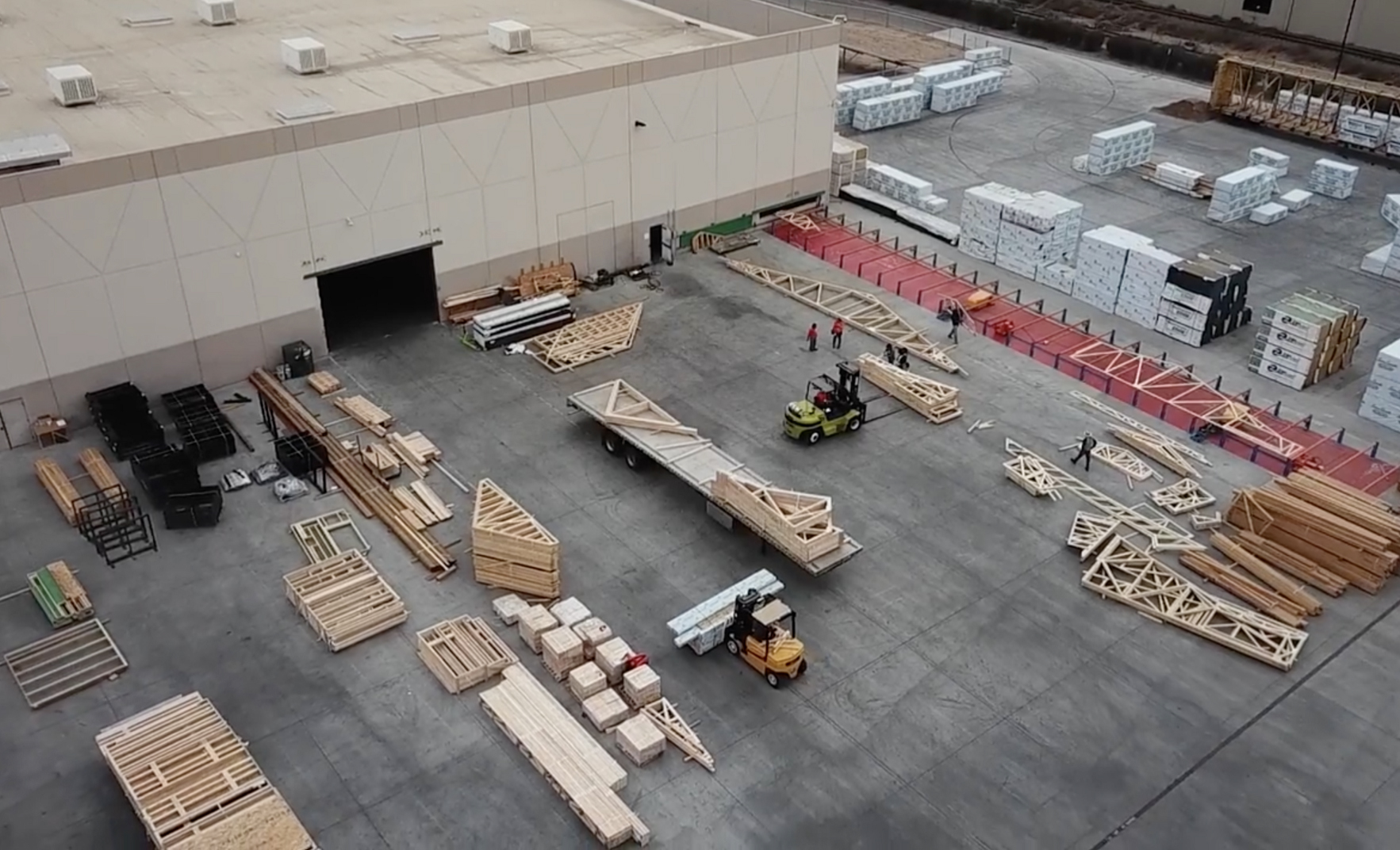
KATERRA factory; image via Medium

Bad habit 2: Thinking only about the present.

“Don’t stick your head in the sand and wait to become irrelevant,” urges Mitchell. His view is that, far too often, building-product manufacturers get stuck in their routines with sales and marketing. They rely too heavily on their existing list clients, not realizing that the construction landscape is shifting around them.

Mitchell’s go-to example of this is KATERRA, a pioneering company that creates pre-fabricated buildings from scratch, thereby expediting the construction process. KATERRA could be viewed as an existential threat to many building-product manufacturers, but if they learn everything they can about a company like this, they can establish how to either compete or collaborate with them. Always keep an eye on future trends, and consider how your company can be a key part of the “revolution”.

Bad habit 3: Being obsessed with competitors.

“Most building material manufacturers are too focused on their competition and not enough on their customers,” says Mitchell. Because of this, many manufacturers have a tendency to focus on lowering costs rather maximizing the quality of their product. The fear is that potential clients will always opt for the least expensive way to achieve their goal. But good value comes in many forms — not just a low cost per unit.

Improving customer service can lead manufacturers to win more commissions without having to lower any of their prices. The key is to focus on what your clients want, what their priorities are, what makes them tick. If you can help architects in their design challenges with great knowledge and guidance, they (and their client) will come to view you as indispensable. Suddenly, your competition becomes irrelevant.

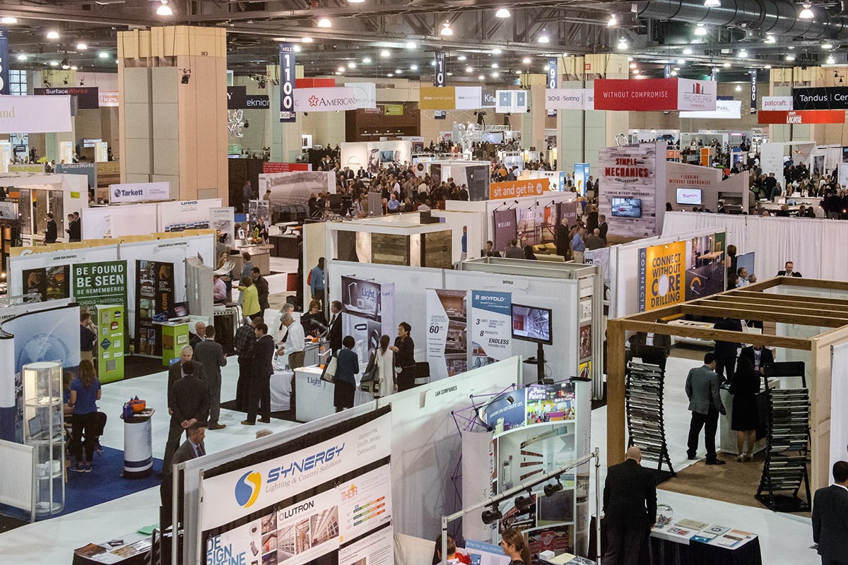
Neocon East; image via Neocon

Bad habit 4: Ignoring competitors.

As dangerous as obsessing over your competitors, discounting them can also cost you. Analyzing the approach of competitors can reveal not just what they are doing well (strategies you can copy) but also where they are weak (areas you can take advantage of). Mitchell does extensive “reconnaissance” on his client’s competitors.

“I don’t just check out competitors’ trade show exhibits,” said Mitchell. “I also study their website. I look at whether they are using social media and how. I analyze their SEO. Do they have a blog or engage in content marketing, and how good is it?” The key here is to be open minded. It is possible that your competitors are doing certain things better than you. Learn from them and you are more likely to overtake them.

Bad habit 5: Sticking with the status quo.

If you have a tried and tested formula that has resulted in sales then it may make sense to continue with that strategy. But all too often, manufacturers take this too far, avoiding the risks of new approaches and subsequently missing out on key opportunities in the industry.

“The building materials industry is ten years behind most other industries in marketing,” asserts Mitchell. He attributes this view to many things, from the industry’s lack of courage in leadership positions to manufacturer’s aversion to innovating online. Whatever your stance, it is clear that dynamism is vital to success in construction. Don’t be afraid to implement new sales and marketing strategies. Test, learn from and then optimize those strategies. In the end, brands that adapt will thrive.

Gain leads from major firms such as AECOM, HOK and OMA through Architizer’s community marketplace for building-products. Click here to sign up now.

Top image: iStock, credit: Palladadesign

The post 5 Bad Habits Costing You Sales With Architects appeared first on Journal.


Architectural Details: Toyo Ito’s Flowing Concrete Canopy

$
0
0

Find the perfect concrete products for your next project through Architizer’s new community marketplace for building-products. Click here for more informationAre you a concrete manufacturer looking to connect with architects? Click here.

While Instagram and Pinterest have granted us an unlimited supply of stunning renderings and pristine photographs for key architectural projects across the globe, the design details and construction processes that make these buildings unique remain inaccessible to a vast majority of the general public. With this inaccessibility in mind, architect, educator and author Georg Windeck — an Associate Professor at the Cooper Union in New York City — has set about bringing the story of architectural details to the masses.

Windeck’s book — simply entitled Construction Matters — is described by the author as an “anti-textbook” designed not to instruct, but to inspire. The compendium is split into four chapters based on the elemental materials of architecture — concrete, brick, wood and steel — and tells the tales behind the key details of iconic buildings around the world, from Mies van der Rohe’s Farnsworth House to the stunning Los Manantiales Restaurant, engineered by Felix Candela.

This article explores one of the more extraordinary projects from Windeck’s book — the undulating concrete shell and tree-like columns of Toyo Ito’s Meiso No Mori Municipal Funeral Hall in Kakamigahara, Japan. This is how Ito’s spectacular “forest of meditation” came together …

Meiso No Mori Municipal Funeral Hall, Kakamigahara, Japan; via OpenBuildings

Developed in collaboration with engineer Mutsuro Sasaki, Ito’s concept for the funeral hall was borne out of a desire to merge evocative symbolism with a logical structural rationale. The flowing plane of white concrete is reminiscent of the smoke that rises from the cremation furnaces, while also appearing as a part of the landscape, connecting ground, sky, lake and hill.

To create a structure that is at once ethereal and permanent, Ito sought to produce a wafer-thin shell of concrete that would appear to float despite the material’s inherent heaviness. In order to achieve this effect, the formwork took on a vital role, and it was employed in a manner that evoked the ceremonial process of the crematorium itself. As Windeck explains, “The formwork is the actual architecture, and the concrete is only there to document it in order to permanently preserve its memory, just as a death mask is made to preserve the facial features of a departed person.”

The form for one column consists of three vertical portions that form rings around the column shaft. Drawing by Construction Matters

Each ring is assembled from shop-produced plywood segments. Courtesy Toyo Ito and Associates.

The formwork for the columns was rationalized, comprising three sections that combine to produce the smooth, curved profile of each support. The techniques of traditional Japanese woodwork were skillfully utilized, before curved steel rebar was carefully inserted to provide the concrete with the necessary tensile strength. “The steel reinforcement of the column makes a funnel-shaped version of a tied column, in which circumferential reinforcing rings tie the vertical bars to their required positions to prevent them from buckling under load,” describes Windeck.

Circumferential reinforcing rings are fixed in place before the concrete is poured. Courtesy Toyo Ito and Associates

Left: section diagram showing curved reinforcing bars (drawing by Construction Matters); right: a construction worker reveals the concrete column (courtesy Toyo Ito and Associates)

Once the concrete was poured, it was essential for it to solidify as soon as possible to avoid it running to ensure the smooth, shell-like quality of the roof canopy. To aid this process, Windeck explains, “Chemical accelerators are added to the concrete; they quicken the hydration process in which the concrete hardens and give it a high early strength.”

The undulating roof canopy necessitates different levels of reinforcement across its surface. Drawing by Construction Matters

Roof construction approaches completion. Courtesy Toyo Ito and Associates

The irregular nature of the undulating roof plane gave rise to varied levels of stress across the surface, so additional steel meshes were inserted where necessary while maintaining an incredibly thin shell. Once the concrete was dry, final layers were applied to create the smooth, bright surface of the finished building — a veritable cloud of concrete that defies all expectations of a material so closely associated with the dominant forms of Brutalism.

Interior view of the finished columns. Courtesy Dennis Gilstad/Construction Matters

The wavy external edge of the canopy reveals its slender depth. Courtesy Dennis Gilstad/Construction Matters

“A lightweight roof built as such a concrete structure creates an environment that is dematerialized through its minimal physical presence, and dehistoricized in its negation of time,” says Windeck. “This time-less character forces the inhabitant to search for an understanding of the architecture as a found landscape, rather than a built creation.”

For more on Toyo Ito’s instant classic and other extraordinary details realized in concrete, check out Construction Matters, available here.

Search for the perfect concrete products through Architizer’s new community marketplace for building-products. Click here to sign up nowAre you a concrete manufacturer looking to connect with architects? Click here.

The post Architectural Details: Toyo Ito’s Flowing Concrete Canopy appeared first on Journal.

Look Up: 7 Sculptural Wood Ceilings That Undulate and Flow

$
0
0

Find the perfect wood ceiling products for your next project through Architizer’s new community marketplace for building-products: Click here for more informationAre you a ceiling manufacturer looking to connect with architects? Click here.

In recent years, architects have catapulted wood into the spotlight. Today, wood is increasingly painted as a strong alternative to concrete and steel. Praised for its sustainability, durability and ease of use, architects are harnessing cutting edge wood-building techniques and expressing immense confidence in the material’s possibilities for new construction. A widely anticipated example of such techniques is cross-laminated timber (CLT), which allows architects to build “an amalgam of curved configurations that weren’t previously possible”. Given its immense flexibility wood is being harnessed in similar ways for non-structural elements within buildings.

The following collection features eight projects that are united by a distinctive architectural feature: wood ceilings. While wood is more commonly seen beneath our feet, wood ceilings provide an innovative and novel offering. Throughout the following projects, wood ceilings are derived from fascinating sources of inspiration, and result in pleasant environments marked by warmth and comfort. The organic, breathable and dynamic nature of wood introduces life and vibrancy into this diverse set of architectural spaces:

Department of Social and Cultural Analysis, New York University by LTL Architects, New York, N.Y., United States

Wood ceiling by Hunter Douglas Architectural

For this project, LTL Architects wanted to create a functional office design that could still be filled with streaming light and visual interest. Throughout the public areas and shared spaces, dropped wood ceilings with integrated lighting create multiple volumes. Additionally, cork walls throughout the space tie into the wood palette and create an overall gesture of continuity.

Geometric Origami Ceiling by ASSEMBLE, Melbourne, Australia

For this project, ASSEMBLE’s aim was to create a low cost, 3D design that would act as a flexible and inspiring workspace. The main feature of the studio is the ceiling: a geometric form comprised of triangular, origami-inspired folds of timber. The ceiling design grew out of hands-on experimentation with folding origami paper.

Daiwa Ubiquitous Computing Research Building by Kengo Kuma and Associates, Tokyo, Japan

With this building, Kengo Kuma and Associates broke away from hard materials such as concrete, metal and stone and instead created an unconventional campus designed with soft wood and other earth materials. The architects wanted to create a gentle and organic flow of light and wind throughout the campus. Additionally, scale-like wood panels undulate, creating a dynamic, flowing façade.

Bar Nou by MAIO, Barcelona, Spain

At this refurbished bar in the center of Barcelona, a new vaulted ceiling system creates a cascading and continuous perception of space. The impressive timber structure extends all the way from the facade to the bar’s back wall, which is covered in a large mirror. This exciting contemporary space renders an enclosed experience, guided by transfixing angles and lines.

TED Theater by Rockwell Group, Vancouver, Canada

Wood structure developed in collaboration with Nussli

For this project, Rockwell Group drew inspiration from scaffolding and interestingly, the campfire — a temporary space that signals the beginning of a communal event and gathering. The majority of the structure was created from Douglas fir wood, and is comprised of several components that can be disassembled and re-assembled.

ONE Kearny: Lightfold by IwamotoScott Architecture, San Francisco, Calif. United States

ONE Kearny: Lightfold, a ceiling installation by IwamotoScott Architecture, transforms a typical ceiling into an abstracted, luminescent and folded chandelier. The geometry of the fixture extends and reflects along the rest of the angled hallway. The design draws together ideas of light, materiality and solidity.

Sky Central by AL_A, HASSELL and PLP Architecture, London, United Kingdom

Designed to house over 3,500 employees, Sky Central communicates flexibility, openness and encourages the flow of ideas across the business. The huge light-filled volumes of space, which are enhanced by the organic latticed-wood ceiling, create a space characterized by inspiring, energizing and timeless design.

Search for the ideal wood ceiling products through Architizer’s new community marketplace for building-products. Click here to sign up nowAre you a ceiling manufacturer looking to connect with architects? Click here.

The post Look Up: 7 Sculptural Wood Ceilings That Undulate and Flow appeared first on Journal.

LEDucation: 11 Brands Bending the Rules of LED Lighting Design

$
0
0

Find the perfect LED lighting products for your next project through Architizer’s new community marketplace for building-products: Click here for more informationAre you a lighting manufacturer looking to connect with architects? Click here.

The global LED lighting market is expected to surpass $100 billion by the end of year 2024. This represents an extraordinary growth rate, but it should not come as a surprise: In an era of rapid urbanization and rising concern for the environment, LEDs represent a far more energy-efficient method of illuminating buildings, both inside and out.

That said, their sustainable qualities are not the only reason architects love LEDs. Light emitting diodes can be contained within incredibly slim casings or even positioned upon flexible, sheet-like materials, enabling lighting designers to create unique forms fit for a broad range of architectural typologies.

Many of these forms were showcased this week at LEDucation, one of the world’s biggest shows dedicated to new creations in LED lighting. Architizer explored the exhibition rooms at the Hilton in Midtown Manhattan and talked with some of the most forward-thinking brands in the business about the very latest in LED innovation. We’ve picked out some of the most visually striking LED fixtures at the show — here’s who lit up LEDucation this year:

leducation LED lighting

Interlace by WAC Lighting

A Mobius Strip gone wild, WAC Lighting’s playful Interlace pendants demonstrate the flexibility of LEDs more than perhaps any other product. Available in two sizes — 28” and 39” diameter — a pair of seamless interlocking loops are backed by highly reflective chrome. These sinuous, sculptural forms are suspended using powered aircraft cables, creating a glowing statement piece that appears to float in mid-air.

LEDucation LED lighting

Pluck by SONNEMAN – A Way of Light

Renowned lighting brand and Architizer Member Brand SONNEMAN describes its Pluck floor and wall lamps as being “dramatically poised”, and it’s easy to see why. The product boasts a slender, arced profile and a crisp-edged, puck-shaped light that hovers delicately in mid-air. This disk is held with a magnet and rubberized ball that allows users to angle it in any direction, while the arc itself can swing out for maximum extension or be folded against the wall.

LEDucation LED lighting

Custom lighting installations by FLOS / Lukas Lighting

FLOS recently acquired Lukas Lighting, a brand specializing in the creation of dramatic bespoke LED lighting for commercial interiors. They’ve worked on beautiful corporate interiors, retail chains, hospitality, and more with clients like JP Morgan Chase, Michael Kors, and Four Seasons Hotels. A standout installation completed in recent years was a light wave composed of 2,600 polished stainless steel and clear glass spheres, levitating within Capital One’s Gensler-designed New York headquarters.

Seraph Collection by Blackjack Lighting

Blackjack Lighting’s Seraph Single Pendant can be customized with a diverse set of light guides to suit the taste and space of different clients. Available with either a polished chrome or matte black finish, groups of pendants can also be arranged in unlimited variations within the Seraph Modular System, enabling dramatic light constellations that fill the entire ceiling.

ModernRail Pendant by Tech Lighting

Tech Lighting exhibited a large array of stylish sconces, recessed lights and linear lighting fixtures, but the distinctive ModernRail Pendant was a highlight at LEDucation. The aged brass fixture’s elegant form is defined by a series of frosted opal glass globes with fully dimmable LEDs. At a scale of 3’ in length and 12” in diameter, the pendant is ideal for all architectural typologies from commercial to residential.

LEDucation LED lighting

Cu-Beam suspended lighting by Dyson

Architizer Member Brand Dyson has developed a sci-fi-sleek LED lighting solution for the modern workspace. The Cu-Beam down-light provides powerful, focused illumination for specific tasks, while the ultra-wide distribution of the up-light is suited to atriums, foyers and offices. For full flexibility, the “duo” option combines up- and down-lights that can be independently controlled for different functions. Each unit contains innovative heat pipe technology to keep it cool throughout each day.

Ripls by Louis Poulsen

Created by Danish designer Jakob Wagner, Ripls is a “multi-dimensional” light fixture that changes in character as you move past it. The undulating surface of the lamp evokes the subtle rippling of water, creating a diffused glow that makes it ideal for intermediary spaces such as corridors, stairways and reception areas. This is Minimalist lighting with a gentle twist.

LEDucation LED lighting

VentoFlex Tiles by Emerge Lighting / Visual Communications Company

Ventoflex by Visual Communications Company (recent acquirer of Emerge Lighting) is perhaps the most literal manifestation of this article’s headline. The wafer-thin modular system allows architects and interior designers to bend a constellation of 90 CRI Luxeon LEDs around or through other architectural elements, producing a completely bespoke lighting installation. The square sheets are so thin that they can be cut with scissors into any shape that designers desire.

LEDucation LED lighting

Slikk and yo.yo by IMPACT Architectural Lighting

The subtlest of curves makes the world of difference for one of IMPACT’s signature lighting fixtures. Slikk is engineered from a single piece of aluminum that has been welded, rolled, spun and ground smooth for a striking, seamless finish. Meanwhile, IMPACT’s playful yo.yo pendant displays a series of bolder curves, and is inspired by everyone’s favorite electronics-free toy. It comes in 12”and 16” diameters, and is available in 14 vivid powder coat paint colors.

LEDucation LED lighting

Mantis Sconce by Lindsley Lighting

Cofounder Alan Lindsley worked at Gensler for 13 years before launching his own lighting firm, and his architectural background shines through in the streamlined form of the Mantis Sconce. Mantis boasts a slim profile only made possible through the use of LEDs, and is available with an anodized silver, anodized bronze or white powder coated finish.

LEDucation LED lighting

Eclipse and Frame by Folio

Folio’s stunning “Folio Panel” range is built around the idea of combining maximum light with minimum thickness. True to its word, the company’s LED technology allows for units that are just 23mm thick and provide an even distribution of dynamic white light to the space below. Among the many forms offered by Folio, Eclipse and Giro are two of the most elegant, suspended lightly above kitchen countertops and meeting tables like gently glowing halos.

Search for the LED lighting products for your next project through Architizer’s new community marketplace for building-products: Click here for more informationAre you a manufacturer of glulam products looking to connect with architects? Click here.

The post LEDucation: 11 Brands Bending the Rules of LED Lighting Design appeared first on Journal.

This Movie of Marble Being Quarried is Truly Mesmerizing

$
0
0

Find the perfect marble for your next project through Architizer’s new community marketplace for building-products. Click here for more information. It’s free for architectsAre you a marble manufacturer looking to connect with architects? Click here.

When Italian artist and filmmaker Yuri Ancarani set out to capture the carefully orchestrated process of extracting marble from a quarry in the Italian Alps, he had some pretty wonderful material to work with. Gigantic blocks of marble are carved out like enormous sugar cubes, cleaved from the mountainside with the careful encouragement of huge diggers — monstrous machines dwarfed by the otherworldly landscape that surrounds them.

Check out the magical movie below …

“ll Capo” (Excerpt) by Yuri Ancarani – NOWNESS from NOWNESS.

One man, Il Capo (“The Chief”), conducts the entire operation with subtle but decisive hand movements — a flick of the wrist here, a clenched fist there — and the 20-ton blocks slide gracefully to the floor like calving glaciers, ready to be taken away for further processing. (The artist spent a year filming these surreal scenes on Monte Bettolgi in the Apuan Alps, and the resulting footage was exhibited at London’s Whitechapel Gallery.)

Via Nowness

Ancarani cranked up the visceral richness of the environment with subtle filters and high exposure to emphasize the stunningly beautiful slabs of marble as they are prized away from the quarry wall. It makes for a truly engrossing portrait of an everyday industrial operation, and serves to remind us all of the work that goes into sourcing the building materials we work with each day.

Search for the best marble products through Architizer’s new community marketplace for building-products. Click here to sign up now. Are you a marble manufacturer looking to connect with architects? Click here.

The post This Movie of Marble Being Quarried is Truly Mesmerizing appeared first on Journal.

An Architect’s Guide To: Suspended Ceilings

$
0
0

Find the perfect suspended ceiling for your next project through Architizer’s new community marketplace for building-products. Click here for more informationAre you a structural insulated panel manufacturer looking to connect with architects? Click here.

Sometimes referred to as false ceilings or dropped ceilings, suspended ceilings function as a second ceiling that hangs below the original or structural one. These systems can improve acoustics in a room by lowering the ceiling height, as well as adding in more absorptive materials. They can also make for a much cleaner design, by concealing wires as well as heating and ventilation pathways.

Suspended Ceiling Systems

Panel and Tile Systems: Suspended ceilings are often composed of a series of panels that form the visible surface of the ceiling. One of the most common panel system is the “tee” system. Long strips, called “mains” are connected with shorter strips called “tees.” This grid of mains and tees are then filled with panels to form the second ceiling. The panels stay in place by gravity and can be easily removed by lifting them up and out of the frame.

Concealed Grid Systems: Concealed grid ceilings have a more higher-end look than the standard panels systems. This type of suspended ceiling uses the panels themselves, which fit neatly together edge-to-edge, to conceal the actual grid. Manufacturers such as Arktura, offer concealed grid systems that can render a variety of complex visual patterns from simple, repeated elements. These systems are manufactured to conceal HVAC, lighting and other infrastructural elements, while maintaining their complete operability.

Suspended Ceiling

Stretch Ceiling via Barrisol

Stretch Ceiling Systems: A stretch ceiling is a suspended ceiling system that is composed of one large panel. The shape of the suspended ceiling is defined by the frame, which is usually custom designed and fabricated. The frame can be made to fit snugly against the walls of the room, or could be more sculptural, such as a wave-shaped frame suspended below the ceiling. The stretched material is commonly a thin plastic film such as vinyl or PVC, which can be any color, finish or transparency. However this surface could also be a custom wooden veneer panel or decorative fabric.

Custom Ceilings: If you are not completely satisfied with any single system, you may choose to create a custom ceiling to address the specific needs of your space. Many manufacturers including Armstrong Ceiling Solutions and Arktura work with architects to bring custom structures to life. 

Aesthetics

Color & Finish: Ceiling panels or tiles come in almost any color you can imagine, and in most cases they could be painted or powder-coated to match the specific color scheme of your design. Make sure to speak with your supplier before painting or coating your panels, in order to ensure that they will maintain the same acoustic properties and fire-rating efficiency.

Materials: Some common materials for off-the-shelf panels include fiberglass, gypsum, tin, plastic, or mineral fiber. However, more decorative or custom panel options are often made of hardwood, fabric, metal, plastic and glass. When it comes to material selection, the main limitation will be how each material performs against fire and safety codes.

Size: Standard off-the-shelf fiberglass and gypsum panels are 2’ x 2’ or 2’ x 4’ and are often up to ¾” thick. However, other decorative materials can be manufactured to be much thinner. Suspended ceiling accessories, such as lighting fixtures, fans or other HVAC access panels are typically found in these same dimensions.

Quantity: It is important to calculate how many panels you will need in order to cover the total area of your suspended ceiling grid. Use the drop ceiling grid and materials calculator for a quick estimate of the number of standard sized panels needed for a space. Regardless of whether you are choosing off-the-shelf panels or custom panels and grids, you can send your reflected ceiling plans (RCPs), floor plans, and elevations to the manufacturer to get their help in deciding on the layout, shape, and quantity of panels.

Aesthetics

Acoustical Properties: Most ceiling manufacturers have specialized products that can target the sound conditions of any space. Arktura’s sound-attenuating Soft Sound material, for example, is sustainably produced from recycled milk cartons, and can transform otherwise loud spaces into pleasant acoustical environments.

For this reason, it is commonly harnessed throughout educational, office and hospitality settings. When specifying a suspended ceiling, it is important to describe your needs in terms of sound control for the space. Some questions you may ask yourself is whether the ceiling should deflect or absorb sound, and to what extent?

Fire Resistance: It is important to ensure that there are no fire sprinklers or smoke detectors mounted behind the suspended ceiling. If there are sprinklers behind the grid, you may be able to install drop-out ceiling panels, depending on local codes. Drop-out ceiling panels are designed to respond to the heat from a fire, and allow sprinklers to function properly.

Maintenance: Acoustic ceiling panels or tiles, which are meant to help improve the sound quality inside a space, may have a sponge-like texture on the surface, with many small holes to help absorb sounds. This may work well acoustically, but could be very difficult to clean. If your building has strict hygiene codes, talk to your manufacturer about how the material that you select will hold up over time. 

Sustainability: It is important to consider the life cycle of the ceiling products that you are specifying. Ask your manufacturers whether or not they are made from recycled materials and if they can be recycled once they are removed from the installation. Some manufacturers offer ceiling grid systems with low volatile organic compound (VOC) levels, which can help improve air quality within the space itself and overall, during the manufacturing process.

Case Studies

ONE Kearny: Lightfold by IwamotoScott Architecture, San Francisco, Calif.

Look Up: 7 Sculptural Wood Ceilings That Undulate and Flow

The eight projects in this collection are united by a distinctive architectural feature: wood ceilings. While wood is more commonly seen beneath our feet, wood ceilings provide an innovative and novel offering. Throughout these projects, wood ceilings are derived from fascinating sources of inspiration, and result in pleasant environments marked by warmth and comfort. The organic, breathable and dynamic nature of wood introduces life and vibrancy into this diverse set of architectural spaces.

Search for the perfect suspended ceiling through Architizer’s new community marketplace for building-products. Click here to sign up nowAre you a structural insulated panel manufacturer looking to connect with architects? Click here.

The post An Architect’s Guide To: Suspended Ceilings appeared first on Journal.

Going Global: How to Share Your Architecture With the World

$
0
0

Click here to enter the 2018 A+Awards today and get your best projects recognized by communities around the world.

Architizer’s A+Awards — a worldwide program designed to recognize the globe’s best architecture and products — was born in 2012 on the back of one key belief: that great architecture is for everyone. For too long, discussions about architecture were stuck in an echo chamber occupied by architects, architectural critics and academics who would exchange thoughts on the built environment while 99 percent of those who inhabit it every day remained on the sidelines.

It was crucial, then, to create an awards program that would engage the public like never before. Using the power of the internet, social media and a wealth of other platforms, the A+Awards was designed to bring architecture to the masses in this modern digital age while getting the best designers on the planet the recognition they truly deserve. Today, it is the world’s biggest architectural awards program.

As Architizer invites entries for the sixth season for the A+Awards, we take a look back at how far this pioneering program has come and the very exciting road it is headed on this year. Hold on to your hats — this is the epic tale of how great design grabbed the spotlight …

A+Awards

Thanks to a partnership with PVBLIC, in May 2015, A+ winning architecture was given its most exciting platform yet: Times Square’s iconic billboards.

Half a Decade of Amazing Architecture

It all began on October 9, 2012, when Architizer founder Marc Kushner announced a different kind of competition, declaring: “Enough with that echo chamber where architects tell other architects which architects they like. The industry needs to break out, and the A+Awards are designed to do it.” And so it did. In its first year, the A+Awards launched with over 200 jurors from the world of architecture, design, technology and development. With 87 big winners and a host of attendees including hugely significant cultural figures from President Mikheil Saakashvili of Georgia to fashion designer Thom Browne, the A+Awards had already peaked the interest of many, all across the globe.

During the following four years, awards for building-products were introduced, giving an unprecedented stage for manufacturers and brands to have their products celebrated on a global stage. In doing so, the A+Awards effectively foreshadowed the Architizer that we are so proud to be today: a platform for cross-disciplinary community and the preeminent tool for architects to find building-products. With each passing year, more submissions and an ever-increasing media presence have made the A+Awards the largest awards program of its kind for the built environment.

Last year, the A+Awards attracted 400,000 public votes from more than 100 countries and territories, along with entries from over 100 nations and over 200 total winners. Fueled by special features on the Architizer homepage and an audience of millions on social media, total media impressions for winning projects topped 300 million. This number continues to grow at an amazing rate, and the potential for further expansion in the digital era is incredibly exciting for architects, their clients and us, here at Architizer.

2018: Celebrating Architecture Everywhere

The 2017 A+Awards will be a challenging year to top. Fortunately, with new ideas and fresh collaborations, we’re ready to make this the best A+Awards yet! Here are some highlights to look out for this year:

+ Going Global

This year, the A+Awards are going truly global. In order to give your spectacular work the spotlight it deserves, we will be using our redesigned Architizer Journal and our social media following of 4.3 million people across five platforms to give your projects more international exposure than ever before. In doing so, the awards will be more accessible and meaningful to local communities, worldwide.

+ A Bigger, Better Book

To wholeheartedly enact our goal of going global, we will also be creating a larger hardbound book in partnership with Phaidon, the premier publisher for the creative arts, with over 1,500 titles in print. Bigger and increasingly encyclopedic in its nature, the 2018 A+Awards annual will serve as an evergreen resource and echo Architizer’s larger goal of educating architects to create better buildings, better cities and better worlds. Enter now for a chance to be included in today’s most comprehensive guide of the world’s best architecture.


+ New Categories

Last but not least, the 2018 A+Awards will feature fresh new categories that will not only recognize the design work of architects, but the spectacular products and materials that make these designs a reality. This year’s new Product Categories include Brick Cladding, Green Walls & Roofs, Terracotta Cladding and more.

A+Awards

Archifest Pavilion by DP Architects was the 2017 A+Awards Jury and Public Choice Winner in the Architecture+Color category.

The A+Awards program is completely accessible to all architects, with two awards dedicated to each category. One is awarded on votes cast by our list of over 400 amazing jurors, a stellar line-up of luminaries from the worlds of design, technology, media, business and more, while the other is decided by hundreds of thousands of votes from the general public. Each of these awards is considered equal in importance, and both are decided wholly by counting the votes.

2018 can be your year! Enter now to be a part of this international movement and have your work celebrated among today’s most innovative architecture and building products, across every part of the globe.

Click here to enter the 2018 A+Awards today and get your best projects recognized by communities around the world.

The post Going Global: How to Share Your Architecture With the World appeared first on Journal.

In Ruins: 6 Projects That Breathe New Life Into Dilapidated Buildings

$
0
0

Find the perfect products for your next restoration project through Architizer’s new community marketplace for building-products. Click here for more information. It’s free for architectsAre you a manufacturer looking to connect with architects? Click here.

Amidst the rolling hills of long grasses swaying in the wind sits what is left of a stone building, stripped of its roof with all of its walls at various levels of disrepair. Weather and time have taken their toll as nature begins to grow over and engulf the structure. Ruins such as this are scattered across both rural and urban landscapes. We encounter them as sections of wall stripped down to their bare masonry or truncated ceiling rafters, hinting at what was once a full enclosure.

Ruins have become an object of fascination and romanticization. They are picturesque memorials to the past — physical reminders of what once was and the inescapable powers of time and decay. But every ruin has the potential to shelter once again, to become a historic frame for a contemporary space. These six projects have breathed new life into derelict shells. Positioned at the intersection of old and new, the buildings speak to the durability of masonry, its ability to be reused and repurposed. Even in ruins, their foundations prove robust enough to support a whole new structure for new generations of users.

THE WHITE HOUSE by WT Architects, Isle of Coll, United Kingdom

The clients inherited the lime-built walls of this 18th-century house and were persuaded to incorporate their new home with the walls of the ruins, instead of restoring the old or building new. The original walls were stabilized and consolidated, while still maintaining their characteristic cracks. New stone walls extrapolated on existing boundary walls, reusing materials found on site. Half of the walls of the old house remain as uncovered ruins, only now serving a dual purpose: a tribute to the original ‘ruined’ character of the site and an enclosure for a new courtyard garden.

DOVECOTE STUDIO by Haworth Tompkins, Snape, United Kingdom

After minor repairs, the crumbling walls of a Victorian industrial building were reused as a literal frame to hold a new Cor-Ten steel structure used as a flexible space suitable for artist-residencies, rehearsals, performances and meetings. With its plywood interior, the Cor-Ten steel form maintains the shape of the original building before it was reduced to the remnants seen today. The Cor-Ten steel was welded as a single piece next to the original building, then craned into place, fitting snugly into its ruin-shell.

CASA SABUGO by Tagarro-De Miguel Arquitectos,Sabugo, Spain

Unlike the other listed projects, Casa Sabugo does not stem from an existing, encountered ruin, rather one created by the architects. The eastern wall of this existing family farmhouse was torn down to bring in light and sweeping views of the Asturian countryside. New materials, namely glass and steel, patch the rough scars of demolition as well as the openings of the retained walls

NIOP HACIENDA by AS Arquitectura, Champoton, Mexico

The ruined walls of old livestock and textile buildings were transformed into a variety of hospitality functions, including a boutique hotel, ballroom, weekend residences, restaurant, private villas and event spaces. Delicate interventions sought not to overpower the existing masonry walls but rather highlight and celebrate the aging walls, allowing for the beautiful juxtaposition of new life within the old structure.

BLAJ CULTURAL PALACE REFURBISHMENT by Vlad Sebastian RusuBlaj, Romania

The Cultural Palace, originally designed in 1930 by Victor Smigelschi, stood in ruins after a destructive fire in 1995, not to be revived until 2012 as a multipurpose hall for the Romanian Academy. Only ruins that pertained to the original building were kept and consolidated. The introduction of skylights celebrates the building’s ruined state pre-renovation by allowing the original brick walls to be seen in a similar natural light to when they sat in ruin, exposed to the elements.

KOLDINGHUS by Johannes + Inger Exner, Kolding, Denmark

This 13th-century Danish castle was largely destroyed by a fire at the beginning of the 1800s and continued to fall into further disrepair until 1890 when restoration efforts began. In respect of its history, including its destruction, the ruins were to remain as untouched as possible. Choosing materials easily distinguishable from the castle ruins, floor-to-ceiling laminated wood pillars were constructed to support a new roof, mezzanine levels and suspended bridges that allow visitors to interact with the ruin from different heights and perspectives.

Search for the ideal restorative materials through Architizer’s new community marketplace for building-products. Click here to sign up now. Are you a glass manufacturer looking to connect with architects? Click here.

The post In Ruins: 6 Projects That Breathe New Life Into Dilapidated Buildings appeared first on Journal.


3 Reasons You Are Losing Out to Inferior Building-Products

$
0
0

Connect with huge architecture firms and gain new business through Architizer’s community marketplace for building-products. Check out the latest construction leads and sign up now.

One of the most frustrating things that can happen for a building-product manufacturer is to lose out on a big sale to inferior products that are clearly of a lower quality than theirs. Unfortunately, this scenario is all-too-common for brands. Many architects, their clients, developers or contractors tend to sacrifice quality — knowingly or not — for various reasons during the design and specification process.

As a manufacturer of high-quality materials or products, identifying those reasons is key to avoiding this negative outcome. Architects might specify a lesser product for reasons relating to cost, lead time, or other constraining factors. On the other hand, it might simply be that they don’t recognize the added value a particular product can bring to their project because of the way it has been marketed to them.

Here are just a few reasons why inferior products might get chosen ahead of yours — and what you can do to avoid it.

Image via iStock; credit: andrewgenn

1. Too Much Information

We’ve spoken at length on the value of being knowledgeable about your product, and using that insight to become a helpful resource to architects. That said, there is such a thing as information overload. Some manufacturers bombard architects with technical information over and over, relying solely on knowledge and persistence to earn a sale. At the very least, this unfocused approach can be irritating to architects. At its worst, it can feel overwhelming.

While it is important to know everything there is to know about your product, it is even more crucial to pick out select pieces of information that are truly useful to the person you are selling to. Getting to know your customer will help you understand their priorities and constraints, which will enable you to highlight how your product forms the optimal solution to their design problems. Ask them questions, uncover their hurdles, and then help them to jump over those hurdles to succeed.

Image via iStock; credit: IconicBestiary

2. Neglecting Long-term Value

As highlighted in our previous article on “How to Talk About Pricing With Architects”, cost is one of the primary reasons your product might miss out in favor of another brand. Many manufacturers fall into the trap of lowering their prices to remain competitive. However, engaging in a “price war” with competitors is not a good long-term strategy. Instead, you should aim to highlight the added benefits that make your product better value for money over its lifetime.

While a resilient façade panel or an energy-efficient toilet might be more expensive on a per-unit basis, they might save a client substantial sums of money by contributing to lower maintenance costs or bills each year. If you can give a clear idea of these savings to architects, they will factor this into their decision-making process. Ultimately, the true value of each building-product lies in its cost at the beginning, middle and end of a building’s life. It’s vital to emphasize this fact during your conversations with architects. They will quickly realize that inferior products are not necessarily the cheapest option.

Communication between two people.

3. Poor Communication

Perhaps the worst reason of all for a manufacturer to lose out to an inferior brand is one that is so easy to fix: bad communication. Brands that don’t communicate quickly or clearly enough with their customers tend to lose out — Architizer’s data shows that sales reps who responded to an architect’s search within the first 24 hours of its creation were 86% more likely to have their product shortlisted for a project than those coming a day later.

Simply put, time-strapped architects appreciate reliable brands that respond swiftly to their inquiries. Do your research to find out architects’ preferred form of communication (hint: it’s probably not cold calling), and reach them in a way they are comfortable with. This is simple customer experience stuff. Manufacturers that put as much time and energy into customer service as they do to developing high quality products always outsell those that don’t.


Sure, up-front price for building-products is a factor — but it’s far from the only reason that manufacturers miss out on a sale to inferior products. Great customer experience is key to winning business from architects. If you are reliable, communicative and informative with them on a consistent basis, you will soon find your brand being considered alongside your competitors. At that point, the superior quality of your products can do the rest of the work and help get you specified.

Gain leads from major firms such as AECOM, HOK and OMA through Architizer’s community marketplace for building-products. Click here to sign up now.

The post 3 Reasons You Are Losing Out to Inferior Building-Products appeared first on Journal.

“Timber Is the New Concrete”: 8 Architects Pioneering Laminated Wood

$
0
0

Find the perfect glulam products for your next project through Architizer’s new community marketplace for building-products: Click here for more informationAre you a manufacturer of glulam products looking to connect with architects? Click here.

As one of the most elemental building materials, timber has come a long way from the world’s oldest examples of wooden architecture, early Neolithic water wells. With this era being deemed the “beginning of the timber age,” wood has taken the place of concrete and steel to become the 21st-century material of choice for many. Praising its sustainability, quality and speed of construction, architects have fully embraced new types of engineered timber that are markedly hardy, steadfast and malleable.

This material fixation is largely due to one particular technology: cross-laminated timber. Usually referred to as CLT, new types of engineered wood consisting of laminated wood sections allow architects to build an amalgam of curved configurations that weren’t previously possible. The sheer strength and rigidity of laminated timbers make for beams and arches that span vast distances without intermediate columns, which equates to more design flexibility than traditional timber, concrete or iron construction. By and large, the significant advantage is that creative freedom is not sacrificed for structural requisites.

Is laminated wood truly the future of construction? It’s hard to disagree with the words of Alix de Rijke, director of London-based firm dRRM, in a recent interview with Dezeen, “CLT is the future of construction. Timber is the new concrete.” Regardless, this new breed of timber structures is worth celebrating, and we do so with a collection of courageous curves made from sinuous laminated wood framework. The projects below are only a few examples that are representative of the material’s potential and of what is to come …

Gammel Hellerup Gymnasium Multi-Purpose Hall by BIG – Bjarke Ingels Group, Hellerup, Denmark

Designed for Bjarke Ingels’ alma mater, this sustainable sports facility is characterized by its undulating knoll-like roof that serves as an informal seating and outdoor activity area. Resting 16 feet below ground, the multi-purpose hall minimizes unwanted shade on the surrounding buildings.

Sport Court – High school La Tourelle by ecdm, Sarcelles, France

Under the context of an ambitious urban renewal project, ecdm dreamt up this multi-sport court, which provides access and cover for disabled people. The laminated wood structure is dispersed within a long hall-like tube wrapped where curves and counter-curves make up what looks to be two enormous pairs of glasses.

Bodegas Protos by Alonso Balaguer y Arquitectos Asociados, Valladolid, Spain

Designed to conserve energy, this new annex connects former wine cellars through a tunnel built under the diver road. Buried into the topography, the form of the structure reinterprets the construction of ship-shaped wine cellars with a set of parabolic arches constructed from laminated wood.

Centre Pompidou Metz by Shigeru Ban Architects, Metz, France

Housing permanent and temporary exhibitions from the Musée National D’art Moderne, this large hexagonal structure covers a collection of interior spaces structured around a 250-foot central spire. Clad in a fiberglass-and-teflon membrane, the laminated timber shell, resembling a cane-work pattern, stretches above an internal area of 86,000 square feet. Read more about Ban’s extraordinary glulam projects here.

Banq Restaurant by NADAAA, Inc., South Boston, Mass., United States

Located in an old banking hall, this restaurant was conceptualized around the relationship between the ceiling and the ground. A striated, birch plywood-slatted system conceals the building’s old infrastructure — sprinkler system, mechanical equipment, lighting and other acoustic systems — creating a virtual canopy to dine beneath.

Hotel of the Wind / Tierra Patagonia Hotel by Cazu Zegers Arquitectura, Ultima Esperanza, Chile

Situated at the entry area of “Torres del Paine” National Park, this hotel was designed to merge with the surrounding landscape. Like a form carved in the sand, the exterior finish has a silvery sheen that mimics that of old wooden houses worn away from winter. Inside, warm and cozy spaces are structured under laminated timber pathways.

Nature Boardwalk at Lincoln Park Zoo by Studio Gang Architects, Chicago, Ill., United States

Functioning as an outdoor classroom, this shelter coexists with the natural and urban setting around a new boardwalk that circumscribes a body of water. Inspired by a tortoise shell, the laminated latticework consists of prefabricated bent-wood volumes covered by a series of interconnected fiberglass orbs.

‘Minna no Mori’ Gifu Media Cosmos by Toyo Ito & Associates, Gifu, Gifu Japan

Designed to encompass various reading, resting and study zones, the scheme is defined by large funnels placed along the ceiling, further emphasizing the helical nature of the plan. To that end, the roof canopy is composed of spiraling latticed wooden units with interstitial openings that allow natural light to flood into the spaces below.

Search for the ideal glulam products for your next project through Architizer’s new community marketplace for building-products: Click here for more informationAre you a manufacturer of glulam products looking to connect with architects? Click here.

The post “Timber Is the New Concrete”: 8 Architects Pioneering Laminated Wood appeared first on Journal.

David Chipperfield’s Exquisitely Detailed Stone and Concrete Architecture

$
0
0

Find the perfect stone products for your next project through Architizer’s new community marketplace for building-products. Click here for more information. It’s free for architectsAre you a stone manufacturer looking to connect with architects? Click here.

David Chipperfield Architects has created iconic stone and concrete projects across the world. Between its four offices, the firm works to create architecture that is responsive and grounded, beautiful in form and rich with material texture. The firm has gained recognition and praise among its contemporaries for projects that arrive at simplicity. Chipperfield finds simplicity through editing and selection, exploring the complexities of site, form, function, cost, materiality, and program and to create a cohesive piece of built environment that is functional and creative while at the same time responsive to current and future needs.

David Chipperfield Architects’ mastery of simplicity is seen in plan, elevation and volume across many different building typologies, but most notably in its cultural projects. The following projects showcase Chipperfield’s use of stone and poured concrete to create distilled spaces, introducing elements of great weight to foster a deep connection to site:

David Chipperfield Architects David Chipperfield ArchitectsMuseo Jumex, Mexico City, Mexico

Travertine supplied by Franco Soluciones En Piedra

Museo Jumex sits on a triangular site within the Polanco area in Mexico City surrounded by glass high-rise commercial buildings. This wedge-shaped, privately-funded art museum marks the first realized project by David Chipperfield Architects in Latin America. The simplicity of its iconic sawtooth form and its imposing scale gives gravity to the building and positions it as a prominent piece of architecture within its context.

The museum rests on fourteen exposed white concrete columns atop of a plinth that merges with the public plaza. It’s continuous stone cladding is locally quarried travertine from the State of Veracruz supplied by Franco Soluciones En Piedra. The company is committed to selecting the best stone, and stone product solution for ever project. The museum’s large floor to ceiling windows and the exterior walkways are the only elements allowed to cut at the solidity of the museum.

David Chipperfield Architects David Chipperfield ArchitectsGallery Building Am Kupfergraben, Berlin, Germany

Façades by Dreßler Bau GmbH

This gallery building is positioned on the Kupfergraben canal which is a prominent site in Berlin overlooking the Lustgarten and Museum Island. The architecture fits over the footprint of a building destroyed in World War II. After winning a private competition to complete the city façade facing the Neues Museum, Chipperfield created a building that borrows from its surroundings and lost history to capture a new face for the arts.

Gallery Building Am Kupfergraben draws from its immediate historical context and reinterprets the architectural sense of scale and repetition in its façade. A textured language of its elevations is achieved through the use of reconstituted stone and brick masonry by Dreßler Bau GmbH. The generous large windows fit with the overall scale of the gallery while achieving a harmonious relationship with the proportions of its neighbors. The building’s elegant detailing, clean lines and the skillful use of stone lend it a unique beauty.

David Chipperfield Architects David Chipperfield ArchitectsValentino Rome Flagship Store, Rome, Italy

Stone/terrazzo supplied and installed by Laboratorio Morseletto

This 20,000-square-foot flagship store spans several buildings across Piazza di Spagna and Piazza Mignanelli. The structure is carved out to create a stunning shopping atmosphere. The architecture borrows from the store’s original fashion concept of merging old and new.

Each space within the luxury store is detailed with tasteful material connections. The interior sees a grey palette of Venetian Terrazzo with Carrara chippings and marble across walls, ceilings and floors, supplied by Laboratorio Morseletto. The grand entrance is a 20-foot-tall volume made from marble columns and terrazzo walls. The two main staircases are each entirely lined in marble, giving the impression that they have been cut from a single piece of stone. These materials form a pristine box that is perfect for showcasing delicate cloth, leather and fabric goods.

David Chipperfield Architects David Chipperfield ArchitectsXixi Wetland Estate, Hangzhou, Zhejiang, China

Façade by ECADI

This village of apartment buildings on the outskirts of Hangzhou shapes a relationship between water and built architecture. The series of residences won the 2016 LEAF award under the multiple occupancy category solidifying it as a benchmark piece of architecture that is responsive and sensitive to the environment.

In plan, the locally sourced stone-clad apartments form an interconnected series of plinths that sit right in the water. Surrounded on all sides by the national wetland park, the village is characterized by its dark and light stone walls by ECADI. From a distance, the rectangular cubes hold their ground within the site without overstating their presence. The horizontality of the landscape and the use of natural building materials helps establish a serene sense of place within nature.

David Chipperfield Architects David Chipperfield ArchitectsInagawa Cemetery, Inagawa, Japan

Façade by Obayashi

Inagawa Cemetery and visitor center is located on a steep slope in the Hokusetsu Mountain Range, just 40 kilometers north of Osaka. The built architecture is spread across a series of terraces that are bisected by a monumental stepped path leading up to a shrine at the highest point.

The visitor center and chapel are programmatically arranged under a single sloping roof plane. The quiet spaces rely on the simplicity of nature and purity of form. The architecture is unadorned and uses minimal artificial and mechanical heating and cooling systems, instead harnessing indirect diffused sunlight and natural breezes. Constructed by Obayashi, the floors, walls, ceilings and roofs are all formed from red tinted concrete made to resemble stone. The formal use of planes and surface allow this man-made stone to meld with the landscape.

Search for the best stone products through Architizer’s new community marketplace for building-products. Click here to sign up now. Are you a stone manufacturer looking to connect with architects? Click here.

The post David Chipperfield’s Exquisitely Detailed Stone and Concrete Architecture appeared first on Journal.

First Impressions: 5 Textured Façades Cast in Concrete

$
0
0

Find the perfect concrete products for your next project through Architizer’s new community marketplace for building-products. Manufacturers: Check out the latest construction leads and sign up now.

Concrete, like liquefied stone frozen in time, assumes the shape and characteristics of whatever formwork it is poured into. Unlike glass and steel, which hide their true nature with smoothed surfaces and neatly detailed edges, concrete embraces its inherent imperfections, leaving behind a tactile record of its construction.

Eschewing standard plywood formwork, the architects of the following projects opted for more expressive molds, producing richly textured façades that reveal the essence of concrete while evoking deeper meanings. If you are considering casting your next project in concrete, check out the impressive possibilities of the material below:

textured concrete, Foro Boca by Rojkind Arquitectos

Photos by Jaime Navarro; via Rojkind Arquitectos

textured concrete, Foro Boca by Rojkind Arquitectostextured concrete, Foro Boca by Rojkind Arquitectos

Foro Boca by Rojkind Arquitectos, Boca del Río, Mexico

Concrete façade by Cemex

Foro Boca aims to revitalize the Mexican Port of Veracruz by providing the city with a new concert hall for its philharmonic orchestra as well as music education programs for its underprivileged youth. The building, drawing inspiration from the waterfront setting, is an assemblage of concrete masses akin to the rock-strewn jetties at the harbor’s edge.

The exterior walls were cast-in-place using wooden boards of varying lengths and depths as formwork. This imprinted their surfaces with a jagged and grainy finish, characteristics that will become more pronounced as the concrete weathers by the sea. The use of board-formed concrete was continued throughout the building, creating an interior with a distinctly cavernous quality.

textured concrete, Daeyang Gallery by Steven Holl Architects

Photos by Iwan Baan; via Steven Holl Architects.

textured concrete, Daeyang Gallery by Steven Holl Architects

textured concrete, Daeyang Gallery by Steven Holl Architects

Daeyang Gallery and House by Steven Holl Architects, Seoul, South Korea

Concrete façade by Sika

The Daeyang Gallery and House comprises three copper-clad volumes containing the main living quarters and a broad concrete base that houses the owner’s sprawling contemporary art collection. The walls of the gallery extend into the site, carving out a secluded courtyard in the heart of this densely populated neighborhood.

The entire lower level was cast in place using bamboo formwork, a naturally abundant material with a great deal of cultural significance in Korea. The bamboo reeds formed concave striations across the façades which catch the light beautifully while providing a contrast to the smooth cladding above. To the right of the main entrance, the building’s roof plan, including its 55 skylights, has been cast into the concrete, creating a sculptural relief above the fountain.

textured concrete, Perot Museum of Nature and Science by Morphosis Architects

Photos by Roland Halbe; via Morphosis Architects.

textured concrete, Perot Museum of Nature and Science by Morphosis Architects

Perot Museum of Nature and Science by Morphosis Architects, Dallas, Tex., United States

Concrete façade by Gate Precast

The Perot Museum of Nature and Science appears like a mountain in the Dallas skyline, rising up from a xeriscaped plinth of rocks and indigenous plant life. Its stone-colored exterior is cracked open by “glacial” walls of steel and glass which allow sunlight to penetrate deep into the gallery spaces.

The fissured façades are complemented by a craggy skin of precast concrete panels. There are almost 700 panels in total, each weighing up to eight tons, and each featuring a uniquely-molded profile of protrusions and crevices. These irregular surfaces make the building appear almost natural, as though it was formed by extreme geological forces rather than constructed.

texture concrete, Clyfford Stills Museum by Allied Works Architecture

Photos by Jeremy Bittermann; via Allied Works Architecture.

texture concrete, Clyfford Stills Museum by Allied Works Architecture

Clyfford Still Museum by Allied Works Architecture, Denver, Colo., United States

Concrete façade by Oldcastle

This art museum is dedicated to the work of Clyfford Still, an American painter who helped pioneer abstract expressionism in the post-war era. It seems like a simple concrete box from a distance but, up close, its façades are as expressive as the artist’s brushstrokes.

The exterior walls were cast in place using narrow planks of Hem-Fir as formwork. The edges of the planks were beveled with a router, allowing the concrete to ooze out between them. When the formwork was removed, vertical fins of concrete were revealed, “creating a rich surface that changes in the intense Denver sunlight and forms varied shadows across the building.”

Photos by Hufton and Crow; via Heatherwick Studio.

textured concrete, Learning Hub by Heatherwick Studiotextured concrete, Learning Hub by Heatherwick Studio

Learning Hub by Heatherwick Studio, Nanyang Technological University, Singapore

Concrete façade by LWC Alliance

The Learning Hub was designed to foster a sense of community among the students of Nanyang Technological University. So, rather than boxy classrooms accessed via long corridors, the program is divided up amongst twelve tapering towers, clustered around a central, light-filled atrium.

The façades are clad in curved panels of precast concrete which are ribbed to accentuate the building’s shape. To simplify construction, BIM specialists where hired to develop ten reusable silicone molds which could be combined to create unique cladding configurations for each tower at no additional cost. In order to differentiate the cladding from the structure, the concrete bearing walls were embossed with hundreds of whimsical illustrations by artist Sara Fanelli, depicting images from art, science and literature. As the architect’s describe, these walls were treated “like handmade clay, allowing their surfaces to have the qualities of detail and warmth that people would not expect from concrete.”

Search for the best concrete products through Architizer’s new community marketplace for building-products. Click here to sign up now. Are you a concrete manufacturer looking to connect with architects? Click here.

The post First Impressions: 5 Textured Façades Cast in Concrete appeared first on Journal.

Kandinsky’s Color Theory in Architecture

$
0
0

Find the perfect glulam products for your next project through Architizer’s new community marketplace for building-products. Manufacturers: Check out the latest construction leads and sign up now.

Wassily Kandinsky’s art explored the relationship between color and its viewers. He eschewed the grays, browns and blacks of Cubism, embracing color as the primary vehicle for expression. In doing so he completely separated painting from a need to depict a subject. The goal of Kandinsky’s art was to capture music in a plastic medium, to evoke the same feelings a piece of music could evoke through shades and hues.

Color Study: Squares with Concentric Circles by Wassily Kandinsky. Image via Wikipaintings

The theories he developed about color and meaning would prove influential in all creative fields, with the De Stijl movement expanding his philosophies and incorporating color into industrial design and architecture. Employing the color wheel, Kandinsky went through each hue, explaining the feelings it evoked, emotions it captured, and the sound it “made.”

Cycling through the colors of the rainbow, here is a sample of Kandinsky’s thoughts on color from his book “Concerning the Spiritual in Art,” paired with buildings from the Architizer database. If you are considering a vibrant cladding product for your next building, be inspired by the master of the whole spectrum:

YOUNG DISABLED MODULES by ///g.bang/// josé javier gallardo, Zaragoza, Spain

Red: alive, restless, confidently striving towards a goal, glowing, “manly maturity.” Translated into sound: “sound of a trumpet, strong and harsh,” Fanfare, Tuba, deep notes on the cello, clear violin.

Refurbishment and Extension of ArcelorMittal R&D Headquarters [insideOUT] by [baragaño], Avilés, Spain

Orange: a mixture of red and yellow, radiant, healthy, serious. Translated into sound: middle range church bell, an alto voice.

Falcon Headquarters by Rojkind Arquitectos, San Angel, Mexico

Cladding by Panelite

Yellow: “warm, cheeky, and exciting, disturbing for people, typical earthly color… representing madness in color, an attack of rage, blind madness, maniacal rage.” Translated into sound: loud sharp trumpets and high fanfares.

123 social green housing in Madrid by SOMOS.arquitectos, Madrid

Green: stillness and peace, but with a hidden, passive strength. “Green is like a fat, very healthy cow lying still and unmoving, only capable of chewing the cud, regarding the world with stupid dull eyes.” Translated into sound: quiet drawn out middle position violin.

Didden Village by MVRDV, Rotterdam, Netherlands

Exterior finish: Kunststof Coatings Nederland

Blue: deep, inner, supernatural, peaceful. “Sinking towards black, it has the overtone of a mourning that is not human … typical heavenly color.” Translated into sound: the flute, cello, and organ.

Avant Chelsea by 1100 Architect, New York City

Unfortunately Kandinsky didn’t distinguish between blue and indigo. Apparently they were the same to him.

Purple Hill House by IROJE KHM Architects, Gyeounggi-do, Korea

Violet: a mixture of red and blue, “morbid, extinguished … sad.” Translated into sound: the english horn and bassoon.

Search for the ideal colored cladding through Architizer’s new community marketplace for building-products. Click here to sign up now. Are you a cladding manufacturer looking to connect with architects? Click here.

The post Kandinsky’s Color Theory in Architecture appeared first on Journal.

An Architect’s Guide To: Concrete Surfaces

$
0
0

Find the perfect concrete surfaces for your next project through Architizer’s new community marketplace for building-products. Manufacturers: Check out the latest construction leads and sign up now.

Concrete has existed at the core of architecture for nearly two centuries. In its simplest form, concrete is a mixture of paste — composed of Portland cement and water — and rocks of varying sizes. Through a chemical process called hydration, the paste hardens around both fine and coarse aggregates to form the strong rock-like material known as concrete. One of the most notable qualities of concrete is that it is malleable when just mixed, but strong and durable once hardened, which means that it can be harnessed to meet a wide range of architectural and design applications.

Architizer spoke with Nerisa Garcia of Concreteworks East, a specialty manufacturer of architectural concrete, which focuses on projects in the tri-state area. According to Concreteworks East, some of the most common applications of architectural concrete include countertops, sinks, tubs, wall panels, stairs, tile, fireplaces and finally, outdoor landscaping elements. Despite their aesthetic and functional differences, many of these applications follow very similar manufacturing principles.

Concrete Surfaces

200 5th Ave by STUDIOS Architecture and Landworks Studio; image via Concreteworks East

Concrete Surface Systems

“I think that there’s a lot of flexibility in terms of working with precast concrete and GFRC (glass fiber reinforced concrete),” said Garcia. “The only real setback is timing; it does take a little bit of planning so depending on scale, it’s ideal for architects and designers to reach out to us in the beginning stages of a project. Once it’s planned out and fabricated, it’s quite quick to install.”

Precast Concrete: Precast concrete is manufactured by casting concrete into a mold, which is then cured in a controlled environment, transported to the construction site and lifted into place. This affords the opportunity to create highly precise bespoke elements as well as large quantities of standardized elements, like concrete wall panels. Not only do precast methods offer better quality control than onsite casting, but they also have the potential to greatly reduce construction and labour costs, since molds can be used time and time again. “In order to achieve very high standards, all of our products are precast,” said Garcia. “In the beginning, we used to also do pour-in-place, but due to the nature of most construction sites, it is just not ideal in terms of finish quality.”

Glass Fiber Reinforced Concrete (GFRC): Glass fiber reinforced concrete is a type of reinforced concrete that is mainly used for architectural applications. GFRC allows precast concrete panels and designs to be made lighter, stronger, thinner and larger. For example, instead of breaking up a kitchen countertop into 8-foot slabs, each weighing about 300-pounds, GFRC allows manufacturers to make a single slab as long as possible.

Concrete Surfaces

East River Waterfront via Concreteworks East

Aesthetics

Beyond creating an endless array of color options, manufacturers such as Concreteworks East can create a variety of different finishes that incorporate contrast, texture and depth.

Color: Concreteworks East offers 15 standard precast colors as well as custom color development, creating virtually endless design possibilities. “When an architect is looking for a custom color, we will typically ask them to send us a photo or sample. Using that sample, we will find something close in our color library and then reverse engineer from there. Colors can be adjusted for whatever the project calls for.”

Formwork: The mold in which concrete is cast creates different shapes, patterns and surface textures. Common materials include timber boards, plywood, metals, plastics, foams and fabric. According to Garcia, “our most popular finish right now is board formed. We use plywood to achieve a grainy finish on the concrete panels. Different woods are also possible and result in different textures; some have extremely prominent grains and others are much more subtle.”

Seams and Joints: Wherever two or more concrete slabs butt up against each other, there will likely be a visible seam. It is important to talk to your manufacturer about whether you wish to accentuate or conceal seams. GFRC may allow you to get rid of seams altogether.

Surface Processing: Once concrete has cured, it is possible to alter the appearance of its surface through various physical procedures known as surface processing. These include polishing, grinding, and honing. These procedures will generally give concrete a smooth sheen and expose the aggregate. For rougher appearances, concrete can be sandblasted after curing, or washed during the curing process.

Aggregate: Aggregates of different types and sizes can be specified to alter the appearance of surface-processed concrete. Some commonly used aggregates include decorative stones such as quartzite, rounded river stones and crushed glass.

Translucency: Embedded fiber-optic filaments can help to conduct light through the cast concrete, in order to create visible patterns on the surface.

Concrete Surfaces

Sprial House via Concreteworks East

Performance

Sealants: Many different chemical sealants are available to help protect concrete from stains, corrosion, or surface damage, specially tailored to a variety of both interior and exterior applications. It is important to discuss which sealant to use with a specialist and tell them whether the concrete surface will be exposed to extreme moisture or freezing temperatures.

Concrete Surfaces

House in Jiyugaoka by Airhouse Design Office; Image via Archiportale

Sustainability: There are a number of ways to specify more environmentally friendly concrete, which may also contribute to LEED credits. For example, many manufacturers are substituting aggregates with more sustainable options, including recycled content and that which limits the amount of VOCs, in turn leading to zero emissions.

When working with Concreteworks East, clients are able to specify the percentage of recycled content that they want to incorporate into their concrete products. These additives may include fly ash, recycled glass and plastics, rice hulls, slag cement, post consumer material and industrial byproducts. These can be added at up to 80% of the entire mix.

Finally, as a light-colored product, uncoated concrete and those finished in bright white and light grey can be harnessed to increase daylighting reflections within a space.

Concrete Surfaces

Poughkeepsie Residence via Concreteworks East

Maintenance: Similar to other natural materials such as wood and stone, concrete is porous and therefore requires sealers to protect the material against staining and water absorption. Once sealed and installed however, concrete surfaces can be easily maintained by washing them with non-abrasive soaps and water, and by treating them with periodic waxing.

Search for the best concrete surfaces through Architizer’s new community marketplace for building-products. Click here to sign up now. Are you a concrete manufacturer looking to connect with architects? Click here.

The post An Architect’s Guide To: Concrete Surfaces appeared first on Journal.

7 Emerging Materials That Will Change Architecture

$
0
0

Find innovative materials for your next project through Architizer’s new community marketplace for building-products. Manufacturers: Check out the latest construction leads and sign up now.

The beginning of civilization as we know it really started with a series of material innovations; the Bronze Age and the Iron Age set us on the path to where we are now, after all. So it makes sense that the history of architecture is also deeply engrained in technological developments of the time. Skyscrapers would have never reached such heights without developments in steel, for example, and façades would have never slimmed down without thin-shell concrete.

In a time that is so buzzing with technological development, we cannot help but salivate a little at the material prospects for architecture that are now emerging. Read on to see what drastic innovations may be transforming the built environment in the near future.

A large crack down the chimney of Corbusier’s La Tourette is a typical challenge that modernist concrete icons pose for preservationists. From Walking Through Le Corbusier by José Baltanás (London: Thames and Hudson, 2005), via Metropolis

Self-Healing Concrete

The greatest downfall of concrete — the world’s most widely used building material — is unavoidable cracking caused by exposure to water and chemicals. Butrecent developments by a team in the Netherlands extends the life of this popular material by infusing concrete with bacterial spores that patch up cracks when water seeps through. This amazing innovation has now begun to be used in real-world projects, including a set of self-healing water tanks in the Netherlands.

The Shimizu TRY 2004 Mega-City Pyramid concept for Tokyo is a proposal so large that it can only be completed with the help of carbon nanotubes; images via Dark Roasted Blend.

Nanomaterials

Nanotechnology is pushing materials science beyond the limits of what once seemed impossible. When combined with ultra-high-strength concrete, nanomaterials such as Carbon Nanotubes (CNTs) create a material so strong in both tension and compression that steel rebar is no longer needed in construction, therefore expediting the building process. The possibilities don’t stop there. Other developments include ultra lightweight (super-strong) materials as well as another form of self-healing concrete.


This fully transparent solar cell could make every window and screen a power source; via Extreme Tech

Solar Panel Innovations

Nanotechnology could also greatly improve the efficiency of solar panels, making it possible to embed a single panel with a huge array of individual solar cells. This would greatly reduce the cost of the technology, finally making solar energy a viable alternative to fossil fuel. Other explorations in making solar energy cheaper include dye-sensitized solar cells (DSSCs), DuPont’s silicon ink component and fully transparent solar panels that could replace standard glass in windows across the world.

In addition to insulating, Aerogel also has the unique property of being translucent, potentially redefining the “glass house”; photo of Hemsworth Managed Offices (Atkins Architects) via Kalwall by David Jewel.

Aerogel Insulation

Whether it’s climate change or simply daunting energy bills, nearly everyone is demanding more efficient, greener new buildings. Insulation is therefore a hot topic, especially when it comes to aerogel — not only one of the lightest materials available, but also one of the highest insulators (it also held 13 other Guinness World Records in 2011.) Originally developed by NASA, a commercial spin-off has emerged in the form of Thermablok, specifically designed for residential and commercial uses.

Hopefully they don’t actually sweat that much; image via Advanced Science News.

Sweating Rooftops

Though the idea of a “sweaty” building sounds rather … unpleasant … this new material from researchers at ETH-Zurich that aims to make your building perspire is anything but. The rooftop material absorbs water when it rains and only releases it when the heat is raised to a certain temperature. The resulting evaporation will in turn keep the house cool — much like the process of human sweat.

MASS Design’s hospital in Rwanda uses architecture to reduce the risk of disease spreading through the facility. New SLIP materials could also help with the cause in the future.

Slippery Surfaces

Stopping the spread of disease in a confined space such as a hospital is no easy task, involving continuous disinfecting and even the occasional architectural reorganization. But now a team from Harvard is investigating an alternative that would produce a “slippery liquid-infused porous surface” (SLIP) that would let bacteria slip right off. In addition, the material could ward off dust, ice and graffiti, making it a tantalizing prospect to industries outside of just health care.

SILK PAVILION from Mediated Matter Group on Vimeo

Spider Silk

Similar to our obsession with diamonds as the “hardest material on earth,” our fascination with the naturally occurring material of silk never seems to abate. Stronger than steel, weight-for-weight, the super-fine material has the added bonus of being super-flexible. Scientists have long tried to synthetically engineer the material (to give the humble silkworm a bit of a break), with little progress. But a team from from the MIT Media Lab has found a way to control silkworms to do their bidding to create a silk pavilion — basically, printing with worms.

Search for cutting-edge materials through Architizer’s new community marketplace for building-products. Click here to sign up now. Are you an innovative manufacturer looking to connect with architects? Click here.

The post 7 Emerging Materials That Will Change Architecture appeared first on Journal.


Do Your Building-Products Cost Too Much?

$
0
0

One of the primary reasons building-product manufacturers miss out on a sale is due to pricing. With developers constantly looking to drive down costs, makers of high-quality products and materials can find themselves left out in the cold, either from the beginning of a construction project or further down the line via value engineering. Some manufacturers respond by reducing their margins to a bare minimum in order to remain competitive.

Here’s the catch, though: They’re doing it wrong. Selling yourself short is never smart in business.

If your product is of a higher-quality than those of your competitors, the last thing a manufacturer should do is to bring themselves down to the same level. Instead, there are a number of stronger alternatives to this strategy, and all involve — you guessed it — good communication and messaging to architects and their clients.

Remember: You’re Worth It

First and foremost, it is vital that your marketing materials clearly lay out why your product is an essential product rather than some kind of optional luxury. Specific qualities of your product mean that you can offer a better return on investment than similar, cheaper products made by your competitors. Is your product or material greener, healthier or more resilient than alternative choices? Make your products’ unique selling point the central feature of your website, social media posts and brochures. Craft your story around that standout benefit.

Via iStock; cedit: ponsuwan

Even aesthetics can be viewed through the lens of ROI. If an architect’s client is a retailer and the project is a storefront, using a more attractive cladding material will improve that retailer’s brand and reputation, ultimately helping to increase footfall (and therefore income) for the store. It may be difficult to convince thrifty developers of this fact, but architects are likely to understand the added value of aesthetics in this context, and will factor this into their specifying decisions.

In the end, there is a good reason your product is one price and your competitors’ is another. Unless there are inefficiencies in your fabrication or sourcing processes pushing your prices up, that reason is likely to relate to the added benefits of your product. It’s up to you to better communicate the benefits of using your product to prospective customers.

Put Cost in Context

If you are still facing pushback on pricing from architects and their clients, the next step is to change the context of your conversation with them. Let’s take cladding manufacturer TRESPA as an example. TRESPA can be viewed as a more expensive option when compared with low-cost vinyl siding, as the chart below illustrates:

Sure, TRESPA’s laminate panels appear to be a pricier option than standard vinyl options. However, consider the resilience and visual flexibility of TRESPA, you realize that this comparison is somewhat misplaced. TRESPA panels can be made to accurately mimic the aesthetic of stone, wood or metal cladding, and their composition means that they can be cut any shape.

Couple this with their excellent strength to weight ratio, and it becomes clear that TRESPA can be compared favorably with more expensive products such as stone veneer. By changing the context and comparing the product directly with higher-end products, laminate siding starts to look like a distinctly good value option.

Believe in Better

Often, large-scale developers do not reject a product because it breaks their budget — they just need convincing of its value compared with the alternatives. Armed with the right information, architects in charge of projects for these developers can build a strong case for certain products to be included in the specification documents. It’s up to you to give it to them.

Via iStock; credit: siraanamwong

Mark Mitchell, marketing consultant for building materials companies, goes a step further, arguing that many manufacturers should actually increase their prices. He says that many brands undervalue their products and their services, giving customers the perception that they are the same as their inferior competitors. Instead, Mitchell argues, companies should stand firm on pricing that matches the quality they can provide: “The attitude to have is, ‘Yes, we cost more. Would you like to know why?’”

Great customer service and superior product quality will shine through in the long term. A famous Belgian beer company once called its product “reassuringly expensive”. While this slogan was coined with tongue firmly in cheek, it is often true of building-products. Everyone in the construction industry — from architects to developers to building-product manufacturers — should resist thinking in terms of cost and focus more on value.

In the end, a good product will provide that value to the people that matter most of all: The end-user.

Gain leads from major firms such as AECOM, HOK and OMA through Architizer’s community marketplace for building-products. Click here to sign up now.

The post Do Your Building-Products Cost Too Much? appeared first on Journal.

Black Beauties: 18 Dark Residential Products Bringing Sexy Back

$
0
0

Find beautiful residential products for your next project through Architizer’s new community marketplace for building-products. Manufacturers: Check out the latest construction leads and sign up now.

Perhaps the two hues that have most battled for supremacy in residential design, black and white seem to take turns pushing each other off the throne, though sometimes they deign to share it. Residential products and materials, naturally, follow suit to keep up in the color wars.

In recent years, we’ve been witnessing black recapturing the lead in residential products, from exterior cladding and interior finishes to appliances and bath fittings. So if you’re in the midst of designing your own black beauty, now’s a good time to shop products and materials for your project. To help you get started, we present 18 ideas.

Aura Exterior Paint by Benjamin Moore

Aura Exterior Paint offers superior fade and deterioration resistance to ensure whatever bold hue you select — including the shown Onyx in flat finish — will be long-lasting. It’s also resistant to mildew, cracking, peeling, blistering and dirt.

black

Professional Series cooking range by Bertazzoni

Professional-style cooking ranges don’t always come in standard stainless steel. Case in point: Bertazzoni’s 30-inch-wide, four-induction-zone range with an electric self-cleaning oven boasts a black finish for the oven front. The larger 36- and 48-inch models are also offered in black. A matching backsplash and range hood are available.

Bettelux Shape by Bette

Designed by Tesseraux + Partner, this gorgeous series of freestanding bathtubs and washbasins sport a linear box-frame structure that can be specified in the same color or with a contrasting one from the body. The enameled steel frame comes in six hues including, of course, black. Coordinating mirrors and storage shelves are also available.

Hayon Collection by Bisazza Bagno

Although known for more whimsical product designs — like monkey side tables — Jaime Hayon waxes sophisticated for his eponymous bath collection. The tubs, consoles, basins and bath furniture sport feminine curves and legs inspired by 1930s-era styling. Can’t decide if all black is for you? You can get some of the pieces in black with a white interior.

Terracotta by Clé Tile

The beautiful artisanal Terracotta collection consists of two categories of tile: Antique Terracotta Provincial Red are tiles that were salvaged from antique structures in France, while Belgian Black French Reproduction are new tiles that were handcrafted in the traditional method of terracotta production but with blackened clay. The result is an intriguing chalky surface that suggests age. The black series is available in square, hex, star and cross shapes and is suitable for both walls and floors indoors and out.

XGLOSS by Dekton

Earlier this year, the Cosentino brand introduced its versatile ultra-compact surface with a super-polished finish, reflecting the current trends in high-gloss furniture and millwork. We think this surface looks beautiful in both Spectra black and Halo white, but a few in-between neutrals are available, as well. The slabs measure up to 1,440 by 3,200 millimeters in 8-, 12- or 20-millimeter thicknesses.

Exterior Siding by Delta Millworks

Delta’s charred shou sugi ban siding looks absolutely stunning on house exteriors. It’s offered in three species and multiple styles: Noroshi (Half Gator); Accoya (Gator, Hewn Gator, Gator Shingles, B&B or Texas Barnwood); and Douglas Fir (B&B). The planks and shingles are dimensionally stable and moisture resistant.

Tara by Dornbracht

Tara is an oldie but a goodie that’s been recolored in on-trend hues, including matte black as an homage to the Bauhaus style. This sleek collection includes modern gooseneck faucets, pot fillers, tub fillers, hand showers, coordinating lever or cross handles, thermostatic valves and a wide range of accessories from soap dispensers to towel hooks.

The Humber by Drummonds

Perfectly suited to either a traditional or transitional bath, this freestanding soaker is a new take on the traditional French bateau-style tub. The generously sized cast-iron vessel sports a raw, polished, primed or RAL painted exterior (including the black textured one shown).

Kolbe; Elliott Bay House by Janof Hald Architecture; photography by Benjamin Benschneider via kolbewindows.com

Ultra Series by Kolbe Windows and Doors

Large expanses of glass that open homes up to uninterrupted views are all the rage right now, but a wall of casement windows can offer the same drama, as in this Seattle house designed by Janof Hald Architecture. The Ultra Series picture and push-out casements, as well as matching entrance doors and push-out awnings, were specified in Coal Black finish and fitted with high-performance ThermaPlus LoE insulating glass.

black

adorne by Legrand

Always ahead of the curve in creating beautiful light switches, Legrand’s adorne wall plates come in a range of colors including this sleek, jet-black finish appropriately named Black Ink. Pair it with the company’s sofTap Switch — which uses a micro-movement sensor — in Magnesium for an overall dark aesthetic.

Black Stainless Steel Series by LG

Though not stark black, LG’s Black Stainless Steel Series updates the typical stainless steel appliance look, making it appear warmer in a way. Well-suited to both modern and traditional settings, the line includes a range, refrigerator and dishwasher, all of which boast a fingerprint-resistant finish.

Vov by Mastella

We imagine the black swan Odile to have hatched from this seductive black egg of a bathtub. Designed by Oriano Favaretto, the organic-shaped fixture is made of Cristalplant in all black, all white or bicolor and measures 120 centimeters wide by 170 long by 50 high.

Nemo R / RS by MGS

The Milan-based kitchen and bath fitting manufacturer has been recasting its products in on-trend colors. Among them, the minimalist, solid stainless steel Nemo R and Nemo RS kitchen faucets in Black Steel finish caught our attention. The design integrates the handle right onto the spout, and the spout can be specified fixed or with 210-degree rotation.

Monocle by Rich Brilliant Willing

The hip Brooklyn studio designed the Monocle sconce as a disc-shaped unit that swivels and tilts on a matching round wall mount. The milled solid aluminum fixture comes in a natural, gold or black finish with an injection molded plastic lens that can also be specified flush with the diffuser. The LED source outputs 640 lumens in 2,200 to 3,500 Kelvin white light.

New Matte Black Finish by Siematic

In stark contrast to the high-gloss white we’ve been seeing in kitchens, Siematic introduced a new matte black finish to its minimalist PURE kitchen system. The cabinetry and drawer units, available without handles for an even more streamlined look, sport crisp and clean lines that pair perfectly with the new finish. The doors can also be specified with matching vertical slats and glass.

Stix by SONNEMAN – A Way of Light

Stix is a square LED rod that’s designed to be grouped to create striking mobile-like centerpiece chandeliers. The acrylic luminaire measures 39.5 inches long by 3 inches deep and wide and comes in sets of three and six and in satin black or satin aluminum finishes.

Puzzle by Stone Source

Edward Barber and Jay Osgerby designed this award-winning collection for Italian tile brand Mutina as a series of multicolored modular units that create completely unique graphic walls and floors. Eight color families are offered, including a dark palette consisting of Coal and Slate.

Search for the perfect residential products through Architizer’s new community marketplace for building-products. Click here to sign up now. Are you an innovative manufacturer looking to connect with architects? Click here.

The post Black Beauties: 18 Dark Residential Products Bringing Sexy Back appeared first on Journal.

8 Pendant Lights That Stole the Architectural Digest Design Show

$
0
0

Find the perfect lighting for your next project through Architizer’s new community marketplace for building-products. Manufacturers: Check out the latest construction leads and sign up now.

From the beauty of the fixture itself to the quality of light that is emitted, the strength of any project is inextricably tied to being seen in its best light. It’s no wonder that in just the last six months, 15,000 units of lighting have been researched through Architizer’s sourcing platform, with pendants comprising a sizeable portion of that number. With that in mind, we scoured the Architectural Digest Design Show for some of the most cutting edge fixtures on the market today.

This season, the Design Show hosted a number of phenomenal local lighting designers, who were given a chance to show off their great craftsmanship and creative use of stunning materials such as brass, nickel and hand-blown glass. Each brand anchored their display with larger-than-life geometric pendants, in many cases even premiering their most scaled-up expression yet. With completely customizable armatures and shades, you are sure to find the perfect pendant — whether subtle or dramatic — for any typological setting or scale.

Pendant LightingTempo Chandelier by Atelier de Troupe

All eyes were on the sculptural armatures of the Tempo series by LA-based designers Atelier de Troupe. Composed of curves joined by shaped connectors, Atelier de Troupe tailors each piece to the individuals’ needs in order to create a perfect sense of rhythm and repetition. Powered by 50W equivalent warm g8 LED bulbs, the fixture is available in both raw brass and blackened brass finishes.

Pendant LightingTripp Mini Pendant by PELLE

Founded by Jean and Oliver Pelle who met while pursuing their Masters of Architecture at Yale University, PELLE is an independent design studio that combines art and engineering to create expressive lighting, among other objects. Creating their own patinas in-house, the Tripp Mini Pendant harnesses PELLE’s newest rusted steel finish. Evoking a sense of an infinitely circling galaxy, the geometric pendant experiments with the classic triangular three-sided shape, and uses angular distortion to emanate light outwards through shifted apertures.

Pendant LightingAlpine LED Chandelier by Studio Endo

Studio Endo’s new Alpine LED Chandelier uses form to embody the grand stature of natural elevations. Three descending peaks of light are vertically aligned to create a monumental composition, making it perfectly suitable over a long table or below a vaulted ceiling. Studio Endo’s Alpine LED Chandelier is available in Black Powdercoat, White Powdercoat, Satin Brass, Satin Copper and Satin Nickel.

Pendant LightingApollo 6 Chandelier by McKenzie & Keim

McKenzie & Keim stole this year’s design show with the Apollo Series, which includes a range of reductive table lamps, pendants and chandeliers. Currently most popular in a matte powder-coated black finish, the Apollo 6 Chandelier is composed of glass and brass shades that blend seamlessly into the fixture’s geometric and customizable armatures. Each of the four shades houses a powerful, dimmable LED bulb, which casts a brilliant yet soft light through the hand blown glass.

Pendant LightingCirrus Double Pendant by Coil and Drift

The newest addition to Coil and Drift’s Cirrus line, this sculptural double pendant is composed of two counterbalanced light sources, each featuring cast-resin rings arranged perpendicularly around a globe bulb. The appearance of small bubbles on the surface of the rings creates the illusion of glass, while functionally remaining much lighter. The upside-down U-shaped polished chrome rod hangs from an additionally vertical rod, which connects the pendant to the ceiling.

Pendant LightingGrand Aperture Chandelier by Allied Maker

This year, New York-based design and manufacturing studio Allied Maker premiered their Grand Aperture Chandelier at the Architectural Digest Design Show. This simple yet highly sophisticated fixture is a scaled version of the Aperture 4 chandelier, only built up for much grander spaces. Four large glass domes encompass a central light source to create a unique statement piece with an engaging quality of light.

Pendant LightingStamen by Niche

Hand-blown in New York and perfect for modern hospitality and residential settings, the Stamen pendant by Niche was inspired by the natural forms of flowers. Through its organic curvature, the Stamen pendant redefines the parameters for hand-blown glass lighting. As the signature pendant in the Niche line, this fixture became the impetus for all of the other pendant designs that followed.

Pendant LightingDuo Pendant by immerLit

Based in Cambridge, Massachusetts, immerLit designs and individually handcrafts translucent porcelain lighting fixtures, which elegantly highlight the natural beauty and versatility of porcelain material. Inspired by one of the universal symbols of justice, the Duo Pendant balances two angular porcelain shades, which can be visually adjusted to be in perfect symmetry or appear misaligned. Altered using a small swivel, each porcelain shade can be oriented up, down, horizontal or anywhere in between, allowing the user to create their own sense of balance.

Search for the best lighting through Architizer’s new community marketplace for building-products. Click here to sign up now. Are you a lighting manufacturer looking to connect with architects? Click here.

The post 8 Pendant Lights That Stole the Architectural Digest Design Show appeared first on Journal.

Steel the Show: How Gehry Reinvented the Art of Metal Cladding

$
0
0

Find the perfect steel products for your next project through Architizer’s new community marketplace for building-products. Manufacturers: Check out the latest construction leads and sign up now.

From rippling façades to delicate gestures crafted in metal and glass, Frank Gehry’s buildings have become some of the world’s most recognizable to the architecture community and beyond. The 1989 Pritzker Prize winner’s work has inspired generations of new designers and transformed how we understand the discipline. Known for experimentation, fluidity and an emphasis on the art of architecture, Gehry’s work has expanded an otherwise rigid and rectilinear practice of architecture.

The architect’s ideologies of what the built environment can offer are manifested in a bold exploration of material limitations and the free-flowing form of his designs. In particular, his unique manipulation of stainless steel for building skins has rekindled the conversation on the functional role of architecture. While Gehry has become a household name for designing the following projects, these eye-catching structures were only made possible through a close collaboration with specialist manufacturers and fabricators. As you considering the possibilities of steel cladding for your next project, be inspired by these undulating elevations and the companies that helped make them a reality:

Eight Spruce Street (New York) New York, NY, United States

Steel by Permasteelisa Group

Eight Spruce Street in lower Manhattan became the tallest residential building in New York City on completion. In 2011 it won CTBUH’s award for Best Tall Building in the Americas for its functionality, program and design. The building’s rippling metal façade sets it apart along the skyline, hinting at a new era for façade design in the high-rise typology.

The building skin was created using 427,000 square feet of stainless steel and glass. The flowing stainless steel is broken into panels that are positioned over a unitized curtain wall system. Gehry worked closely with Permasteelisa Group to create this complex metal system. The innovative company is a worldwide leading contractor in engineering, project management, manufacturing and installation of architectural envelopes. For Eight Spruce Street, a design feedback loop was created between Gehry Partners and Permasteelisa to connect the design with the realities of construction.

Pritzker Pavilion, Chicago, IL, United States

Steel by Zahner

This 100-foot-wide proscenium is sited on the north end of Millenium Park in Chicago. The visually stunning curved steel elements seem to unfurl from a central core and work to form the roof planes of the pavilion. The steel shapes play a functional role for the performance stage, while at the same time bringing the idea of decoration back into the architectural conversation.

The steel canopy was manufactured by Zahner. The metallic curves consist of fourteen distinct pieces that make use an innovative two-part steel structure. The 2’ x 4’ 22ga “Angel Hair” finish high performance stainless steel skins clad the secondary structure. The stainless steel contains molybdenum which offers optimal corrosion resistance for the metal.

Museum of Pop Culture, Seattle, WA, United States

Steel by Zahner

A colorful, sculptural museum, the MoPOP building was completed in 2000 and marks the edge of Seattle’s City Center. Residing within the shadow of the Seattle Space Needle, the curvilinear forms of this landmark structure breaks away from ideals of symmetry and purity of form to explore movement and free flowing organic form.

The museum’s skin was realized and produced by Zahner. Gehry’s unique curves for the building make it one of the first projects to use the Zahner Engineered Profiled Panel System (ZEPPS), a patented technology for producing complex curvilinear structures. The building is made up of 3,300 unique structural assemblies clad with stainless steel sheets. The Zahner team worked closely with Gehry to produce prefabricated “Angel Hair” finish stainless steel sheets that could be easily transported to the site and assembled quickly.

Peter B. Lewis Building, Cleveland, OH, United States

Steel by Zahner

The shimmery, asymmetrical and decentralized addition to a business school, the Peter B. Lewis Building forms a narrative between old and new. The iconic curves and twisting metal planes of the architecture challenges the revivalist architecture of the main campus. Like the facade, the buildings interior rethinks connections and distribution of space.

Gehry choose Zahner for the company’s commitment to a holistic approach to the engineering and fabrication of metal systems. The building’s facade is constructed using 22 ga stainless steel finished in #4 satin to create its reflective sheen. The School Building’s scale-like skin uses Zahner’s proprietary flat seam system to create an easy-to-assemble interlocking pattern.  

Lewis Library, Princeton, NJ, United States

Steel by Outokompu

Located on the corner of Washington Road and Ivy Lane on the south end of Princeton University’s campus, this 87,000 square foot metal, glass and clay library brings together multiple programs. From technology spaces and research rooms to study spaces and classrooms, the building’s program is housed under stepping curved roof planes.

The abstract form of the architecture was used as a means to inspire and stimulate the imagination of scholars of higher education. The building uses 88,000 pounds of embossed stainless steel panels from the Swedish company Outokompu. The steel was brought in coils and formed into panels by local sheet metal fabricators. The repetition and single curve properties of the design allowed the metal to be easily pieced together on site.

Search for the best steel products through Architizer’s new community marketplace for building-products. Click here to sign up now. Are you a steel manufacturer looking to connect with architects? Click here.

The post Steel the Show: How Gehry Reinvented the Art of Metal Cladding appeared first on Journal.

16 Designer Radiators that Look Like Works of Art

$
0
0

Find the perfect radiators for your next project through Architizer’s new community marketplace for building-products. Manufacturers: Check out the latest construction leads and sign up now.

The classic cast-iron radiator can be a charming sculptural piece that often injects character and history into a space. However, if you’re searching for something different — perhaps more decorative, compact, modern, or just plain unique — for a current project, take a look at these offerings. And, not to worry, American architects: While many of these designer radiators are from Europe, some models are available right here in North America, too.

Blow by Cordivari Design

This unit designed by Jean-Marie Massaud can easily be mistaken for an Anish Kapoor sculpture. The refined, polished stainless-steel slab, with an uneven surface plane that evokes water, comes in a single size of 500 by 1,700 millimeters and can be horizontally or vertically mounted to walls. Also available for central heating systems, Blow reaches a maximum temperature of 95 degrees Celsius.

Play by Jaga

Knockonwood by Jaga

From left: Knockonwood and Moon from Jaga

Play, Knockonwood and Moon by Jaga

Jaga has something for everyone and every space. Take, for instance, its Play radiators finished in hues that complement children’s bedrooms and play areas (though neutral colors are available, as well). Play boasts lower energy use due to less water in the system to begin with. As expected in a child-friendly unit, it features a lockable thermostat control, rounded corners, and casing that doesn’t get too hot.

Meanwhile, Knockonwood is an elegant wooden system with a gentle cascading arc profile and simple grill design. Available in three types of wood veneer (oak, beech, and maple), the radiator comes in six sizes, all with the same low-H2O heat exchanger as the Play design.

Finally, for those looking to disguise the radiator as a wall sculpture, Moon sports an organic pattern cast from “polyconcrete” (a mineral composite material) and finished in white, black, white gold, yellow gold, or brown.

Book and Booklet by Caleido

Launched at the Cersaie show in Bologna, Caleido’s Book and Booklet were designed by architect Marco Piva as monoliths with thin aluminum-sheet fronts defined by one or two folded corners (like a book page). Suitable for both residential and commercial spaces, the sleek units come in three sizes and wattages of 360, 530, and 670, in a range of RAL colors. Electric and hot-water versions with low-water content are also available.

Diamond by FOURSTEEL

A geometric treat for the eyes, Diamond features a dimensional, faceted front fashioned out of steel. It comes in three formats — XS (900 by 1,040 millimeters), 1200 H (horizontal configuration measuring 1,500 by 1,200 millimeters), and 1500 V (vertical measuring 1,200 by 1,500 millimeters) — in brushed metal, textured black, white, gold, old gold, or RAL color finishes. The central-heating versions operate on 568 or 1,205 watts, while the electric units use anywhere from 600 to 2,000 watts.

Bloom by HOTECH DESIGN

HOTECH’s Sullivan

Bloom and Sullivan by HOTECH DESIGN

Designed for HOTECH by Giovanni Tomasini, Bloom sports a haphazard pattern of varied-size convex asterisks (or five-pointed stars, depending on how you look at it). It comes in a single size of 1,800 by 600 millimeter in black or white and uses 820 watts.

Sullivan, designed by Diego Paderno, Arianna Filippini, and Federica Ravera, is a contemporary triptych with a carved floral scroll motif. It measures 1,800 by 560 millimeters, comes in aluminum or black finish, and uses 865 watts.

Rusty by Eskimo

Channeling Cor-Ten steel, Rusty is part of Eskimo’s Outline collection and is hand-patinated for a striking rusted-metal effect, then finished with hardwax oil. Available in numerous sizes, with varying wattages, the slab-shaped radiator can also be specified in mirror-finish or wood styles.

Camellia by Walney

With an abstract silhouette of a budding stem, Camellia easily passes for wall art. Its vertical base is offered in 14 sizes with a chrome, copper, bronze, gold, gunmetal, brushed or mirror stainless steel finish or in any of 20 RAL colors. Meanwhile, the decorative stem comes in three sizes. Wattages range from 648 to 2120, depending on the model.

Trame by Tubes Radiatori

Milano by Tubes Radiatori

Add-On by Tubes Radiatori

Trame, Milano and Add-On by Tubes Radiatori

Tubes has been building an impressive collection of units by collaborating with internationally renowned designers. One example is Trame, which was created by Stefano Giovannoni, an industrial designer who’s conceived popular products for diverse brands including Magis, Fiat, Laufen, Moooi, Samsung, Sodastream, and Toto, among many, many others. For Trame, he employed undulating bars that evoke a woven textile detail in any of 110 colors.

Milano by Antonia Astori e Nicola de Ponti is a column that resembles a turned leg of an elegant table. The sculptural, sinuous product can be mounted on walls, hung from the ceiling, or left freestanding on the floor using a support base and is constructed of steel finished in five sophisticated neutral hues. Both water and electric versions are available.

And Satyendra Pakhalé conceived Add-On, a Red Dot Design Award-winning product that plays on a theme of modularity with a number of configurations that range from simple rectangles to freeform asymmetrical shapes. Five neutral colors are offered for this design.

Bonus: Radiators That Look Like … Radiators

If you’re looking for products that actually look like radiators — albeit sleeker, edgier, or more sophisticated — one of these offerings might fit the bill:

Quill by BISQUE

The elegant Quill comprises highly polished stainless steel tubes with canted tops, resembling the pipes of a grand organ. Its integrated looping rail holds and warms towels, making this a unit best suited to bathroom settings.

Ron by Eskimo

A high-output radiator, Ron features aluminum tubes with an irregular shape inspired both by 1950s aircraft technology and schoolhouse radiators. The modular system can be expanded width-wise and comes in six heights, allowing designers to perfectly fit the unit into just about any spot, from underneath a low windowsill to within a tall corner niche. Available in a range of RAL colors, Ron can also be ordered in matte or polished aluminum, gold, or industrial bead-blast metal.

Sloane from Hudson Reed

Sloane by Hudson Reed

Sloane is a flat-bar, panel-style radiator that evokes a picket fence in anthracite or white. Choose from several sizes in a single- or double-panel configuration. This central heating unit is suitable for use with forced-circulation, closed-loop systems only.

Search for the best storage products through Architizer’s new community marketplace for building-products. Click here to sign up now. Are you a storage manufacturer looking to connect with architects? Click here.

The post 16 Designer Radiators that Look Like Works of Art appeared first on Journal.

Viewing all 17433 articles
Browse latest View live