Quantcast
Channel: Journal
Viewing all 17431 articles
Browse latest View live

The Art of Rendering: How to Create Photo-Real Greenery in SketchUp

$
0
0

Ronen Bekerman is an industry leader in Architectural Visualization who hosts in-depth tutorials on his specialist blog. Architizer is pleased to present a selection of these guides written by some of the world’s best rendering artists.

As a SketchUp user for many years now, it was a great joy for me to help bring Skatter to the SketchUp user community. Skatter is the brainchild of Architect and 3D Artist Thomas Hauchecorne, and he did a superb job developing it. Today I’m very happy to share this article by one of our early beta group users, Mads Bjerre from AART Architects. He first shared “The Meadow” in the Skatter Support forums, sparking everyone’s imagination as to what can be done with Skatter. Enjoy this article and know that “The Meadow” Scene file along with the assets are available for free in The ArchVIZ Shop.

Introduction

Welcome to this article whose purpose is to guide you through the making of “The Meadow.”

The Meadow was a project made especially for the release of Skatter, which is a brand-new extension for SketchUp. Skatter is a powerful new tool that makes it possible to scatter compound objects either as an array or over the surface of a host object/plane. This is particularly advantageous when working with 3D vegetation like grass, trees, bushes, etc.

I think that many SketchUp users will agree with me that this has always been a major challenge, especially at the rendering stage. There have been previous attempts to make scatter plug-ins, and these plug-ins roughly did the job, but with some limitations. Consequently, many have to rely on other programs like Photoshop in post-processing.

Nevertheless, I think many of us love SketchUp. When working as an architect as I am, time matters almost every time. In my case, it always depends on what I am able to accomplish in a very short time. That is why I chose SketchUp. It is fast, intuitive, flexible and easy to use. Thanks to the many serious developers of SketchUp extensions out there, more and more opportunities are opening up, and every time, the gap between SketchUp and other more “sophisticated” and advanced 3D programs narrows.

With this small introduction, I will continue to tell a bit more about the scene “The Meadow” and how I’ve used Skatter for SketchUp as one of the main tools.

The scene was created to test the capabilities of Skatter for SketchUp. Therefore, I chose to work with a landscape scene, without buildings! Something I never do. I like the idea that I control everything in my workflow, so I decided to make everything from scratch, right down to each single straw of grass.

I searched the net for some reference images, to see how the distribution of natural grass looked like. I also found some landscape images for inspiration and to help me mentally visualize the project.

3D Grass-Making

Before I continue, I need to say that the work would have been less easy without some other great SketchUp plug-ins. To make the grass, I used Fredo Scale and Fredo ThruPaint. For the terrain, I used Artisan for SketchUp. Fredo Scale allows you to twist and bend your geometry, and Fredo ThruPaint is a great tool for UV-mapping your textures on challenging geometry without any distortions.

I started out by using Fredo Scale to bend the grass components in different angles. I then used Fredo’s ThruPaint to map the grass texture. I made a single grass texture in different shades of green and mapped it on every single straw. Then I moved the position of the texture to catch the different green shades. In this way, I had only one material to control in V-Ray, which I think is an advantage when you are working with complicated scenes.

Basic grass material:

I made the flowers in exactly the same way. I made an all-in-one flower texture and used ThruPaint to move the position to fit the geometry.

All-in-one flower materials:

Now I had to make the grass bundles.

This is the part where I used Skatter for SketchUp for the first time in the process. I made a simple hexagon shape as my host object and selected four of my previously made grass components to be scattered. I used different settings for the different grass tufts, but for the most part I used Uniform as my distribution method and enabled the Random Transform feature. Skatter offers endless possibilities to control your distribution, but these simple changes gave a pretty good result.

Eventually, I ended up with some different grass tufts, starting from low grass and ending up with reed.

Using V-Ray

This is pretty straightforward. I used a reflection layer and a two-sided material for a translucency effect. For the flower leaves, I also made a transparency map and a bump map. The bump map was overkill, though.

Below is the bundle I decided to use in my final scene:

Modeling the Terrain

As I mentioned earlier, the terrain modeling was mainly made with Artisan for SketchUp — another great plug-in. If we are to be fair, Sandbox could probably do the job, but Artisan provides some great additional features, which are hard to do without when you want things to go easy and especially if you want to control your scatter distribution. More on that later.

I started out with a simple sandbox plane. I then used Artisan Sculpt Tool to form the terrain.

When I was pleased with the final design, I used Fredo’s ThruPaint tool to project my ground-cover textures to the terrain without any distortions. I went back to Artisan and used the Paint Brush Tool, which allows you to paint a new texture on top of the existing ground-cover texture by clicking and dragging. I painted the road area and the bottom of the lake using this method. Artisan also does this without any texture distortion.

Now I could prepare the terrain for Skatter using Artisan’s Select Brush. By clicking and dragging the brush, I could select specific areas, especially in my road area, where I needed more control with my scatter distribution. I grouped the areas and placed my camera in the scene.

Now, I was ready to use Skatter. Below is the final camera position:

Using Skatter With the Terrain Model

It’s Skatter Time!

Now the fun part begins, namely, to use Skatter on some larger areas.

I imported my grass tufts into the scene and made them into simple V-Ray proxies. I first scattered the road. It was my intention to get the road to look old and rarely used, with grass in the center and on the sides with some vague bumpy tracks. Because I grouped the road areas earlier, it was much easier to control the scatter parameters to get this look. In this situation, it was necessary to use some other Skatter features.

Because I worked with sloped terrain, I needed to get my scattered objects to follow the surface. I did this with the Pointing up slide bar, which was set to normal. I also used Scale falloff in the Area section to make a sliding transition toward the tracks. Because I worked with proxies, and not visible components, I enabled the “Render Only” feature so I could control future editing in the Render List.

For the road area, I used six layers: one for each of the grass bundles, one for each of the flowers and one for the stones. I also scattered some stones manually, which together with a simple bump map on the ground-cover texture did the trick.

Below is the first render test of the scattered road area:

The rest of the scattering was made in the same way, but because much of the remaining vegetation was far away from the camera position, I used the Camera feature and enabled Exclude non-visible to remove every scattered object outside the viewport and Distance clipping because it was not necessary with such high levels of details in the background, where your eyes cannot see it anyway.

Finally, I placed some trees and made a water material for the lake. I chose not to spend a lot of time doing too many lighting adjustments, as I did not have time for it. So the scene lightning is just a good old V-Ray Sun and Sky. I used an HDRI in the water reflection, though. My final V-Ray settings were just an exterior preset in a medium quality.

The image below is the final raw render:

This is the image with a white override material:

I spent less than an hour on the post-processing. I had already found the background images and my background trees, so I used the time adjusting light, contrast and color balance.

I hope you got something from following this tutorial. Keep in mind that this was just a small part of the many great possibilities Skatter for SketchUp offers.

For this tutorial, I have added the model of the terrain and the used components (grass, flowers, etc.) to Ronen’s ArchVIZ Shop for free, so feel free to experiment with them in the 3D model or in your own projects.

Below you can see some other render tests I made earlier:

So, that’s it! I hope you enjoyed it.

Mads Bjerre

Enjoy this article? Check out the other features in our series on “The Art of Rendering”:

4 Unique Approaches to Architectural Visualization

Striving for Real-Time Photo-Realism in Architectural Visualization

Create a Stunning Watercolor Visual Using SketchUp, AutoCAD and Photoshop

A Photographic Approach to Architectural Visualization

Be sure to check out Ronen Bekerman’s best renderings of the week and his in-depth guides to all things ArchViz.

Architizer is harnessing the latest technology to create a better way for architects to research building-products. Sign up today and find everything you need to create amazing architecture.

The post The Art of Rendering: How to Create Photo-Real Greenery in SketchUp appeared first on Journal.
10 Outlandish Architecture Projects Made Possible by Engineers

$
0
0

Find perfectly engineered products for your next project through Architizer. Manufacturers: Check out the latest construction leads and sign up now.

“Architecture begins where engineering ends.”

Walter Gropius’ famous words form only one of a vast array of opinions pertaining to the intersection — or lack thereof — of two key professions within the construction industry. Down the years, the relationship between architects and engineers has often been strained: While architects exercise their creative flair and seek to push the built environment to its physical limit, engineers are frequently cast as killjoys, paring designs back for reasons of structural integrity and financial pragmatism.

Left: Jørn Utzon’s original proposal for the Sydney Opera House, via Architecture and Design; right: the completed building, designed in collaboration with engineers at Ove Arup, via World Travel Destinations

The reality, of course, is that members of both professions rely on one another throughout the life of a project, and when their complementary skill sets are combined, some of the world’s most extraordinary buildings emerge. The stunning shells of Jørn Utzon’s iconic Sydney Opera House were brought to fruition thanks to the architect’s close collaboration with the engineers of Ove Arup. Likewise, it is possible that a certain tower in the heart of Paris may never have left the drawing board if it weren’t for Gustave Eiffel’s carefully detailed design adaptations.

Left: Maurice Koechlin’s original design for a tower in Paris, via Wikipedia; right: Gustave Eiffel’s final design, via AJH Computer Services

While their love-hate relationship will undoubtedly continue in perpetuity, the best architects and engineers in the world understand and value one another’s strengths. Beyond those landmarks in Sydney and Paris, here are eight more projects that encapsulate the synthesis between the two professions and prove that for every brilliant building designed by an architect, an engineer has provided a solid foundation:

Busan Cinema Center under construction; via Lee Iljoo on Panoramio

Busan Cinema Center, Busan, South Korea

Architect: Coop Himmelb(l)au

Engineer: Bollinger + Grohmann

Austrian firm Coop Himmelb(l)au worked with structural engineers at Bollinger + Grohmann to realize the vast “flying roof” of the Busan Cinema Center. The gargantuan canopy — which houses much of the building’s mixed-use cultural program — is widely acknowledged as the world’s largest cantilevered architectural structure.

Canton Tower under construction; via Solaripedia and Canton Tower website

Canton Tower, Guangzhou, China

Architect: Information Based Architecture

Engineer: Arup Associates

At 2,000 feet tall (610 meters), the twisting Canton Tower currently is the world’s fifth-tallest freestanding structure and forms a distinctive landmark on the skyline of Guangzhou. The torqued steel lattice of the building — nicknamed the “Supermodel” by locals — was designed by IBA’s Mark Hemel in collaboration with engineering giants Arup.

The Interlace under construction; via Chu Yut Shin on SkyscraperCity

The Interlace, Singapore

Architect: OMA

Engineer: Arup Associates and RSP Architects Planners Engineers

Ole Scheeren’s remarkable apartment building comprises a series of huge, multistory volumes stacked in an irregular composition, allowing generous outdoor amenities suited to the tropical climate of Singapore. The large spans necessary for this unusual configuration were delivered in conjunction with Arup’s Beijing office and renowned local firm RSP.

Queen Alia International Airport under construction; via Concretely

Queen Alia International Airport, Amman, Jordan

Architect: Foster + Partners and Maisam Architects and Engineers

Engineer: BuroHappold

The modular roof panels of Foster + Partners’ new terminal at Queen Alia International Airport were designed in consultation with the structural engineers of international firm BuroHappold. These shallow concrete domes and supporting stems — reminiscent of local palm trees — possess a natural strength that allows them to be carved with large openings, bringing natural light into the heart of the terminal.

Kingdom Tower under construction; via The National

Kingdom Tower, Jeddah, Saudi Arabia

Architect: Adrian Smith + Gordon Gill Architecture

Engineer: Langan International and Thornton Tomasetti

Set to surpass the Burj Khalifa as the world’s tallest building on completion in 2020, the Kingdom Tower is on the rise thanks to the architects’ close relationship with Langan International — responsible for sub-grade construction and transportation planning — and Thornton Tomasetti, consulting on structural engineering for the mega-tall building.

Mercedes-Benz Stadium under construction; via Shirts With Random Triangles (via Mercedes-Benz Stadium website)

Mercedes-Benz Stadium, Atlanta, United States

Architect: HOK

Engineer: BuroHappold

HOK’s competition-winning design for the Atlanta Falcons’ new home included a retractable roof with a difference. Its pinwheel form comprises eight huge ETFE segments — reminiscent of bird wings — that slide outward to open up the stadium in fair weather. Currently under construction, the unique roof design is being delivered in collaboration with structural engineering experts from international firm BuroHappold.

Heydar Aliyev Center under construction; via The Architects’ Journal

Heydar Aliyev Center, Baku, Azerbaijan

Architect: Zaha Hadid Architects

Engineer: Werner Sobek, AKT and Tuncel Engineers

The swooping, sculptural skin of the Heydar Aliyev Center constitutes one of Zaha Hadid’s most iconic building envelopes to date. The building’s curvaceous form was largely made possible due to renowned engineering firms Werner Sobek, AKT and Tuncel Engineers, which worked with the architects to develop a steel framework that strikes a balance between robust structural integrity and a dynamic, fluid aesthetic.

Embassy Gardens under construction; via Zefrog on SkyscraperCity

Sky Pool at the Embassy Gardens, London, United Kingdom

Architect: HAL Architects

Engineer: Arup Associates and Eckersley O’Callaghan

Currently under construction, the centerpiece of London’s Embassy Gardens development will take aqueous architecture to new heights — quite literally. HAL Architects has joined forces with Arup Associates, Eckersley O’Callaghan and aquarium designers Reynolds to design the world’s first 100-percent-transparent swimming pool between two towers. The 90-foot-long structure will be constructed from eight-inch-thick acrylic panels and looks set to have pedestrians gazing up as much as swimmers will be looking down.

Search for Structural Frame Manufacturers

Find the best structural systems through Architizer’s new community marketplace for building-products. Click here to sign up now. Are you a wood manufacturer looking to connect with architects? Click here.

The post 10 Outlandish Architecture Projects Made Possible by Engineers appeared first on Journal.

Behind the Building: Emerson Los Angeles by Morphosis

$
0
0

Architects: Find the perfect materials for your next project through Architizer. Manufacturers: Check out the latest construction leads and sign up now.

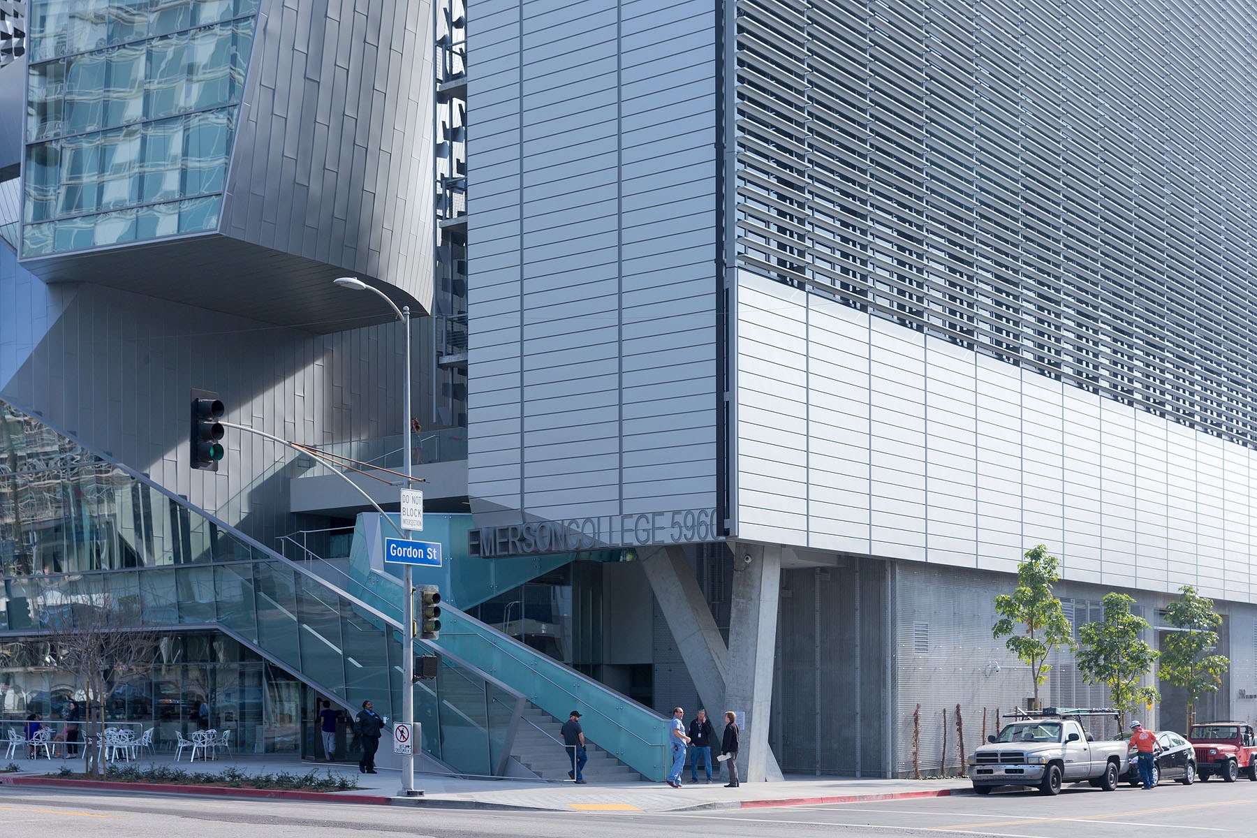
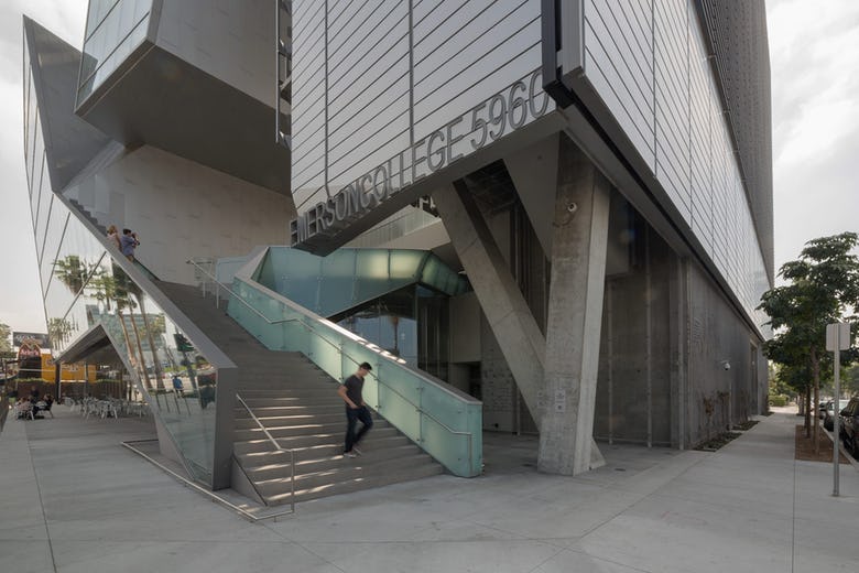
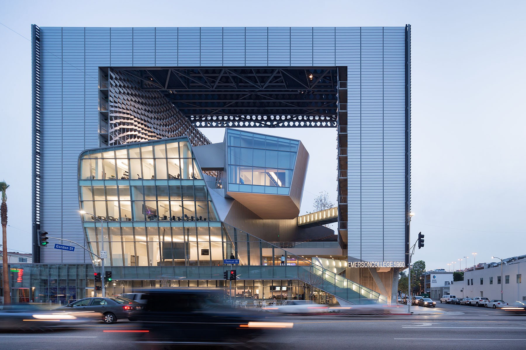
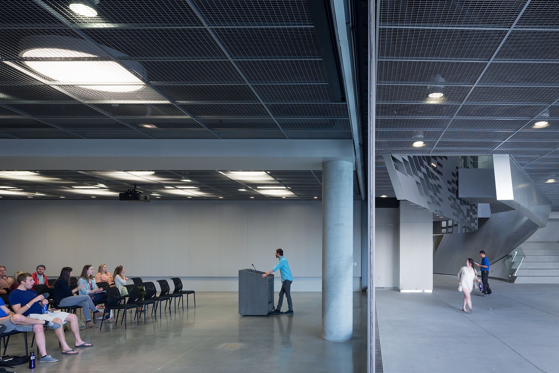
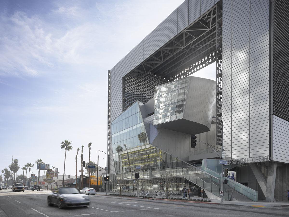
Great design sets the stage for innovation. As a practice constantly looking to the future, Morphosis challenges convention. Rethinking building forms and typologies, the office has become renown for a critical body of work across the world. As one of the firm’s most iconic projects, Emerson Los Angeles was completed in 2014. Built to define the college’s identity at the center of the entertainment industry in Los Angeles, the building establishes a permanent home for the undergraduate internship program, post-graduate certificate program, and professional study programs. The design brings housing, administrative offices and instructional facilities together on an urban site.

Four years later, Emerson Los Angeles has emerged as a significant landmark in Los Angeles. As a backdrop for student filmmakers, the building weaves an urban fabric of outdoor and indoor spaces together with two slender residential towers bridged by a multi-use platform. With over 180 student rooms, four faculty apartments, film and video production labs, and classrooms, the project combines both a sculptural central mass and an undulating, textured metal scrim. At over 100,000 square feet and ten stories high, the project spurred redevelopment as part of a larger transformation in Hollywood. Exploring the structure and its construction, we’ve drawn together the manufacturers that gave life to the design.

Emerson Los Angeles Emerson Los AngelesCurtain Walls

Manufactured by Walters & Wolf

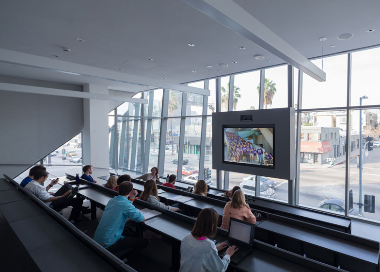
Opening up to outdoor spaces and views of Hollywood, the curtain walls in Emerson were manufactured by Walters & Wolf. Looking out to the famous Hollywood Sign and the surrounding neighborhood, the glazing is concentrated on Sunset Boulevard along the north elevation. Used throughout teaching areas and workspaces, the curtain walls were specified with high performance glass in tandem with an automated sunshade system. Together, they minimize heat gain and maximize views and daylight. Balancing privacy and performance, the project takes a minimal approach to glazing to support more controlled spaces, including a film screening room, sound mixing suites, and computer laboratories. In dorm rooms, the curtainwalls feature operable windows.

Emerson Los Angeles Emerson Los AngelesMotorized Exterior Sunshades

Manufactured by Construction Specialties

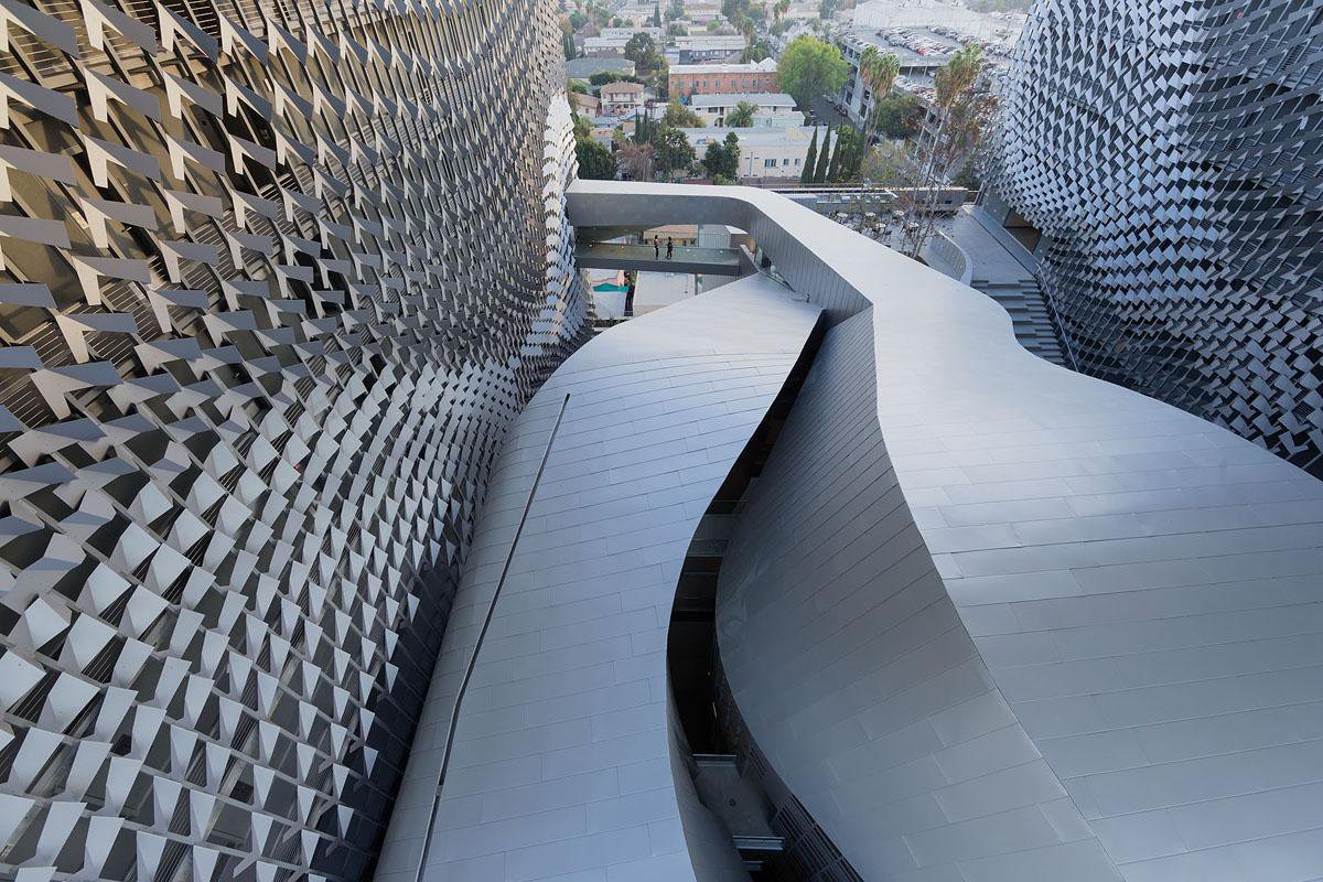
Emerson Los Angeles was designed with a folded panel solar screen to lower the temperature of the air in circulation spaces around the residential and academic areas. Providing shading and natural ventilation of interior spaces, the system by Construction Specialties is connected to weather stations that monitor temperature and sun angle to control the horizontal sunshades. The system opens and closes horizontal fins along the two single-loaded residential towers. This active exterior skin defines the building’s east and west façades.

Emerson Los Angeles Emerson Los AngelesStructural Concrete & Steel

Manufactured by Prieto Construction and Schroeder Iron

Designed with a hybrid steel frame and concrete structure, the building was made with mild reinforced concrete slabs as the gravity framing system. Manufactured by Prieto Construction and Schroeder Iron, the concrete and steel systems include steel beams and columns, castellated beams, post-tensioned concrete slabs and concrete over metal decking. Discontinuous concentric braced frames and steel moment frames were used to transfer lateral forces down to a concrete transfer diaphragm. The thickness of the exterior assembly was determined by the factory-assembled panel system. Together, the concrete and steel accommodate a range of spatial conditions, including open floor space and the need for a helistop spanning atop the academic structure.

Emerson Los Angeles Emerson Los AngelesInterior & Exterior Lighting

Manufactured by Finelite, Winona Lighting and Sistemalux

Drawing from the context of Hollywood film studios, Emerson Los Angeles was inspired by seemingly regular façades housing flexible, open spaces. Interior and exterior lighting was made to integrate with rigging for media connections, sound and screens. The upper platform serves as a flexible armature for outdoor performances, while entire building was conceived as a stage for industry events, screenings, and student films. The lighting by Finelite, Winona Lighting and Sistemalux was made to build upon a play between outdoor and indoor spaces. These were made to be analogous to older urban fabrics in Europe and Asia. At night, the building glows from within, becoming a new landmark along Sunset.

Emerson Los Angeles Emerson Los Angeles Custom Metal Panel Systems

Manufactured by Zahner

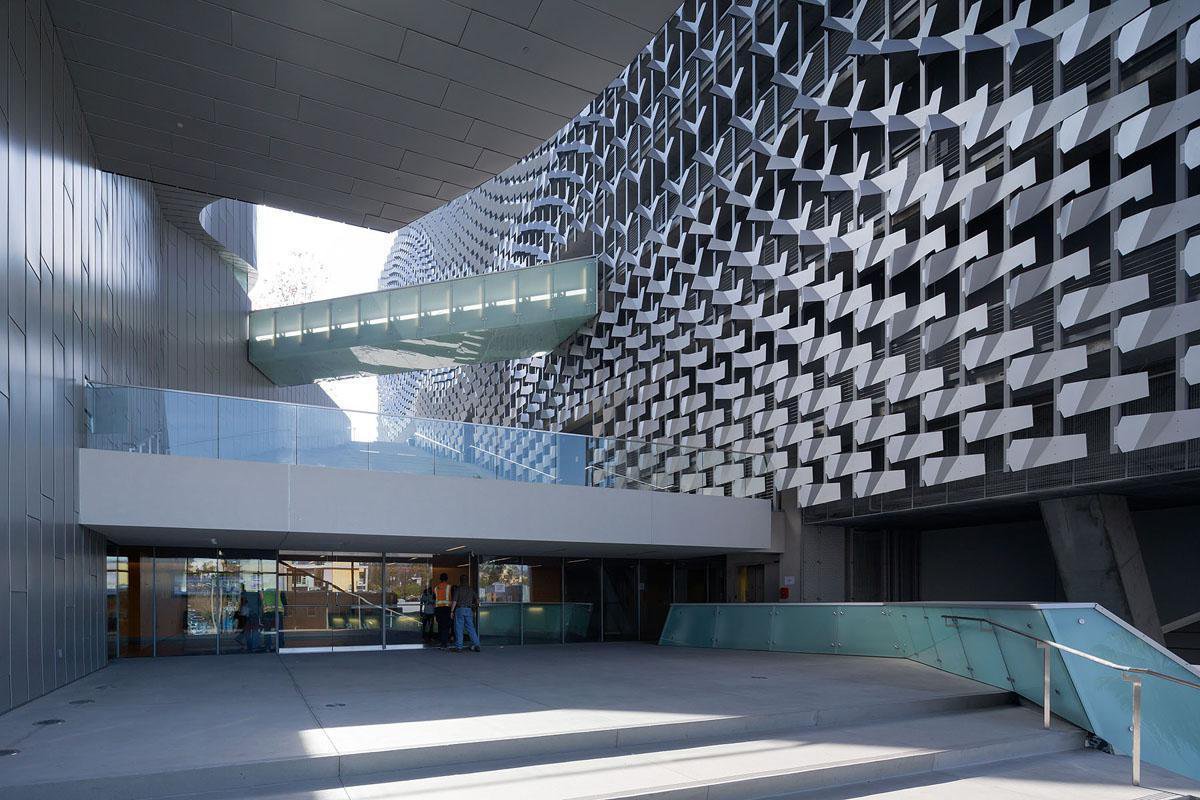
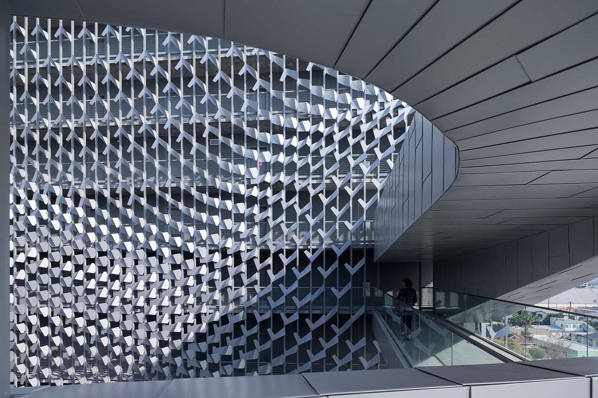
As the most distinctive element of the project, the building features a custom metal panel systems manufactured by Zahner. These screens and panels were made to provide shade and privacy, and are composed of 17 different folded aluminum components. Zahner used 3D models to produce and fabricate the curvatures designed by Morphosis. The eight-story sunscreen was made using computational scripting to determine the final geometry that would shade the internal façades. The dynamic surface was formed through a scripting program that took into account elements like the location of the elm tree in the fifth-floor courtyard and the curvature of the classroom building.

Search for the best materials through Architizer: Click here to sign up now. Are you a manufacturer looking to connect with architects? Click here.

The post Behind the Building: Emerson Los Angeles by Morphosis appeared first on Journal.

2018 A+Awards: Why Your Vote Matters to Architects Everywhere

$
0
0

The public voting period for the 6th Annual A+Awards ends this Friday, July 20th 2018 — this is your final call! Cast your votes using our free and easy-to-use online ballot:

Cast Your Votes Now

Architizer’s A+Awards grew out of a simple yet firm belief that architecture is for everyone, on both sides of the building equation. On the one hand, we believe in celebrating the tireless work of architects who create remarkable spaces for diverse users. On the other, and perhaps most crucially today, we believe in the idea that every single person must have the equal power to identify what an amazing building looks like, inside and out.

Greenwich Peninsula Low Carbon Energy Centre by C.F. Møller Architects, London, United Kingdon — shortlisted in the Architecture + Art Category

Harkening back to Jane Jacobs and the likes, many of the world’s greatest city-builders and architects have operated under the critical belief that those who understand their city best are the people who live, work and play within them. Call it on-the-ground knowledge, experiential knowledge or really whatever you want; the most important thing to remember is that you (yes, you!) are an expert on architecture. You’re well-seasoned after all — Americans, for example, spend an average of 85% of their days inside buildings.

Thailand Creative and Design Center (TCDC) by Department of ARCHITECTURE, Bangkok, Thailand — shortlisted in the Architecture + Furniture category

While these ideas are hardly new and have been percolating for decades, other prominent architecture awards such as the Pritzker Prize fail to hold these tenets true. By trapping voting power within the hands of the elite and rarefied few, they not only collapse any concept of a democratic vote, but also ignore the fact that architecture is shared by everyone. Only through the dynamism of shared usage do buildings truly come to life.

“I see no way in which we can, in good conscience, think of the Pritzker as being anything but a detriment to the profession,” wrote Kazys Varnelis, director of the Network Architecture Lab at the Columbia University Graduate School of Architecture, Planning and Preservation. “Indeed, the entire notion of the Pritzker Prize is testament to the misguided fallacy of architecture as the work of solitary geniuses, ignoring that it is almost inevitably a team product.”

Luminous Drapes by Studio Toggle Architects, Kuwait City, Kuwait — shortlisted in the Pop-Ups & Temporary category

As Architizer continues to occupy a space in which democracy truly matters, we ask you to take this opportunity to cast your ballot. Every single vote holds equal weight, so as you select your favorite project in each category of this year’s incredible shortlist, remember that your voice will be heard just as loudly as anyone else’s. You don’t need to be a Pritzker juror to be inspired by vibrant designs, brilliant spaces and the imaginative people behind them.

With categories that include both built and unbuilt architecture, as well as today’s most cutting edge building products, we can not only collectively celebrate the world as it exists today, but also its future potential. 

LEGO House by BIG – Bjarke Ingels Group, Billund, Denmark — shortlisted in the Architecture + Branding category

Currently in its exciting 6th season, public voting for Architizer’s A+Awards is now open and so, the jury is officially in your hands! Go to our free and simple-to-use online ballot where you will be inspired by today’s very best architecture and vote for your favorite building in each category. Better yet, tell everyone you know to do the same this week.

The more votes cast, the closer we can get to a true reflection of what great design looks like today! Architizer’s A+Awards virtual ballot box is open until July 20th. 

Cast Your Votes Now

Header Image: X HOUSE by Monk Mackenzie — shortlisted in the Unbuilt – Private House (L>3000 sq ft) category

The post 2018 A+Awards: Why Your Vote Matters to Architects Everywhere appeared first on Journal.

Almost Invisible: SANAA’s Minimalistic, Curved Glass Façades

$
0
0

Architects: Find the perfect glazing for your next project through Architizer. Manufacturers: Check out the latest construction leads and sign up now.

When architects Kazuyo Sejima and Ryue Nishizawa, the founders of Tokyo-based Sejima and Nishizawa and Associates (SANAA), were awarded the Pritzker Prize in 2010, the jury lauded their ability to create “architecture that is simultaneously delicate and powerful, precise and fluid, ingenious but not overly or overtly clever.” The pair, trained in the Japanese art of minimalism but eschewing its obsession with crisp angles, have become masters at crafting curvaceous glass buildings whose walls are nearly invisible but whose presence is undeniably felt, as if made of air.

It is a skill they have been developing for decades, working alongside leaders in the glass fabrication industry to design art museums and cultural institutions around the globe. Beginning with their formative works and concluding with their most critically acclaimed project to date, we trace the lineage of SANAA’s adeptly detailed, curved glass façades.

SANAA, curved glass façades

Photo by Iwan Baan; via Archdaily. 

SANAA, curved glass façades

Photo by Iwan Baan; via Archdaily. 

21st Century Museum of Contemporary Art by SANAA, Kanazawa, Japan

Curved glass manufactured by Shinko Glass

The 21st Century Museum is a circular building, inscribed in glass and publically accessible from all sides. The interior is organized by white volumes, containing the galleries and ancillary functions, which breach through the main roof like icebergs emerging from a glass ocean.

The curved glazing for the exterior was manufactured through slumping which involves superheating glass to extreme temperatures and letting it fall under its own weight into molds of the desired shape. The curved panels were then cooled very slowly to prevent stress fractures and distortion. Finally, a clear, glass-strengthening film was laminated to the concave surface of the glass, helping the panels achieve their 16-foot heights without the need for additional bracing.

SANAA, curved glass façades

Photo by Floto Warner/OTTO; via Front Inc.

SANAA, curved glass façades

Photo by Floto Warner/OTTO; via Front Inc.

Glass Pavilion at the Toledo Museum of Art by SANAA, Toledo, Ohio, United States

Curved glass manufactured by Pilkington and AVIC Sanxin

SANAA’s next project, fittingly, was a gallery for the Toledo Museum of Art’s extensive glass sculpture collection. Here, the pair continued exploring the idea of galleries within galleries, this time swapping traditional white walls for an impressive, all-glass interior.

For maximum transparency, the architects selected an extra-clear, low-iron glazing. This enabled the ½-inch-thick sheets to be double laminated without taking on the greenish hue associated with thick glass. There are 500 custom-molded pieces in total, each weighing approximately 1,500 pounds. These massive panels were installed, using a special machine, into recessed channels in the floors and ceilings, creating the impression that the glass is limitless.

SANAA, curved glass façades

Photo via Cricursa.

SANAA, curved glass façades

Photo via Cricursa.

Rolex Learning Center by SANAA, Lausanne, Switzerland

Curved glass manufactured by Cricursa

Inspired by the nearby Swiss Alps, the Rolex Learning Center occupies a rolling floor plate that lifts and dives to create a variety of exhibition and public spaces. The interior is perforated by over a dozen rounded courtyards which bring daylight deep into the building without disrupting the flow of space.

There is over 51,000-square-feet of glazing cladding the exterior. The complication here was not fabricating the curved glass — since SANAA was working with glass bending specialist Cricursa — but installing the glass against the undulant concrete structure. Every unit had to be individually cut to fit precisely between the roof and floor slabs. Additionally, to accommodate the movement of the concrete, the glazing had to be installed in flexible, jointed frames which enable each unit to move independently.

SANAA, curved glass façades

Photo via Cricursa.

SANAA, curved glass façades

Photo via Cricursa.

Louvre Lens by SANAA, Lens, France

Curved glass manufactured by Cricursa

The Louvre Lens, an annex to the Louvre museum in Paris, comprises five rectilinear galleries, clad in flat glazing and polished aluminum, with curvilinear glass interiors. The juxtaposition of planar, curved, transparent and mirrored surfaces creates a kaleidoscopic experience, simultaneously framing and reflecting views of the surrounding parkland.

The exterior glazing is set in front of the roof soffit, allowing it to extend the full height of the building, and is supported by ultrathin, polished aluminum mullions. In comparison, the curved interior glazing is frameless, held together instead by polished aluminum clips and transparent silicone joints. Unlike SANAA’s earlier projects, which relied on slumping, these curved elements where fabricated using a fast bending process wherein glass is bent to the required radius by computerized rollers, making costly molds unnecessary.

SANAA, curved glass façades

Photo by Dean Kaufman; via Archdaily.

SANAA, curved glass façades

Photo by Dean Kaufman; via Archdaily.

SANAA, curved glass façades

Photo by Dean Kaufman; via Archdaily.

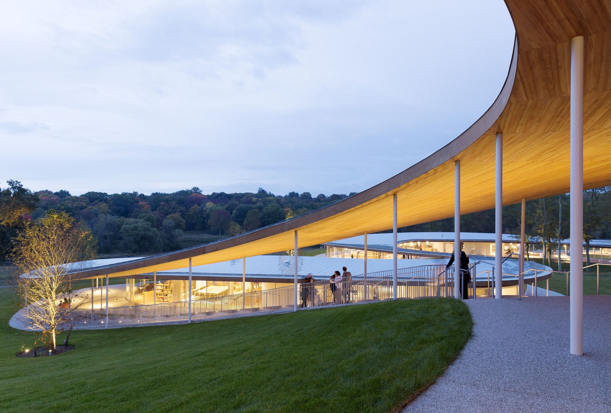
Grace Farms by SANAA, New Canaan, Conn., United States

Curved glass manufactured by Cricursa

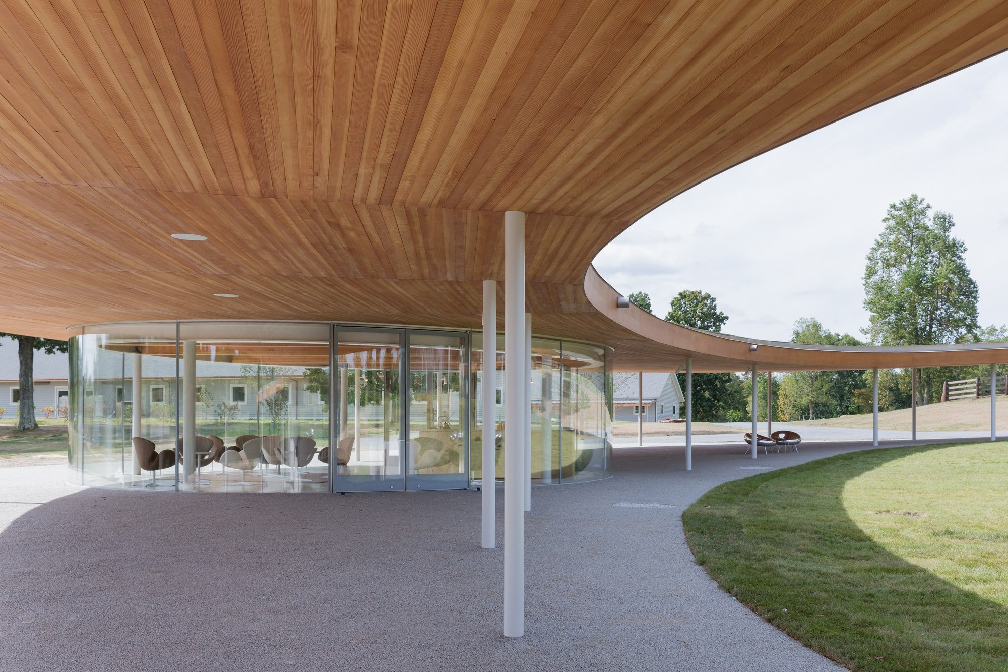
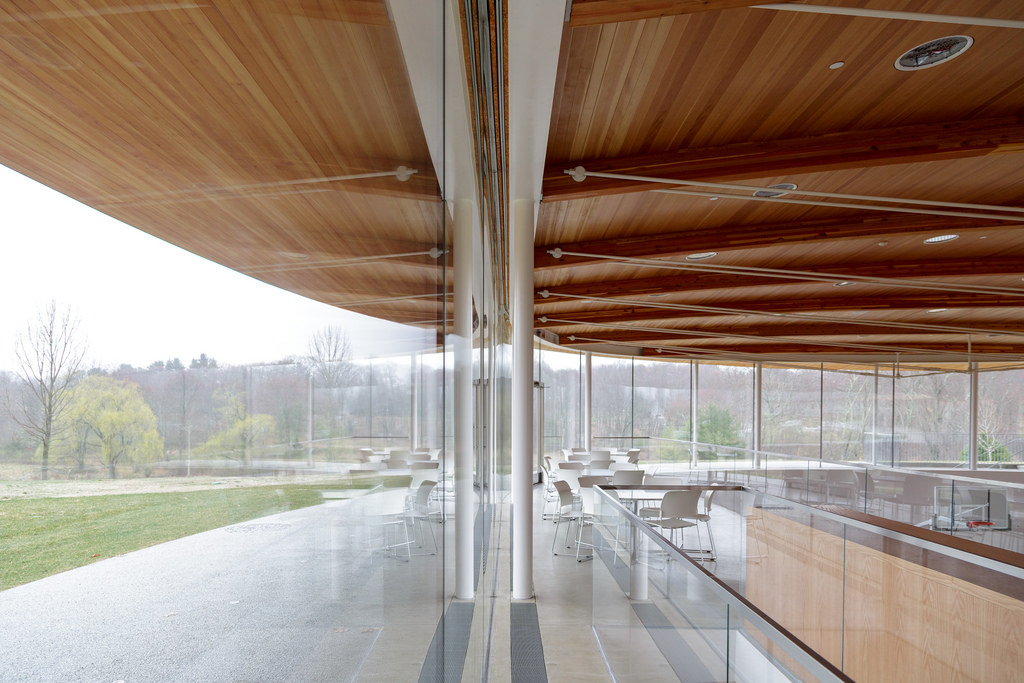
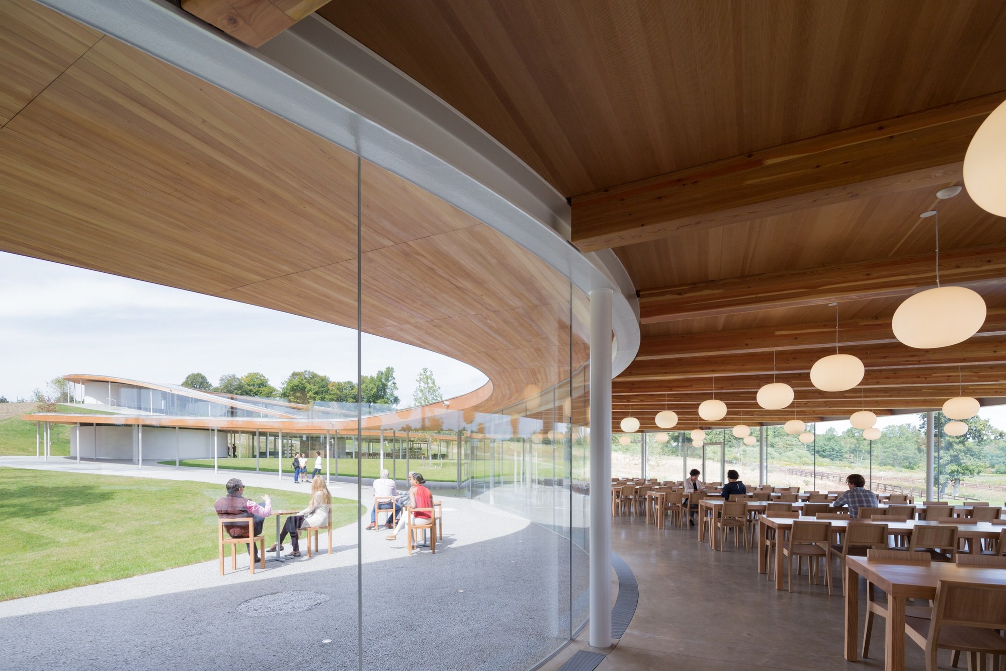
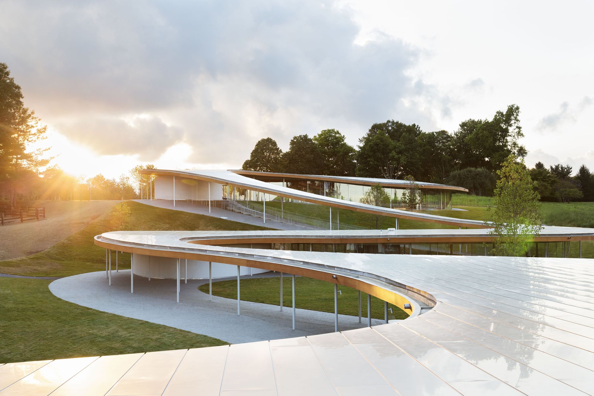
Situated on a gorgeous, 80-acre site in Connecticut, this arts and culture center meanders through the landscape like a river. The serpentine canopy is enclosed in some places and open in others, relying on curved glazing to blur the boundary between interior and exterior. The façades consist of 203 uniquely curved pieces of glass which are installed, without mullions, in a horizontal channel using beads of structural silicone. To keep the interior comfortable, the architects specified a unitized system of double-glazed insulating units with low emissivity coatings. These factory sealed units ensure that the cavity between panes remains air-tight and free of unsightly contaminants.

The resulting façade is as beautiful as it is efficient which is no small feat when dealing with curved glazing. As Ferran Figuerola of Cricursa explained: “The more features you ask for, the more difficult glass is to bend, and here it was necessary to combine low emissivity with high insulation … What we do, as the industry introduces these advancements for flat, is see what we have to do to also achieve it in curved glass. This proactive attitude leads us to advance before the project arrives so when [SANAA] asks us if we can do it, we can say yes.”

Search for Curved Glass Manufacturers

Search for the best curved glazing through Architizer: Click here to sign up now. Are you a glazing manufacturer looking to connect with architects? Click here.

The post Almost Invisible: SANAA’s Minimalistic, Curved Glass Façades appeared first on Journal.

7 Rules for Composing Powerful Architectural Perspectives

$
0
0

Alex Hogrefe is the creator of Visualizing Architecture, a blog dedicated to educating people in the art of architectural visualization. He is also part of rendering studio Design Distill, generating unique and compelling illustrations for architects around the world.

One of the questions I get asked most is: How do I compose perspective shots? I have touched on this subject in past posts but have not organized these concepts into one place. The tips discussed below are by no means the law. There are often circumstances that limit how much the below rules can be or should be implemented, and I break them all the time. But still, I often start with these ideas as a jumping off point.

1. Follow the Rule of Thirds

The rule of thirds is one of the more well-known photography rules and is one that I use most often. Divide the page into three sections both horizontally and vertically creating nine squares. From there, compose the image so that important moments or focal points fall along the lines or at their intersections.

I often place the horizon line of eye level views on the bottom third of the page instead of directly in the center of the image. Above, you will notice that other important elements land on the lines, too, such as the end of the train pavilion and the railroad crossing lights to the right.

Placing the horizon line on the top third of the page also works for low bird’s-eye shots.

The rule of thirds also works great for interior shots. In this case, the perspective lines converge on the bottom right third of the image. Secondary alignments occur with the beams on the top third and left third.

2. Switch to One Point Perspective

In other words, set the camera perpendicular to the structure, essentially generating a perspective elevation rendering. Though this type of image sometimes comes off as a little static, it can be a good complement when paired with more aggressively composed images in a series of illustrations. I often implement one point perspectives when I want a place to feel a little more subdued or monumental.

Above, the camera is placed perpendicular to the train pavilion bridge. This creates a lot of horizontal and vertical lines in the image as opposed to diagonal lines dominating the composition.

3. Master Centering

Centering is hard to pull off, but when done well, it can generate a really compelling image. The focal point of the image is placed directly in the center of the image and is hierarchically stronger than all other elements of the composition.

Above, the image is not perfectly symmetrical but still has a balance to it. The surrounding context is lower, but equal in height, drawing the eye to the center of the image.

4. Let Nature Dominate

In some cases, it is less about the architecture and more about the context. In these situations, the horizon line is moved very low, giving a lot of image real estate to the sky. The same can be done with the ground plane moving the horizon line high in the image, playing up the landscape and minimizing the architecture.

The landscape and more specifically the sky now have a pivotal role in this image instead of acting as a background to the architecture.

5. Get Intimate

All too often, images try to cover too many objectives by telling multiple stories about the design. This leads to weaker images because the focus is on “checking boxes” instead of choosing a view that compositionally is better or that connects well emotionally. Instead of pulling the camera out further and further to get in as much information as possible, move closer and focus in on a single idea.

For the above Cliff Retreat image, I could have included a lot more elements of the design such as the grand stair, the ground level deck below, etc. However, I instead focused on one idea, which was how the cantilevered viewing platform projected out from the cliff and the contemplative space that this created.

Even though there is a lot going on in the above image, there is still only a single focus, which is how the street connects to the monumental stair slanting up the culture center plinth.

6. Correct the Verticals

Most, if not all, architectural photographers follow this convention because it is considered a more accurate representation of the architecture. It is simple to execute and adds another level of refinement to the composition. The adjustment is usually made in eye level and low bird’s-eye views. Also, images with really tall buildings like skyscrapers will typically have the verticals corrected.

For shots at eye level such as the one above, often the vertical lines will converge (angle left or right) the further the camera looks up from the horizon.

The above image shows the vertical lines corrected. There are multiple ways to do this. I typically set my 3D model software (SketchUp) to “Two Point Perspective” before rendering, which solves this problem. However, if the image is already rendered and edited, you can make the correction in Photoshop. I created a tutorial a long time ago describing this process.

7. Don’t Be a Giant

If you are going to create an eye-level view, set the camera height to around 6 feet to better connect the viewer to the experience of being at that space. People often rationalize that they want to better see the ground plane, so they raise the camera to just above head height at 8, 10, 12 feet, etc. However, this makes for an awkward and uncomfortable composition. This rule does break down a bit if you are dealing with extreme sloping sites or standing on a terrace or balcony.

For the above image, the camera is set around 10 feet above the ground. It is hard to tell if the camera is placed on a balcony, if it is being held by a giant or being taken by a low-flying drone. It is important to clarify the intent by either dropping it to eye level or raising it up to 25 or 30 feet.

Here, the camera is set at 6 feet and gives a better sense of being in the space among the people.

When composing an image, there are so many variables to take into account that it can be somewhat overwhelming. Ideas on composition like the ones above help simplify the thought process and speed up the initial camera setup.

This post first appeared on Alex Hogrefe’s blog Visualizing Architecture. Enjoy this article? Check out the other features in our series on “The Art of Rendering”:

Create a Stunning Watercolor Visual Using SketchUp, AutoCAD and Photoshop

Methanoia Reveals the Story Behind Architecture’s Most Striking Visualizations

7 Magical Demonstrations of Hyper-Real Environments

When Architectural Visualization Gets It Right: Victor Enrich’s Surreal Art

A Photographic Approach to Architectural Visualization

Alex Hogrefe Creates Stunning Architectural Visualizations Using SketchUp and Photoshop

4 Unique Approaches to Architectural Visualization

Architizer is harnessing the latest technology to create a better way for architects to research building-products. Sign up today and find everything you need to create amazing architecture.

The post 7 Rules for Composing Powerful Architectural Perspectives appeared first on Journal.

Architectural Details: Klemens Torggler’s Experimental “Evolution Door”

$
0
0

Architects: Find the perfect doors for your next project through Architizer. Manufacturers: Check out the latest construction leads and sign up now.

What makes a door a door?

Typically, it moves on hinges or a sliding track and it serves as an important gateway that allows you to exit one place and swiftly enter another. Under this everyday criteria, it is difficult to say whether or not Vienna-based artist Klemens Torggler’s crazy kinetic “doors” qualify. In fact, not only do his stunning works of art make such meager qualifications seem unimportant, but he also seems particularly unbothered by what you choose to call them. These law-defying designs transcend doors; they are more like installation art or sculptural masterpieces and ultimately hold their own beyond such passé categorization.

Left: video via YouTube; right: Evolution Door via Klemens Torggler

Torggler has been avidly experimenting with origami-like doors since 1997. Over the past 20 years, he has developed several distinct iterations using various combinations of rods, wheels and triangular and square panels. Each one involves new mechanical experimentation, the resulting solution being guided by budget constraints, architectonical context and its final location of use.

Torggler’s work gained exponential traction with the Evolution Door. When moved with just the flick of a finger, the Evolution Door floats through space so slowly and with such fluidity that it is almost eerie; it is as if such patient movement could only be achieved under the cast of wizardry or magic.

With over 5.5 million views, the Evolution Door moves sideways without the use of tracks; video and image via Klemens Torggler.

So how does it work? The Evolution Door is connected to the door frame with two pivots — at the top and bottom — and consists of four triangular “flip-panels.” When movement is instigated, the four sections collapse in on themselves and rotate 90 degrees before straightening back up into a rectangle. After the fact, the door reverts to what appears to be an untouched state of natural homeostasis, at which point it is mind-boggling and exciting to decipher what just unfolded. The Evolution Door has been executed using wood, steel and aluminum.

Left: the Rod design constructed in steel; right: the Screen design constructed in fabric and wood; images via Klemens Torggler

Torggler’s Rod version of the door is the most suitable design for heavy and massive materials. On his personal YouTube channel, the artist is depicted pushing 200 kilograms (440 pounds) of 10-millimeter-thick steel with barely any effort. In contrast, the Screen is a fixed device that is centrally fastened to a floor-to-ceiling pole. Unlike Torggler’s other designs, it is a prototype intended to be used as a stationary room-divider. Most recently, the artist has experimented with an expansive eight-paneled design with four vertically stacked panels on either side of the door frame.

Left: Tangram via Wikipedia; right: butterfly painted door via Klemens Torggler

Torggler’s masterful portfolio is often compared to the lightness and delicacy of paper origami. While he never actually got his hands on origami growing up, Torggler recalls playing with tangram — a Chinese dissection puzzle that is often referred to as the earliest psychological test in the world. In tangram, seven flat pieces are dissected and reconfigured into endless geometric combinations. His work takes a similar approach.

By harnessing a series of simple individual components, he creates imaginative and impeccably well-oiled systems. Torggler’s experimental work serves as an inspiration to door designers, manufacturers and lovers worldwide.

Search for Door Manufacturers

Search for the best building-products through Architizer: Click here to sign up now. Are you a manufacturer looking to connect with architects? Click here.

The post Architectural Details: Klemens Torggler’s Experimental “Evolution Door” appeared first on Journal.

Critical Mass: An Architect’s Guide to Monolithic Building Techniques

$
0
0

Architects: Find the raw materials for your next project through Architizer. Manufacturers: Check out the latest construction leads and sign up now.

Monolithic buildings have historically been used to communicate permanence, power, rule-of-law and durability. As such, mass in a building form is both symbolic of larger societal ideals as well as an aesthetic choice. Current technology, however, has allowed architects to more cheaply and rapidly construct a solid-looking building, which begs the question: What is the value of a truly massive building in our architectural culture today?

This collection addresses a variety of massive building techniques including cast-in-place concrete, rammed earth, stacked monolithic stones and masonry units, all using expressed load-bearing materials.

Concrete Studio by Mell Lawrence Architects, Austin, Tex., United States

This studio design for a creative family is a play of dualities; the heaviness of concrete with the transparency of glass, the hardness of a wall with the soft edges of the landscape. This small structure is composed entirely of poured-in-place concrete that used custom formwork to create a repetitive exterior texture.

Modern Ruin by autotroph, Santa Fe, N.M., United States

Using a rammed-earth building technique this private residence references a ruin, something built sturdily many years ago that persists. The massive form houses utility components of the project while the weathered steel marks the living quarters.

HOUSE 1101 by HARQUITECTES, Sant Cugat del Vallès, Spain

This house uses a dual double masonry wall construction with load-bearing bricks a natural red on the exterior, and painted white on the interior. The house’s cubic forms are connected with free-flowing breezeways that can be fully opened to the outside or closed from the elements.

The Truffle by Ensamble Studio, Costa da Morte, Spain

Embracing the layers of earth, this small retreat is made of unreinforced concrete that was formed by piling soil on the exterior and carefully arranged hay bales as place-holders for the interior volume. The hay was then removed and the soil redistributed producing no material waste.

House 1014 by HARQUITECTES, Granollers, Spain

This project is situated in a historic city center and as such is hypersensitive to scale and existing context. Retaining the historic stone façade, this renovation contrasts the exiting fabric with load-bearing brick walls as solid as their predecessors.

Seashore Library by Vector Architects, Hebei Sheng, China

It is easy to make something that is heavy look heavy. This library on the Chinese coastline uses light to make its massive concrete structure seem unimposing and nimble.

Search for Concrete Manufacturers

Search for the best building-products through Architizer: Click here to sign up now. Are you a manufacturer looking to connect with architects? Click here.

The post Critical Mass: An Architect’s Guide to Monolithic Building Techniques appeared first on Journal.


The Future of Social Housing: 7 Low-Rise, High-Density Developments

$
0
0

Architects: Research materials for your next project through Architizer. Manufacturers: Check out the latest construction leads and sign up now.

As cities around the world struggle with solutions to the housing shortage that faces many communities, one urban building typology has been floated for decades that might increase housing units without reducing quality of life: low-rise, high-density. Emerging in the 1960s and 70s as an antidote to the severe “tower in the park” model offered by Le Corbusier and others, this housing typology had the potential to overcome some of the downsides of massive urban renewal in its emphasis on livable scale and community context.

Low-rise, high-density housing attempts to combine the best elements of both urban and suburban development schemes: a multitude of public transportation options, access to urban services, moderate scale, public open space and individualized dwellings. It can therefore reduce sprawl and efficiently use the limited space found in the urban environment, while also maintaining the street grid and pedestrian pathways.

The following projects show us a few contemporary examples of this building typology, which has the potential to mitigate housing issues and elevate previously neglected communities. From the inner cities of Canada to the posh streets of London, these innovative social housing projects display the low-rise, high-density typology’s great promise for future urban development.

Donnybrook Quarter by Peter Barber Architects, London, United Kingdom

The winner of a British housing design competition, this Peter Barber-designed social housing project in uber-expensive London is organized around two newly created tree-lined streets that parallel the surrounding neighborhoods. Residents’ balconies and windows overlook the public spaces in the complex on all sides, increasing the sense of safety and community for inhabitants.

Social Housing in Athis-Mons by Atelier VongDC, Athis-Mons, France

Featuring two complementary street and garden-facing façades, this social housing project in France draws inspiration from the post-war slab apartment buildings that characterized many European cities after World War II and the pre-war brownstone streetscapes of cities such as New York. The varying rhythm of the garden-facing façade is mirrored by the placement of balconies on the street side.

Queensway by Ayre Chamberlain Gaunt, Southampton, United Kingdom

Built as part of the city’s regeneration scheme, this subsidized social housing project in the U.K. features three different housing typologies, creating a diverse spatial configuration for the building’s inhabitants. The project has a mix of four-story townhouses, two-story mew houses, and three and four-bedroom apartments, allowing large families to take advantage of this housing opportunity. The different types of brickwork evoke the area’s industrial past while breaking up the building’s massed forms.

The Whale by de Architekten Cie., Amsterdam, Netherlands

The Whale is a high-density complex of apartments located in Amsterdam’s former industrial harbor that achieves 100 dwellings per hectare. The undulating roofline of this complex is echoed underneath, as the architects have raised the ground floor of the structure to allow light and air into an interior courtyard.

Hannibal Road Gardens by Peter Barber Architects, London, United Kingdom

Hannibal Road Gardens is another London social housing project by architect Peter Barber in the East End neighborhood of Stepney. The project replaces a row of parking garages that previously served the already existing housing estate and completes the fourth side to what was once a three-sided complex. The eight new townhouses feature at least two garden terraces and individual entrances for large families at subsidized prices.

46 Social Houses by Gabriel Verd, Sevilla, Spain

Set on a small plot in suburban Sevilla, this high-density housing project is organized around a courtyard with each apartment having visual access to both the street and the interior areas. The balconies extend the living spaces into the outside, while corrugated zinc panels in different alloys give the impression of changing light and texture on this low-cost material.

Claredale Street Housing by Karakusevic Carson Architects, London, United Kingdom

Working closely with community residents and the relevant agencies, the architects replaced an eight-story Brutalist housing estate that had low permeability and visibility with a new three-story housing block that increased the flow of pedestrians and connection to the surrounding neighborhood. The project redresses some of the inhospitable housing estates created in the Brutalist style.

Search for the best building-products through Architizer: Click here to sign up now. Are you a manufacturer looking to connect with architects? Click here.

The post The Future of Social Housing: 7 Low-Rise, High-Density Developments appeared first on Journal.

18 Intricate Examples of Traditional Japanese Wood Joinery

$
0
0

Architects: Find the perfect wood building-products for your next project through Architizer. Manufacturers: Check out the latest construction leads and sign up now.

We tend to think of knowledge in terms of progressive accumulation, with each succeeding generation having more information at its disposal than the one that came before it. What is less recognized, however, is the knowledge that gets lost in the course of progress. In architecture, particularly, little attention is paid to the way in which the standardization of building practices led to craftsman techniques falling by the wayside.

japanese wood joinery

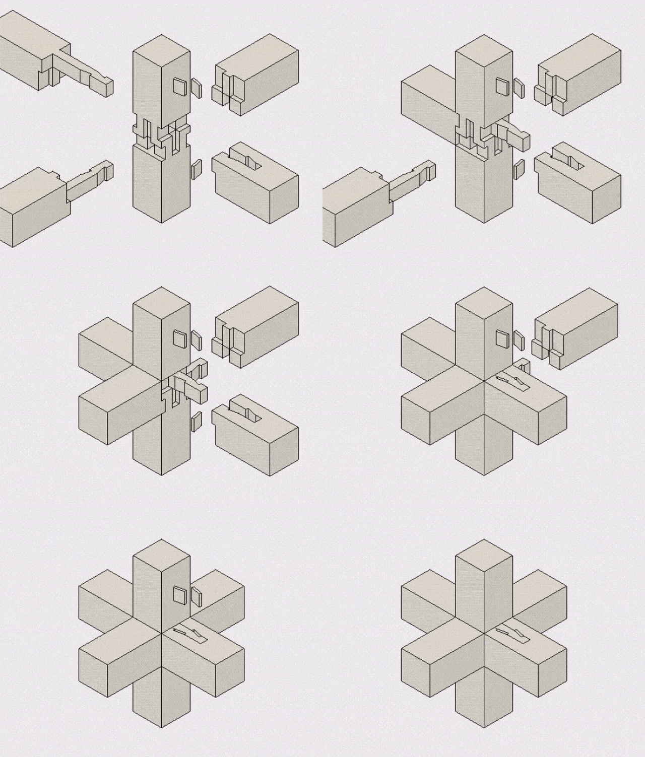
車知栓継ぎ仕口の四方差し Shachisen-tsugi-shikuchi-no-shihousashi. GIF via The Joinery (@TheJoinery_jp)

Nowhere is this more apparent than Japan, a nation with an architectural tradition like no other. Long before screws and metal fastenings became de rigueur, Japanese builders had mastered the art of wood joinery. Using techniques handed down in guilds and families for centuries, Japanese builders would fit wooden beams together without any external fasteners. Buildings would stand for generations, held together with nothing more than tension and friction.

Over time, these traditional building practices mostly fell out of ordinary use, although they continued to serve as a source of inspiration for architects like the Japanese master Shigeru Ban. While traditional joinery techniques were documented in books and archives, their two-dimensional representations were hard for non-experts to visualize; that is, until recently, when one woodworker decided to bring these techniques back from the dead in GIF form.

japanese wood joinery

河合継手 Kawai-tsugite. Via The Joinery (@TheJoinery_jp)

@TheJoinery__jp is the Twitter account of this artist, a young Japanese man who works by day in automobile marketing. At the time of writing, he has created GIF illustrations of 81 traditional wood joints. The project is ongoing, as the creator continues to seek new information about this fascinating tradition from books, magazines and other archival sources.

To create his GIFs, The Joinery uses the mechanical design software Fusion 360. His own experience as a woodworker brings an expert touch to the animation, which deftly captures the satisfaction that comes when parts fit together perfectly. Overall, the project is a great example of how modern technology can facilitate novel, dynamic engagement with old secrets buried within the archive. In fact, as ArchDaily’s Patrick Lynch points out, these joinery techniques may be relevant yet, as CNS milling and 3D fabrication continue to transform the way we build.

japanese wood joinery

Via The Joinery (@TheJoinery_jp)

Check out more of these mesmerizing animations via the medium of Twitter:

Search for Wood Manufacturers

Find the best wood building-products through Architizer: Click here to sign up now. Are you a door manufacturer looking to connect with architects? Click here.

Top image via HILLBILLY DAIKU

The post 18 Intricate Examples of Traditional Japanese Wood Joinery appeared first on Journal.

Uncontainable: The Future of Shipping Container Construction

$
0
0

Find the perfect building-products for your next project through Architizer. Manufacturers: Check out the latest construction leads and sign up now.

SG Blocks, Inc., a leading designer, innovator and fabricator of shipping container-based structures, has signed a master services agreement with Grimshaw Architects, an award-winning, international architecture and design practice. Under the terms of the agreement, SG Blocks will incorporate Grimshaw as its premier design partner for utilization across its current projects and pipeline of future opportunities. In return, this partnership will allow Grimshaw to incorporate SG Blocks’ container-based structures into its global and award-winning industrial design portfolio.

Architizer sat down with Paul Galvin, Chairman and CEO of SG Blocks, to learn more about his company, the benefits and challenges of building with shipping containers and what this partnership with Grimshaw means for the future of the construction industry.

shipping containers, SG Blocks

Inside the SG Blocks factory, shipping containers are modified into modular building elements. Photo via SG Blocks.

Galvin was inspired to found SG Blocks in 2007, along with businessman Steve Armstrong and former-freight ship officer David Cross, after seeing a home the pair had constructed in Charleston, South Carolina, using reclaimed shipping containers. “I immediately saw the value of this method of construction, from commercial to retail to residential,” he said, “The product especially resonated with me given my background in affordable housing and non-profit work. I saw this as an important solution to many housing problems in the U.S.”

From its inception, SG Blocks was at the forefront of container-based solutions and, last year, after nearly a decade of research and testing, the company became the first container supplier to receive an ESR number from the International Code Council (ICC). This number effectively makes SG Blocks’ containers a standardized building product, no different than a store-bought tile or mass-produced brick, which “ensures their ability to meet and exceed all international building codes” while expediting the permitting process.

shipping containers, SG Blocks

A container-based home under construction in the woods. Photo by Karen T. Borchers; via SG Blocks.

When asked the reasons to consider shipping containers over more conventional building materials, Galvin cited “better quality, efficiency, price and speed,” noting that a container-built structure can be “completed in approximately half of the amount of time and with substantial savings in most urban markets.” He went on to explain that “containers are also very durable and, since they are built to withstand maritime conditions, are hurricane and earthquake proof.”

SG Blocks is also proud of the fact that their product utilizes salvaged containers, minimizing the demand for virgin resources and reducing the ecological footprint of new buildings. Using “a recycled product is very sustainable and prefabricating modules offsite speeds up onsite construction and reduces its environmental impact,” affirmed Galvin, “Constructing your building out of a recycled building material, such as a shipping container, is also a contributor to achieving LEED certification.”

shipping containers, SG Blocks

Diagram of a modular, container-based structure. Image via SG Blocks.

Despite these numerous benefits, the construction industry has been slow to adopt container-based construction, especially for large and multi-story projects. “We feel that the construction industry is protectionist and does not like new technologies because it likes to have control,” Galvin said, “But the most logical way to disrupt traditional construction is through prefabricated, modular container-based solutions.”

“The biggest misconception we face is that each room in a building is the actual size of one container. We educate people to understand that walls can be removed to create living spaces, as well as added to create rooms of any size. Shipping containers are engineered to be stackable nine stories high at sea. At SG Blocks, we maximize on this feature … We have several projects which are focused on larger-scale facilities such as a nearly 24,000-square-foot community arts and recreation center for the Heart of Los Angeles; a 6,000-square-foot retail project with Gather GVL, in Greenville, South Carolina; and an 8,000-square-foot new office space for Irontek.”

shipping containers, SG Blocks

Rendering of a proposed, six-story container-built structure. Image via SG Blocks.

The newly signed master services agreement with Grimshaw Architects will help SG Blocks expand on its already impressive portfolio to bring the cost effectiveness, sustainability and customization of container-based construction to an even more diverse range of project types. “We are truly honored to be collaborating with Grimshaw, one of the premier global architectural firms in the world,” stated Galvin, “As we expand SG Blocks’ footprint both nationally and on a global scale and work on larger, more impactful projects, we look forward to working with Grimshaw to create container-based facilities of the future that set the highest possible standards of excellence.”

Search for Prefab Manufacturers

Research building-products and materials through Architizer: Click here to sign up now. Are you a product manufacturer looking to connect with architects? Click here.

The post Uncontainable: The Future of Shipping Container Construction appeared first on Journal.

How Morphosis Harnessed CAD and Concrete for the Perot Museum

$
0
0

Architects: Find the perfect materials for your next project through Architizer. Manufacturers: Sign up now to learn how you can get seen by the world’s top architecture firms.

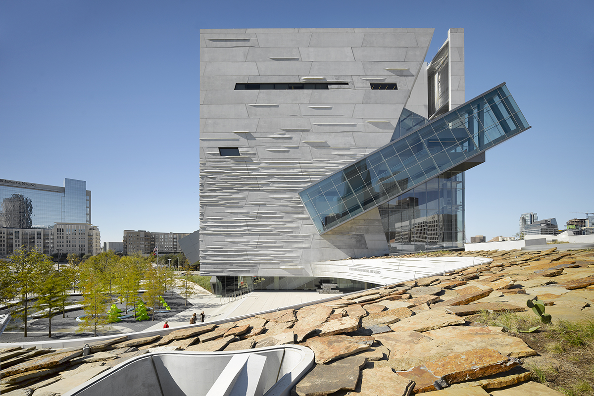
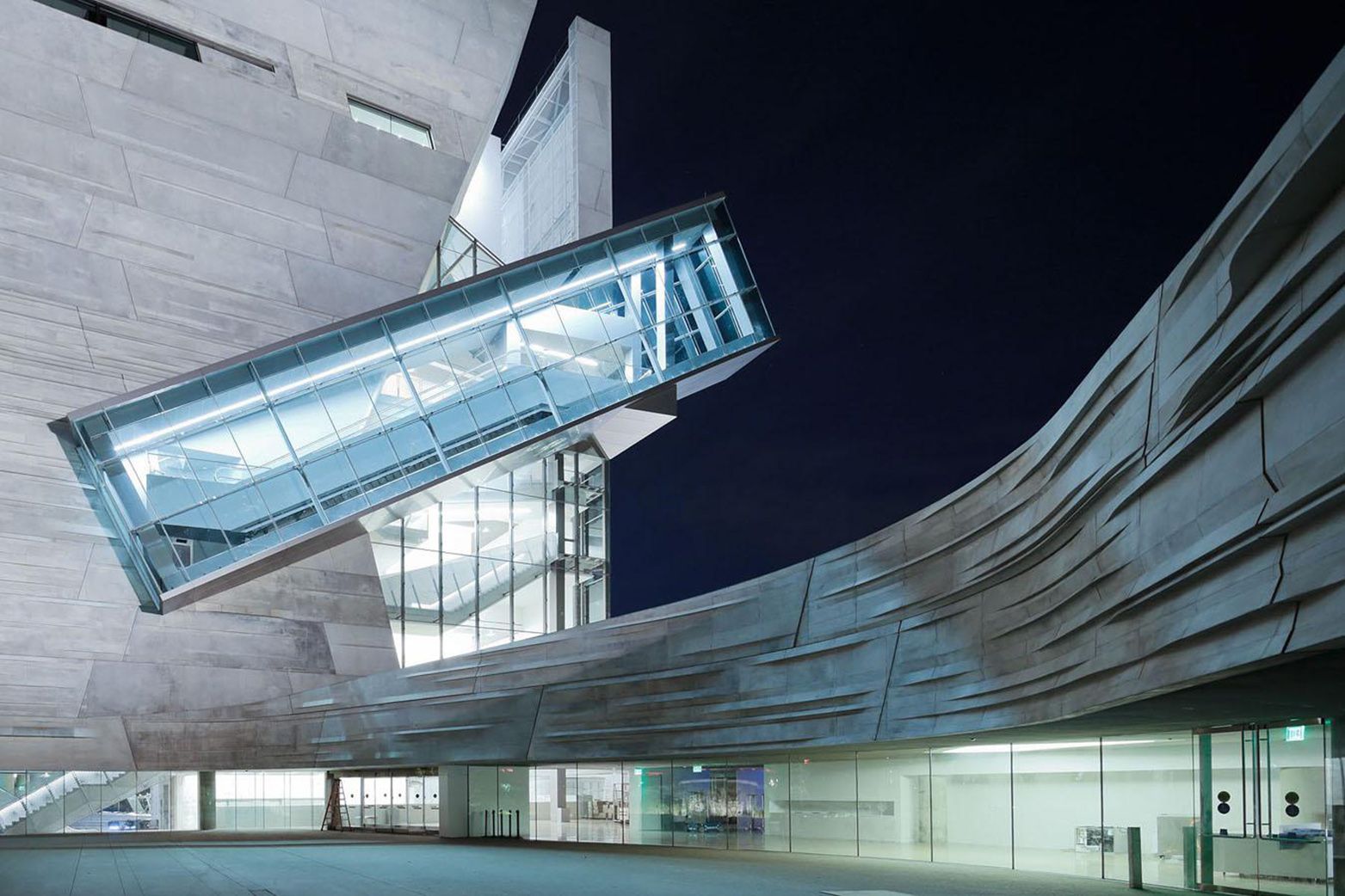
Rethinking the most widely used manmade material takes creativity and craft. Giving shape to concrete, Morphosis Architects explored the material’s potential through the Perot Museum of Nature and Science in Dallas. Built to bring a simple cube and plinth into high relief, the Perot Museum showcases a precast-concrete panel façade that’s both striated and refined. As a material investigation integrating structure and formwork, the elegant cladding solution was made possible through computer aided modeling and a collaboration with Gate Precast of Hillsboro, Texas.

Perot Museum

Image via Morphosis

The project used a mold system of geometry families, both protruding and recessed, to create a series of 4 panel shapes in 12 patterns. These mold pieces were constructed with varied combinations to form new panels. The custom concrete façade was then fixed to the metal structure and made to be load-bearing. The family of molds were used interchangeably to create a surface that appears highly variable, without repetition.

Gate Precast Concrete

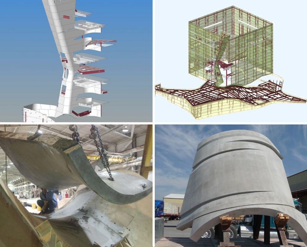
Top: Computer modeling the building’s exterior façade; bottom: images of the fabrication process; via Gate Precast

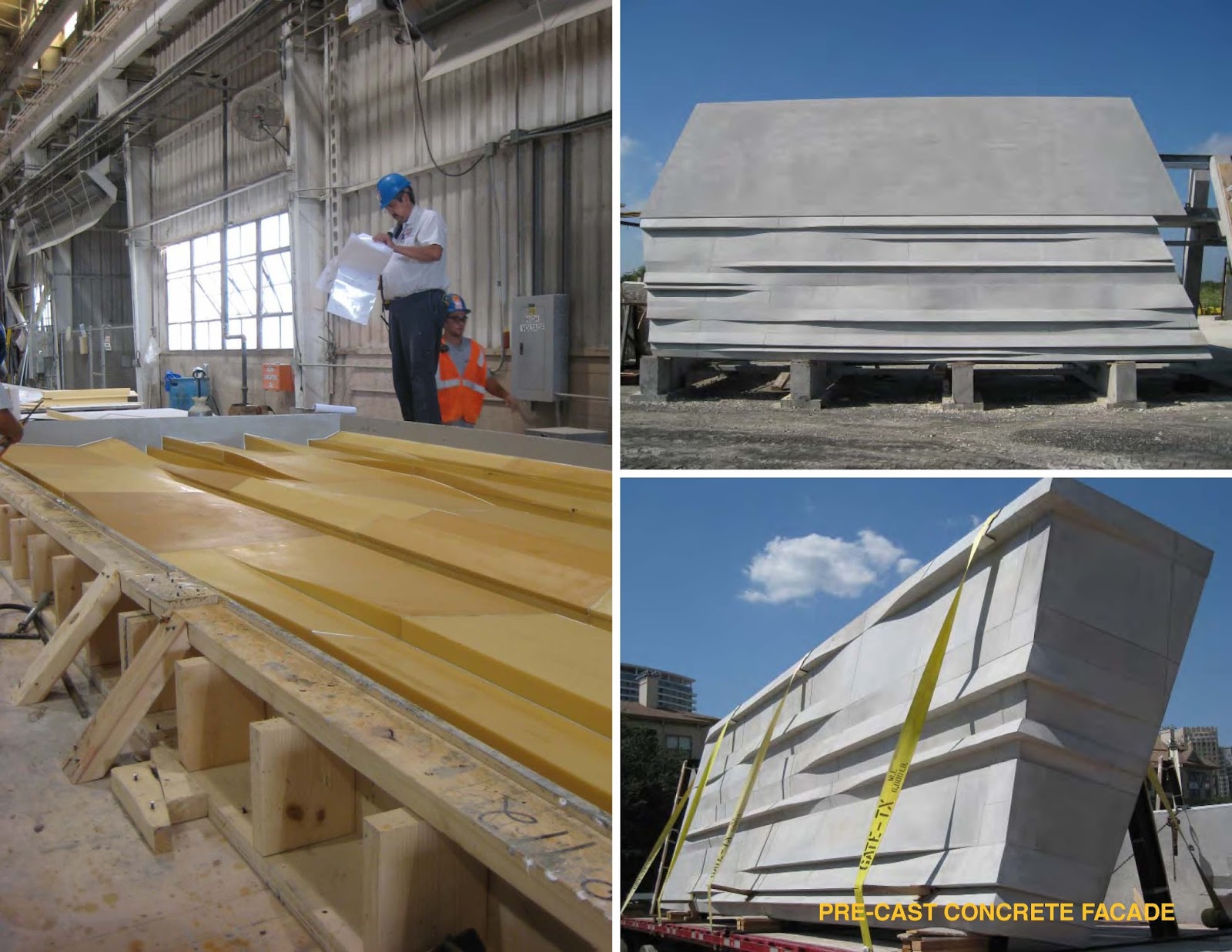
Expressive as it is durable, the concrete panels were reimagined through texture, pattern and form. Morphosis selected a plain gray concrete mix, without pigment or white cement, understanding there would be natural mottling to each panel. 656 precast panels, typically 8 by 30 feet (and weighing up to 16,000 pounds at 9′ inches thick) were made with wood-framed rubber molds to keep façade costs lower. End panels were unique, requiring the short end be poured and set first, then attached with a cold joint after the long section was rotated and poured.

Images of Gate Precast’s manufacturing process; via Gate Precast

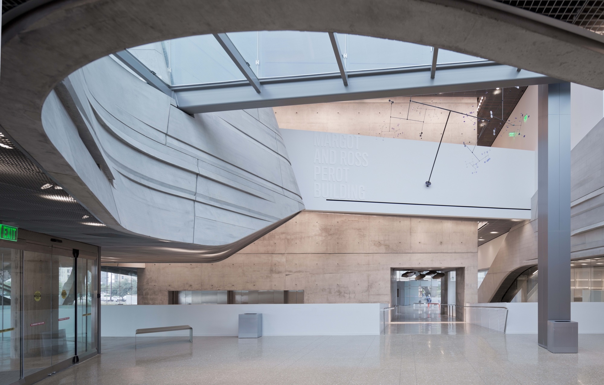
The stone-colored exterior combines with steel and glass alongside the cube’s interior atrium. Here, the precast curvilinear concrete was suspended from the roof. Both inside and out, the precast concrete was made to resemble geological formations. The profiles of protrusions and crevices created irregular surfaces that form the organic façade. The general contractor installed the panels over nine months to create the series of waves that change with sunlight and shadows. Workers were able to install four to six panels per day throughout the construction process. Texture is more dense at the bottom of the cube, made to look as if the building is dissolving across the vertical dimension.

Perot Museum

Image via Morphosis

In total, the tower, the largest part of the museum, is made up of 70,000 sq ft of precast panels; a plinth section consisting of 220 curved panels; and the atrium inside the tower containing 100 panels. The installation process was meticulous, where the Gate’s engineering department provided a “face of panel” dimension to each corner of every panel so that the surveyors could locate exactly where the panel face should be in its correct position.

Perot Museum

Image via Morphosis

Giving a new form to concrete, the Perot Museum is a showcase of versatility and technical ability. Combing creativity and craft, the design achieved LEED Gold certification with recycled materials used in the concrete panels and localized manufacturing. As the sum of its parts, the museum has emerged as a new icon for Dallas and a landmark project for concrete specification and construction in contemporary architecture.

Search for Concrete Panel Manufacturers

Research all your architectural materials through Architizer: Click here to sign up now. Are you a manufacturer looking to connect with architects? Click here.

The post How Morphosis Harnessed CAD and Concrete for the Perot Museum appeared first on Journal.

Architectural Details: COBE’s Audacious Silo Makeover

$
0
0

Find the perfect materials for your next project through Architizer. Manufacturers: Check out the latest construction leads and sign up now.

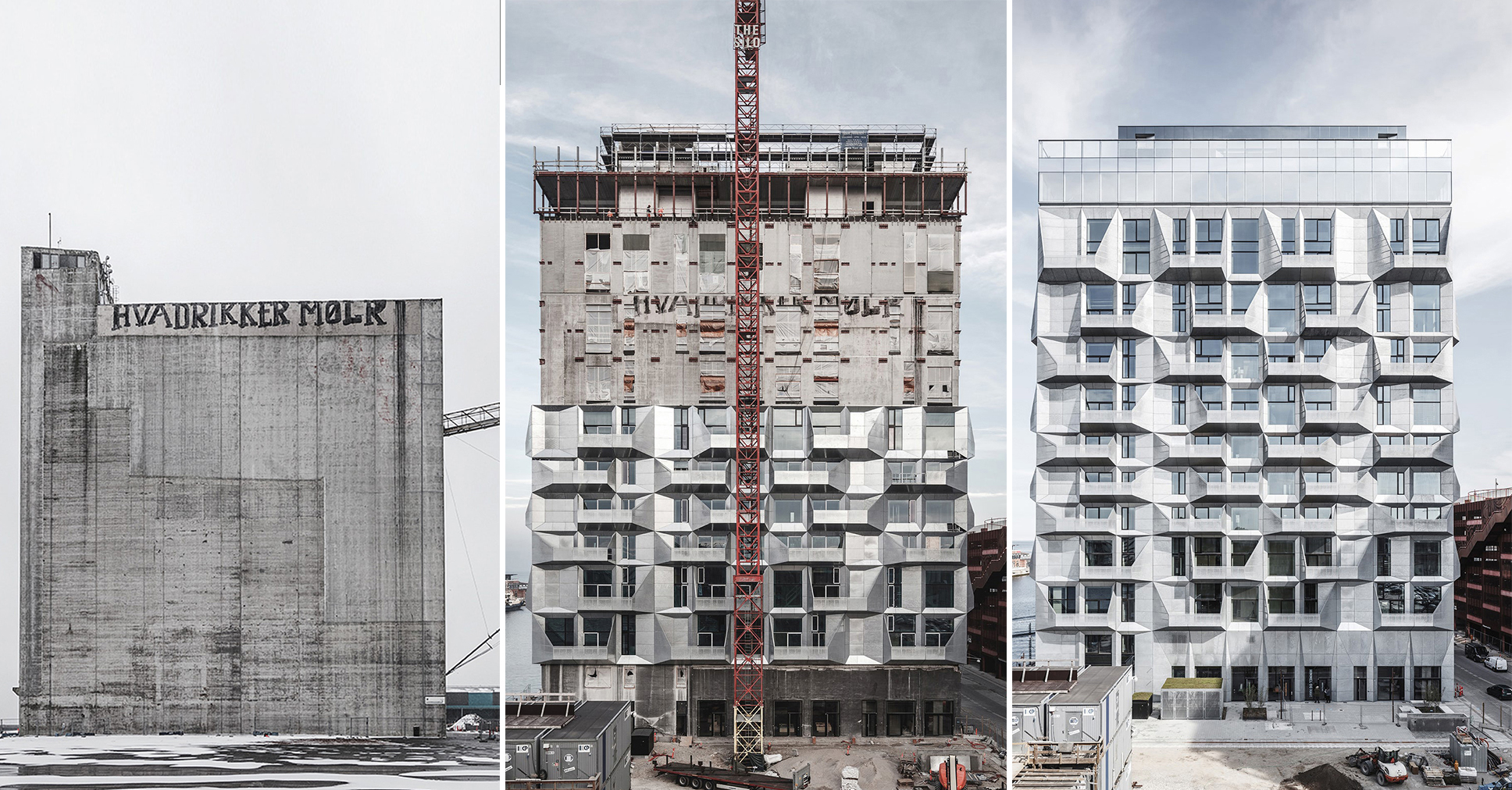
Copenhagen’s coolest metal-clad construction was recently completed by innovative Danish design studio COBE. The firm’s highly anticipated project, The Silo, is an old industrial grain storage facility–turned–apartment complex set within the city’s redeveloping Nordhavn district. With four new galvanized-steel façades featuring faceted balconies, the building’s monolithic concrete-clad past is utterly unrecognizable.

The 17-story complex towers over the other former factories in the neighborhood. Newly minted in shiny steel, the structure stands out as an exemplar of the area’s future reconstruction. In addition to The Silo, COBE is reimagining nearly 4 million square meters (990 acres) of the postindustrial waterfront as a contemporary architectural haven.

According to the architects, The Silo’s unique design was predicated upon the building’s old life as a massive granary. Its slender concrete framework was the perfect setup for COBE to take an adaptive reuse angle on the project. COBE teamed up with Skandinaviska Glassystem (SGS) to bring the building up-to-date with current sustainability standards. By creating an extremely energy-efficient, sandwich module façade, the Danish manufacturer aimed to reduce energy consumption over the building’s entire lifetime and design a watertight construction.

Elevation (left) and section (right) of COBE’s proposed transformation

Before and after: the existing Silo (left) and a rendering of the proposed cladding (right)

Caroline Nagel, project director at COBE, explained the thinking behind the striking exterior paneling. “We wanted to find a robust, rough, harbor-like material, which patinates in a raw way,” she said. “We also wanted a lively façade where the water and surrounding will be reflected during the day. Like the old concrete façade of the silo, we wanted one new façade material, which could solve all situations — from climate shield to wind and rain protection, to balcony railing and protection.”

The design team chose galvanized steel, a strong and versatile material, to form protruding balconies that take on a sculptural aesthetic. Apart from its impressive looks, the new metallic skin can withstand the harsh cold-weather conditions of Copenhagen while aging in a way that’s attractive and on-trend with current architectural façade treatments.

The modular balconies were fully assembled before being craned into position.

The galvanized steel is left exposed, fully expressing the façade’s materiality.

While the building’s exterior envelope steals most of the attention on this project, the spatial variation within the structure also makes a unique interior layout. Each level of the building has a different ceiling height — some 3.5 to 7 meters tall [11 to 23 feet]. This means that The Silo’s 38 units, all with floor-to-ceiling windows and panoramic views, boast distinctive living spaces. Nagel said this design detail helps amplify the expression within the new façade but also complicated the construction process.

“The original silo appeared geometrically very simple and straight in the beginning,” she said. “However, it proved a bit more complex, slightly — yet significantly — twisting up to 14 centimeters from the ground to the top, triggering an important question in the initial stages of the detailed design process: Should we absorb the skewness and aim for a new façade perfectly in lodge, or should the new elements adapt to it and reflect the original geometry?”

COBE chose the latter. The protrusions on the façade inherently camouflage any irregularities within The Silo’s structural framework. Its monolithic design — broken apart at the base and crown of the building with a ground-floor event space and a glass-enclosed restaurant on its top floor — forms the most dramatic of concrete-to-metal makeovers and shows the potential for a single material to transform the way we perceive our industrial past.

Search for Steel Façade Manufacturers

Research all your architectural materials through Architizer: Click here to sign up now. Are you a manufacturer looking to connect with architects? Click here.

Images via COBE by Rasmus Hjortshooj

The post Architectural Details: COBE’s Audacious Silo Makeover appeared first on Journal.

Architizer Launches Product Search for Architects!

$
0
0

Architizer’s new Product Search Engine is in beta mode — check it out and let us know what you think here!

Architects play a crucial decision-making role in the specification of building-products and materials. Since Architizer was built by some of those very architects, we empathize with the challenge that design professionals face each day when searching for the perfect products for their projects. Today, we’re thrilled to reveal a dedicated search engine that will help you quickly find high quality architectural elements, each and every day.

Architizer’s Product Search Engine complements the recently developed Manufacturer Directory, offering architects a new, highly visual way to browse individual products for their projects.

product search architects

The search engine draws together more than 30,000 building-products and materials by over 3,000 manufacturers, numbers that will only increase as use of the search engine increases. Sourced from Architizer’s extensive database, the quality of these products has been vetted by our in-house team of specialists, ensuring that each is worthy of your consideration.

So, what exactly can you research using Product Search? The short answer is: Anything that goes into a building outside of the structural core! The range is vast, from raw materials and standardized elements to high-tech systems and smart appliances. For example, you can find…
Architectural materials for cladding, flooring and more, including:

Building-products for interior and exterior uses, including:

These examples provide just a glimpse of what can be found in the database — type something into the search bar and see what you can find. Crucially, every product surfaced here has been vetted by Architizer for real architects and real projects in recent months. The database gives you an insight into what materials the world’s most prominent architecture firms are researching, and puts the same information at your fingertips.

product search black stone

The streamlined grid layout allows you to compare the aesthetics of curated products side by side, helping you to quickly identify which products merit further investigation. Think of it as a kind of “Pinterest for architects” — since architects are intrinsically visual people, this mode of searching is as satisfying as it is useful.

Product Search is still in beta mode, so look out for new developments in the coming months. In the meantime, we welcome your feedback — email support@architizer.com with your thoughts and suggestions.

Explore Product Search

Architizer is building tech tools to help power your practice: Click here to sign up now. Are you a manufacturer looking to connect with architects? Click here.

The post Architizer Launches Product Search for Architects! appeared first on Journal.

Deep Overhangs: 8 Japanese Homes With Elegant Extended Eaves

$
0
0

Architects: Find the perfect materials for your next project through Architizer. Manufacturers: Sign up now to learn how you can get seen by the world’s top architecture firms.

“Nokishita” translates to the overhang of a Japanese roof. Facilitating new arenas for interaction between residents and visitors, the covered areas sustained by said overhangs result in new transactional possibilities, where life may unfold below. With outward-extending articulated eaves representing a traditional element in Japanese architecture, such features are commonly found throughout residential design. All at once, the homes showcased in this collection display contemporary beauty while reflecting an ongoing commitment to tradition.

Beyond facilitating spectacular places for social interaction, deep overhangs result in a transitional boundary, and thus help smooth the connection between indoor and outdoor space. Such roofing structures block harsh summer sun and take warmly to winter sunlight, making these homes increasingly habitable and comfortable all year round. Reflecting the strength and subtly of the Japanese building aesthetic, each home is designed to maintain the elegance of the dwelling itself, while also deepening the vernacular of the surrounding townscape for decades to come.

Search for Roof Manufacturers

House in Wakayama by spray, Wakayama, Japan

House in Wakayama was designed to host two families, consisting of four generations and eight people in total. The design features a large gabled roof made from titanium-zinc, which covers the entire house. With the eaves forming verandas, the house not only feels more expansive than it is, buts also creates a homey and sheltered atmosphere for the many intersecting lives based at this site.

House in Yokawa by Mosaic Design, Hyogo Prefecture, Japan

Situated in a peaceful rural area, the elderly clients sought to live in a home that was spacious and calm. In addition they hoped to recall their past travels through stylistic diversity. Though each room has different dimensions, elements and roofing structures, the whole building forms a continuous doughnut-shaped space. In the central courtyard, eaves gather and overlap, creating extraordinary contour and shading.

House with Dormer Window by Hiroki Tominaga Atelier, Gifu Prefecture, Japan

For this project, the architects sought to build a home that would add to the neighbourhood’s vernacular and maintain enduring appeal. They decided to create a street-facing roof, and extend the eaves as long as possible toward the street. Combining large eaves with a traditional dormer window, this design merges elements that are famous in both the Japanese and European realms.

Eaves Around House by Masahiro Miyake (y+M design office), Kyoto Prefecture, Japan

Built for a family of four, a married couple and their children, Eaves Around House is formed through an arrangement of interlocking, low-rise units, which create a central area for congregation. The overlapping eaves cut strong sunshine in the summer and spread warmth to interior rooms in the winter. Through clearance gaps between eaves, residents may get a glimpse of Mt. Daimonji nearby.

KOYA no SUMIKA by mA-style architects, Shizuoka-shi, Japan

An extension plan for a young couple’s main residence, the clients sought new living spaces that would ensure comfortable and quiet experiences. Attached to the main house through a corridor, the new structure was completed with a V-beam roof truss that is composed of structural plywood on both sides. With a stunning roof design that extends site lines both vertically and horizontally, the architects created a rich canvas upon which residents’ imaginations may flourish.

House in Fukutiyama by Ohno Atelier, Kyoto Prefecture, Japan

Envisioned as a small house for life after retirement, this design aims to immediately lighten one’s mood and invoke relaxation. Deep eaves create shade and an area for refuge in the summer, while also allowing a cool breeze to rush through. Composed of familiar materials and shapes, the final design embodies a pleasant commitment to simplicity and functionality.

Under Four Roofs by Atelier Haretoke, Kyoto, Japan

Inspired the work of Japanese painter Kaii Higashiyama, the goal was to create a building that resembled both a single structure and a whole townscape through the use of several roofs. Under the floating “four roofs,” living spaces of various sizes are lined up in echelon form. Throughout the entire house, residents can feel the essence of Kyoto: The gable roof, deep eaves, slanted axis, local materials and handcrafted outer wall.

Suehiro house by ALTS DESIGN OFFICE, Uchimaru, Japan

For this project, the architects sought to create a simple composition that would be open and permeable, while also providing family members with individual privacy. To blend with its surroundings, they chose to design a low-rise unit with large eaves, and a communal atrium at the center of the house. In its final form, Suehiro house is a space where family connection may grow.

Search for Roof Manufacturers

Research all your architectural materials through Architizer: Click here to sign up now. Are you a manufacturer looking to connect with architects? Click here.

The post Deep Overhangs: 8 Japanese Homes With Elegant Extended Eaves appeared first on Journal.


Architectural Details: The Sculptural Concrete Staircase of Loft Panzerhalle

$
0
0

Architects: Find the perfect materials for your next project through Architizer. Manufacturers: Sign up now to learn how you can get seen by the world’s top architecture firms.

This dramatic design inside a former tank repair facility in Salzburg, Austria, isn’t the sweeping interior of a Calatrava civic space or a Steven Holl library — it’s a 3,800-square-foot private apartment by Viennese firm smartvoll Architekten ZT KG.

Loft Panzerhalle is a breathtaking, minimalist living space that reinterprets the idea of the loft apartment. The architects were challenged to preserve the historic building and bring natural light into the spacious structure. They opened up the entire apartment and illuminated it through the second-floor ribbon windows.

The design revolves around a central sculptural staircase clad in smooth, waxed concrete. Not only does it serve a practical purpose, dividing the room and creating a roof over the kitchen area, it can be considered a piece of architecture itself.

“Through the stair sculpture, which spans across the rooms,” said the architect, “you do not see the way between the levels as a vertical, functional connection, but rather as an electrical spatial experience.”

The process photographs above show how the stair was cast in situ, supported by an intricate arrangement of scaffolding and faceted formwork. The resulting stair appears to flow seamlessly into the second-story floor slab, which sweeps around from a mezzanine upon which further living quarters are located.

From the first floor to the highest point of the pitched roof, the voluminous apartment measures some 8 meters [26 feet] in height. The master bedroom, guest room and bathroom exist on the sinuous galleries of the upper level. A transparent glass shower cube cantilevers out from the bathroom into a void above the ground floor, giving the feeling of floating above the ground.

The furniture throughout the loft seamlessly integrates into the construction, including a bookcase opposite the main sleeping space. A hidden wellness area features a built-in fireplace.

The lava-stone kitchen sits underneath the stairs in a 7-meter [23-foot] block. It is a multifunctional unit for working, eating and conversing. Herbs can also be grown directly from the space.

The living room, workspace and entertainment area lines the first floor and the building’s old brick walls. This level is connected to two balconies that include a zen garden, grassy knoll, tree jasmine and a relaxation terrace.

With the use of very few materials, the project celebrates the notions of free space and magnanimity. The stairway serves as a focal point in the design, though the sculptural structure is much more delicate than it appears upon completion.

As it ascends, the staircase gets thicker to maintain structural integrity and eventually blends with the floor slab above. In the final photos, the staircase design is an authoritative point of convergence, dividing up the void and helping to preserve a semblance of domestic scale suitable for a residential program. Built with elegance and precision, it is a classic example of how a single piece of bespoke construction can help create unique architecture.

Viewed from one end, the project is symmetrically satisfying. As Smartvoll describes it, the architecture of the building unfolds from the inside out, and from any angle, the composition is undeniably striking.

The loft is part of a network of spaces inside the Panzerhalle building that includes market stands, co-working offices and restaurants.

Research Staircase Manufacturers

Enjoy this article? Check out the other features in our series on architectural details:

Herzog & de Meuron’s Spectacular Elbphilharmonie

Toyo Ito’s Flowing Concrete Canopy

Elissa and Alvar Aalto’s Patchwork Wall of Bricks

Herzog & de Meuron’s Pristine Timber Box

Mies van der Rohe’s Iconic I-Beams

Research all your architectural materials through Architizer: Click here to sign up now. Are you a manufacturer looking to connect with architects? Click here.

Images via smartvoll Architekten ZT KG

The post Architectural Details: The Sculptural Concrete Staircase of Loft Panzerhalle appeared first on Journal.

The Best of the Best: Announcing the Winners of the 2018 A+Awards!

$
0
0

The wait is finally over. The votes are in for the 2018 A+Awards, the planet’s largest and most democratic awards program for architecture and building products, and the winners can be revealed! Click the button below for the full list of finalists and award winners in every category …

View the 2018 A+Awards Winners

This year’s shortlist was undoubtedly one of the most exciting in the A+Awards’ six-year history, so in order to come out on top, the winning projects had to . The creative talent behind this year’s entries inspired the public to cast more votes than ever before, with some incredible statistics highlighting that the world’s appreciation for great architecture is growing:

  • 400,000 public votes from more than 100 countries and territories
  • Entries from over 100 nations
  • 196 total winners

This amazing level of participation has culminated in a stunning celebration of innovative architecture and building-products from every corner of the globe. Each winning firm will receive a beautiful, custom-designed A+Award trophy to highlight their achievement to visiting clients for years to come.

Furthermore, thanks to Phaidon, winners in the Typology and Plus categories will all feature in a stunning new book entitled ARCHITIZER: The World’s Greatest Architecture. The book promises to be better than ever, with more pages, higher quality images and insightful commentary by the creators of each project. Watch this space for details!

In the meantime, feast your eyes on this selection from both the jury and public vote winners. This is what great architecture looks like today:

Iturbide Studio by Taller Mauricio Rocha +Gabriela Carrillo, Public Vote winner of Private House (XS <1000 sq ft) category

Shui Cultural Center by West-line Studio, Public Vote winner in the Architecture +Concrete category

Península House Bernardes Arquitetura

Península House by Bernardes Arquitetura, Public Vote winner in the Private House (XL >5000 sq ft) category

Kengo Kuma Teahouse – Westbank, photographed by Ema Peter Photography, Public Vote winner in the Architecture +Photography & Video category

Dabao Primary School and Community Cultural Centre by Project Mingde, Public Vote winner in the Architecture +Humanitarianism category

As well as the Jury and Popular Vote award winners, five special honorees have been selected, each of which demonstrate extraordinary contributions to the profession across the globe. Stay tuned to Architizer Journal in the coming days as we spotlight each!

For a generous dose of 2018’s best buildings, head this way for the gallery of all winners and commended entries in every category.

The post The Best of the Best: Announcing the Winners of the 2018 A+Awards! appeared first on Journal.

Behind the Building: Grace Farms by SANAA

$
0
0

Architects: Find the perfect materials for your next project through Architizer. Manufacturers: Sign up now to learn how you can get seen by the world’s top architecture firms.

Simplicity is rarely simple. Known for ethereal and elegant design, SANAA is a practice rethinking how we understand contemporary architecture. Founded in 1995 by Kazuyo Sejima and Ryue Nishizawa, the award-winning firm is known for a range of work, from the New Museum of Contemporary Art in New York to the Rolex Learning Centre in Switzerland. SANAA consistently elevates architecture by reimaging traditional forms and spaces, upending conventional ideas on how to design and build. Today, the Pritzker prize winning practice takes on work across a range of scales and program.

Exploring SANAA’s work, this Behind the Building feature focuses on the firm’s Grace Farms design and its manufacturers. Located in New Canaan, Connecticut, the multipurpose building and landscape project was made with Handel Architects to embrace open space for people to experience nature, encounter the arts, pursue justice, foster community and explore faith. SANAA was inspired by the idea of making the architecture a river that’s part of the landscape, an element that doesn’t draw attention to itself. The result is a simple, elegant building that rethinks the relationship between architecture and landscape.

Grace Farms Grace Farms Rainscreen Roof

Manufactured by Zahner

The Grace Farm’s River project floats as a ribbon of glass and steel above the hilly landscape. Working with Zahner, SANAA wanted to give life to the idea of a building that’s part of nature. The structure combines a sanctuary, library, court, commons, and pavilion under an aluminum roof. Featuring a dual curvature panel system, the roof design consists of standard-sized sheets of exterior anodized aluminum. The project uses a light-weight system to achieve the shape with several custom aluminum extrusions that form a channel between the aluminum skins. Here, a floating aluminum plate provides a visual transition between panels.

Grace Farms Grace FarmsGlue-Laminated Beams & Trusses

Manufactured by Structurlam

Balancing the glass and steel enclosure, SANAA specified a hybrid structure made of steel columns and timber beams. The glue-laminated beams and trusses by Structurlam support wood ceilings above individual volumes. These work with over 200 portals of vertical columns and sloping beams that hold up the curving roof. The material palette combines cedar fascia and 3-inch-wide strips of Douglas fir for the underside. Working with SANAA’s concept and direction from Handel, the contractors aligned the joints of the planks at matching angles to follow the turns and slope of the roof.

Grace Farms Grace FarmsConcrete, Foundations & Slabs

Manufactured by Villa Construction

While the River structure floats above the landscape, it also floats above concrete foundations and slabs that run underneath the flowing roof. A series of outdoor spaces open up and reconnect with indoor volumes and rooms. Inspired by ambiguity, the structure’s thin structural supports integrate with the concrete. Manufactured by Villa Construction, the River’s concrete application was made to be simple and support space for activity inside.

Grace Farms Grace FarmsSteel Superstructure

Manufactured by QSR Steel

SANAA’s hybrid structure of timber beams is balanced by a steel superstructure and steel columns. The superstructure was manufactured by QSR Steel along the 1,400 feet of the structure’s length. Carefully sited around vistas and views, the structure is placed around a handful of glazed spaces: a library, welcome pavilion, dining and living room, 700 seat sanctuary and amphitheater, as well as a sunken gymnasium. The superstructure rises above a stepped exterior walkway that runs along the hill and mirrors the roof form.

Grace Farms Grace Farms Glass Curtain Wall

Manufactured by Roschmann Steel & Glass

Part of SANAA’s success at Grace Farms was the use of double-paned window walls to create clear sightlines through the building to the landscape. This glass was chosen to open the interior visually to the outdoors, maximizing transparency and oriented to panoramic views. The low-iron class that was specified was manufactured by Roschmann Steel & Glass. It combines silicon joints with a stainless-steel sash and curved panes. These trapezoidal panes range from seven to eight feet wide, and create a simple, seamless connection along the building façade.

Research all your architectural materials and products through Architizer: Click here to sign up now. Are you a manufacturer looking to connect with architects? Click here.

The post Behind the Building: Grace Farms by SANAA appeared first on Journal.

The Home of Invention: MVRDV Is Architizer’s Firm of the Year

$
0
0

If there is one firm in the world that encapsulates why so many people get excited about architecture, it is MVRDV. The dynamic Dutch studio has had a particularly notable year even by its own high standards, with a number of seminal projects being conceived or completed in the past 12 months. As the firm’s star has continued to rise, its founders have not lost their nerve when it comes to design experimentation. MVRDV represents architecture at its unexpected, inventive best in 2018, making the practice a deserved winner of Architizer’s coveted Firm of the Year Award.

MVRDV’s three founding partners — Nathalie de Vries, Jacob Van Rijs and Winy Maas — graciously accepted the award and chatted about the firm’s past, present and future in this short film, produced by innovative communications agency PLANE—SITE:

“Firm of the Year is a great appreciation [of our work], because Architizer is such an international, global thing,” smiled Jacob Van Rijs, sitting in the bright, airy studio in Rotterdam that forms MVRDV’s creative hub. “It’s good timing too, because it’s our 25th year in existence.” Over the past quarter century, MVRDV has built up a reputation for breaking with tradition and injecting a sense of mischievous fun into a profession that tends to take itself so seriously.

“I think our projects started pretty modest,” reflected de Vries, looking back at the past two decades of the firm’s exploration of form and program. “We wanted to change typical living, typical offices, typical suburban life. What we are trying to do now is actually to see our buildings as something which can be constantly transformed. How can we start to produce buildings that are much more useable and, at the same time, still have meaning, identity and a sense of place.”

Tianjin Binhai Library by MVRDV, Tianjin, China

Tianjin Binhai Library by MVRDV, Tianjin, China

The Tianjin Binhai Library, recently completed in eastern China, is perhaps the grandest manifestation yet of MVRDV’s mission. The building scooped a double A+Award in the Libraries category, securing the juror’s award and — significantly — coming out on top in the public vote as well. Ever since it opened, the building has been among the world’s most “Instagrammed”, and its overwhelming success appears two-fold.

First and foremost, it is a valuable asset to the burgeoning local population, forming a cultural hub with a highly accessible public atrium at its heart. Simultaneously, it is an instant icon, a distinctive architectural motif that draws people from much further afield. They come for the building, they stay for the books. The building has single-handedly turned Tianjin into a cultural destination — a common outcome whenever MVRDV contributes its creative flourish to an emerging town or city.

Seoullo 7017 Skygarden by MVRDV, Seoul, South Korea

Seoullo 7017 Skygarden by MVRDV, Seoul, South Korea

Elsewhere, the firm has spearheaded a resurgence in mainstream appreciation for well-designed public spaces. The radical transformation of an elevated highway in Seoul has provided a vital new pedestrian route through one of the globe’s busiest metropolises. Over the next 10 years, Seoullo 7017 Skygarden will literally bring new life to the city as thousands of trees and plants along its route mature and bloom.

On a smaller scale, MVRDV has made an equally bold impact. The firm channeled its love of vibrant colors and convention-busting concepts for a series of exhibits at the at the Bi-City Biennale of Urbanism\Architecture, the result of collaborations with the Why Factory (the firm’s in-house research lab), Delft University of Technology, the JUT Foundation for Arts and Architecture, Taipei, and Beijing Center For the Arts. Of these, the whimsical (W)ego House — built in Eindhoven for Dutch Design Week — was a standout creation. The installation, a Tetris-like stack of multicolored living spaces, is designed to teach us that, “when confronted with the dreams of others, users must learn to negotiate with each other to optimize use of limited urban space.”

wego house

(W)ego House by MVRDV and the Why Factory, Eindhoven, Netherlands

In the commercial arena, the firm has had a similarly successful year. Following last year’s A+Award-winning Crystal Houses, the firm took home a further trophy in 2018 for Bałtyk, a highly distinctive new office block constructed in the heart of Poznań, Poland. The building, designed in partnership with co-architects Natkaniec/Olechnicki Architekci, features a striking cascade of pixelated volumes that create a series of stepped patios for office workers.

What’s next for MVRDV? With a glint in his eye, Winy Maas hinted at bigger things to come. “The mission is becoming more intense, and bigger,” said the architect. “There’s always the intention to think about the planet, to think about the bigger issues, and to work on the level of the public.” Whatever the firm chooses to explore next, it promises to be an architectural adventure for everyone involved. It may be celebrating its 25th anniversary this year, but MVRDV — creator of bold, brave buildings around the world — has only just begun.

Explore all the winners and finalists from the sixth annual A+Awards, featuring incredible projects by firms from all over the world:

View the 2018 A+Awards Winners

The post The Home of Invention: MVRDV Is Architizer’s Firm of the Year appeared first on Journal.

​Architectural Details: An English Garden Studio Wrapped in Shingles and Stone

$
0
0

Architects: Find the perfect materials for your next project through Architizer. Manufacturers: Sign up now to learn how you can get seen by the world’s top architecture firms.

The unexpected charm found in the quaint countryside of England is unparalleled. Open pastures and elegantly old-fashioned buildings intrinsically offer respite from the everyday business of contemporary society. Even outdated and neglected structures carry a certain beauty with them in such an environment. Ashworth Parkes Architects (APA), a Cambridge-based studio, added attractive rustic architecture to the agricultural setting of Warmington with Country Garden Studios. Composed of a series of timber-shingled, steel and stone buildings, the project focuses on the relationship between texture and typology.

The studios sit in between the formal garden of a main house and a meadow beyond. For the project, the architects were called upon to design three new structures in place of an existing garage on-site, a garden store and the remains of an old piggery. They designed a new studio building, which houses a living annex, catering facilities and a bathroom. They also pieced together a new garden storage building that includes an office at one end. A new greenhouse and carport with a planted roof were also incorporated into the multifunctional site. To create this connection between the old and the new, the architects aimed for the former agricultural aesthetic to remain throughout the new construction.

Site plan for Country Garden Studios

“Although they were for ‘domestic’ use, we wanted to design a collection of buildings that would retain the ‘agricultural’ feel of the originals,” said the architects. “They would be constructed in a simple fashion using unadorned cheap materials but that the precision and care taken in their installation would give clues to the different usage.”

The new buildings emerge from the walls of the original piggery. These walls vary in height and orientation and feature the local coursed limestone that’s seen in the main house and throughout the Warmington and nearby Northamptonshire villages. The aged-looking stone further adds an element of maturity to the site.

“We tried to create a relaxed informality between the buildings as if they have accreted themselves into the site and onto the walls over a period of time as needs required.”

This technical drawing details the front elevation of the main studio.

APA selected sawn larch timber as vertical cladding for the main studio’s façade. They asked the contractors to split 200-millimeter boards into four differently sized strips in order to generate ‘random’ widths for the exterior. This detail resulted in a more disheveled look, according to the architects — one that’s representational of the type of timber the farmer may have found around the site. APA chose the sawn larch over cedar because of its timeless appearance.

“If detailed properly, with air gaps all the way around,” they said, “it can last between 30 and 40 years. We wanted to use the timber in an unplanned unworked state to reflect the site’s history and didn’t want to use anything that looked expensive and refined.”

For the garden storage building and office, APA also used the sawn larch boards to design its oversized shingles. The horizontal layering of the elongated shingles gives the building a ruffled-skirt quality. Iron nails, which fix the shingles to the structure, are uniformly aligned on each board. Over time, they’ll rust and streak down the timber, further antiquating the exterior of the small space.

“We thought that this mixture of practicality and precision reflected both the agricultural heritage and the contemporary usage.”

The front elevation of the garden storage and office

The challenge of designing a series of buildings with conflicting aesthetics, the architects said, was incorporating the refined part of the build. Concealing the gutters, external electric blinds and joinery items and inserting insulation proved difficult when trying to effortlessly give off a rough and dated-looking agricultural setting.
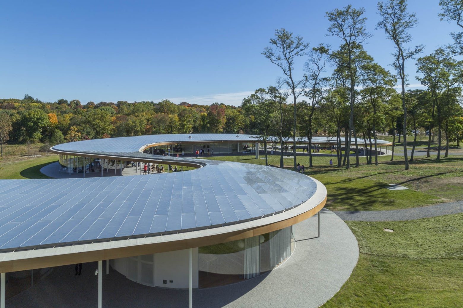
Construction details depicting the external wall section through gutter

Short section including sliding door detail

“To conceal the blinds outside the sliding doors of the main studio, the front wall is of a much deeper construction than the rest of the building,” said APA. “The blinds had to do outside the doors to mitigate solar heat gain.”

Not only that, but creating an ultra-rusty greenhouse also proved tough. Eventually, APA hired a French company to provide a bespoke structure that would fit their uncommon setting.

Country Garden Studio, with its veritable kit of unrefined parts and materials, tested APA’s design integrity as they put together a near-accurate interpretation of an old agricultural property set in present-day England. From the sawn larch timber shingles to the limestone foundation, this modest but modern countryside site reflects the intensity of material usage and detailing done by the architects. These beautifully crafted buildings, each with their own distinct character, undeniably fit with the landscape and historic setting.

Research Shingles Manufacturers

Research all your architectural materials through Architizer: Click here to sign up now. Are you a manufacturer looking to connect with architects? Click here.

The post ​Architectural Details: An English Garden Studio Wrapped in Shingles and Stone appeared first on Journal.

Viewing all 17431 articles
Browse latest View live